We are the digital agency
crafting brand experiences
for the modern audience.
We are Fame Foundry.

See our work. Read the Fame Foundry magazine.

We love our clients.

Fame Foundry seeks out bold brands that wish to engage their public in sincere, evocative ways.


WorkWeb DesignSportsEvents

Platforms for racing in the 21st century.

Fame Foundry puts the racing experience in front of millions of fans, steering motorsports to the modern age.

“Fame Foundry created something never seen before, allowing members to interact in new ways and providing them a central location to call their own. It also provides more value to our sponsors than we have ever had before.”

—Ryan Newman

Technology on the track.

Providing more than just web software, our management systems enhance and reinforce a variety of services by different racing organizations which work to evolve the speed, efficiency, and safety measures, aiding their process from lab to checkered flag.

WorkWeb DesignRetail

Setting the pace across 44 states.

With over 1100 locations, thousands of products, and millions of transactions, Shoe Show creates a substantial retail footprint in shoe sales.

The sole of superior choice.

With over 1100 locations, thousands of products, and millions of transactions, Shoe Show creates a substantial retail footprint in shoe sales.

WorkWeb DesignRetail

The contemporary online pharmacy.

Medichest sets a new standard, bringing the boutique experience to the drug store.

Integrated & Automated Marketing System

All the extensive opportunities for public engagement are made easily definable and effortlessly automated.

Scheduled promotions, sales, and campaigns, all precisely targeted for specific demographics within the whole of the Medichest audience.

WorkWeb DesignSocial

Home Design & Decor Magazine offers readers superior content on designer home trends on any device.


  • By selectively curating the very best from their individual markets, each localized catalog comes to exhibit the trending, pertinent visual flavors specific to each region.


  • Beside the swaths of inspirational home photography spreads, Home Design & Decor provides exhaustive articles and advice by proven professionals in home design.


  • The art of home ingenuity always dances between the timeless and the experimental. The very best in these intersecting principles offer consistent sources of modern innovation.

WorkWeb DesignSocial

  • Post a need on behalf of yourself, a family member or your community group, whether you need volunteers or funds to support your cause.


  • Search by location, expertise and date, and connect with people in your very own community who need your time and talents.


  • Start your own Neighborhood or Group Page and create a virtual hub where you can connect and converse about the things that matter most to you.

December 2016
By Kimberly Barnes

Going the Distance: Four Ways to Build a Better Customer Loyalty Program for Your Brand

Loyalty programs are no longer a novelty. That means that yesterday’s strategies won’t work moving forward, so look for ways to rise above the noise, setting yourself apart from the cloying drone of countless other cookie-cutter programs.
Read the article

Going the Distance: Four Ways to Build a Better Customer Loyalty Program for Your Brand

article-thedistance-lg It’s easy enough for a customer to join your loyalty program, especially when you’re offering an incentive such as discounts. All your customer has to do is give out some basic information, and voila! They’re in the fold, a brand new loyalty member with your company. From there, it’s happily ever after. You offer the perks; they stand solidly by you, bringing you their continued business. Simple. Or is it? In reality, just how many of those customers are act ively participating in your loyalty program? Do you know? Sure, loyalty program memberships are on the rise according to market research company eMarketer, having jumped 25 percent in the space of just two years. However, that figure may be a bit misleading. The truth is that, while loyalty program sign-ups may be more numerous, active participation in such programs is actually in decline. At the time of the study, the average US household had memberships in 29 loyalty programs; yet consumers were only active in 12 of those. That’s just 41 percent. And even that meager figure represents a drop of 2 percentage points per year over each of the preceding four years, according to a study by loyalty-marketing research company COLLOQUY.

When discounts just aren’t enough

So what’s a brand to do? How can you make your loyalty program worth your customer’s while—as well as your own? After all, gaining a new loyalty member doesn’t mean much if your customer isn’t actively participating in your program. Consider this: Does your customer loyalty program offer members anything different from what your competitors are offering? Chances are your program includes discounts. That’s a given. And what customer doesn’t appreciate a good discount? But when every other company out there is providing this staple benefit in comparable amounts, it becomes less and less likely that customers will remain loyal to any one particular brand. Frankly, it’s all too easy for customers to get lost in a sea of loyalty member discounts. They’re everywhere. In fact, just under half of internet users perceive that all rewards programs are alike, according to a 2015 eMarketer survey. The key to success, then, is to differentiate your business from the crowd. If you can offer your customers something unique and valuable beyond the usual discount, chances are they’ll be more likely to stick with your brand. Here’s some inspiration from companies who get it.

Virgin: Reward more purchases with more benefits.

That’s not to say you need to get rid of discounts entirely. In fact, nothing could be further from the truth. Customers still love a good discount. The goal is to be creative in terms of the loyalty perks you offer. Take the Virgin Atlantic Flying Club, for example. As part of its loyalty program, the airline allows members to earn miles and tier points. Members are inducted at the Club Red tier, from which they can move up to Club Silver and then Club Gold. Here, it’s not just a discount. It’s status. And people respond to feeling important, elite. Still, even where the rewards themselves are concerned, Virgin is motivating loyalty customers with some pretty attractive offers. At the Club Red tier, members earn flight miles and receive discounts on rental cars, airport parking, hotels and holiday flights. But as members rise in tiers, they get even more. At the Club Silver tier, members earn 50 percent more points on flights, access to expedited check-in, and priority standby seating. And once they reach the top, Club Gold members receive double miles, priority boarding and access to exclusive clubhouses where they can get a drink or a massage before their flight. Now that’s some serious incentive to keep coming back for more. Discounts are still part of the equation – but they are designed with innovation and personal value in mind, elevating them to more than just savings.

Amazon Prime: Pay upfront and become a VIP.

What if your customers only had to pay a one-time upfront fee to get a year’s worth of substantial benefits? It may not sound like the smartest business idea at first glance. But take a closer look. Amazon Prime users pay a nominal $99 a year to gain free, two-day shipping on millions of products with no minimum purchase. And that’s just one benefit of going Prime. It’s true that Amazon loses $1-2 billion a year on Prime. This comes as no surprise given the incredible value the program offers. But get this: Amazon makes up for its losses in markedly higher transaction frequency. Specifically, Prime members spend an average of $1,500 a year on Amazon.com, compared with $625 spent by non-Prime users, a ccording to a 2015 report from Consumer Intelligence Research Partners.

Patagonia: Cater to customer values.

Sometimes, the draw for consumers isn’t saving money or getting a great deal. The eco-friendly outdoor clothing company Patagonia figured this out back in 2011, when it partnered with eBay to launch its Common Threads Initiative: a program that allows customers to resell their used Patagonia clothing via the company’s website. Why is this program important to customers? And how does it benefit Patagonia? The company’s brand embraces environmental and social responsibility, so it was only fitting that they create a platform for essentially recycling old clothing rather than merely throwing it away. The Common Threads Initiative helps Patagonia build a memorable brand and fierce loyalty by offering its customers a cause that aligns with deep personal values. OK, so their customers get to make a little money, too. Everybody wins.

American Airlines: Gamify your loyalty program.

If you’re going to offer your customers a loyalty program, why not make it f un? After all, engagement is key to building a strong relationship with your customer. And what better way to achieve that goal than making a game of it. American Airlines had this very thing in mind when it created its AAdvantage Passport Challenge following its merger with USAirways. The goal: find a new way to engage customers as big changes were underway. Using a custom Facebook application, American Airlines created a virtual passport to increase brand awareness while offering members a chance to earn bonus points. Customers earned these rewards through a variety of game-like activities, from answering trivia questions to tracking travel through a personalized dashboard. In the end, participants earned more than 70 percent more stamps than expected – and the airline saw a ROI of more than 500 percent. The takeaway: people like games.

Stand out from the crowd.

Your approach to your customer loyalty program should align with your overall marketing approach. Effective branding is about standing out, not blending it. Being memorable is key. To this end, keep in mind that loyalty programs are no longer a novelty. That means that yesterday’s strategies won’t work moving forward, so look for ways to rise above the noise, setting yourself apart from the cloying drone of countless other cookie-cutter programs.


767 What the font?

If you’re looking for a secret sauce to increase your website’s conversion rate, this simple tip could be the key to your recipe for success.

775 Boost email open rates by 152 percent

Use your customers’ behavior to your advantage.

774 Feelings are viral

Feelings are the key to fueling likes, comments and shares.

March 2010
By Jordan Drake

Comcast's Frank Eliason: Creating a Better Customer Experience One Tweet at a Time

Meet the man behind the Internet’s most advanced social media-based customer service program.
Read the article

Comcast's Frank Eliason: Creating a Better Customer Experience One Tweet at a Time

podcast_main “Can I help?” Eleven characters. Unintrusive. Unpresumptuous.

Yet this seemingly innocuous question has the power to soften even the most disgruntled customer and open the door to communication. This is exactly how Frank Eliason, Comcast’s senior director in national customer operations, initiates many of his conversations with those who express their frustrations through Twitter.

Widely recognized as a pioneer in the use of social media for customer service, Frank – or @ComcastCares, as he is known in the Twitterverse – makes a strong case for why companies should not be afraid to venture into the social web.

Rather than shying away from criticism, he approaches each case head-on, with humility, authenticity and a genuine passion for achieving resolution to problems. In doing so, he has achieved the ultimate goal of any marketer or social media guru – transforming formerly dissatisfied customers into brand evangelists.

Recently, Frank joined Fame Foundry’s Jordan Drake to share his experience as the human voice behind the cable giant.

[powerpress]

Frank Eliason Based in Philadelphia, Frank first joined Comcast as a customer service manager in September 2007. Shortly thereafter, he began reaching out to customers via phone after they blogged about their experiences with the company. In February of the following year, Frank was asked to take on a new role, director of digital care. In the two years since, he has spearheaded an innovative program that uses the tools of social media to provide real-time response to customer concerns – a program many others now seek to emulate. Follow him on Twitter @ComcastCares.

More from Fame Foundry

The Fame Foundry Podcast and the Fame Foundry Daily Tips for Business Growth are available now on iTunes.

Subscribe Now


August 2009
By The Architect

DeadSpace: 7 Reasons Why MySpace is as Good as Dead

The first behemoth of social network is on its way to the grave, with no one to blame but itself.
Read the article

DeadSpace: 7 Reasons Why MySpace is as Good as Dead

The first behemoth of social networking, MySpace—now owned by Fox Interactive Media—is on its way to its grave, with no one to blame but itself. MySpace’s popularity hit its apex in March 2008. In the following month, it was overtaken by its first real competitor, Facebook. But the writing was on the wall long before that. Web developers and architects all over knew that MySpace was doing it wrong. Surely at least a few of its own developers knew this and pushed for change. Still, MySpace was the slowest to adapt. For a site of that magnitude—including all of its systems, engineering and hacks to make it function—change does not come easy or cheap. The site was not built to do or handle what it attempts to do today, and its poor framework and conventions of interaction are a reflection of that. This is where the ever-important step of planning and laying a site’s foundation is so important. MySpace architects did not effectively build the system to be much more than a novelty. And while MySpace is not your average website, it serves as a lesson in utility for anyone charged with planning, building and running a website on any scale. If a better alternative in Facebook had never come along, MySpace would not be in this position nor would it have pushed to try to make any changes, even in the eleventh hour. People still want to connect to other people, share things they care about and display certain aspects of their life. Whether you agree with those aspects of our culture or not, they do exist, and MySpace fulfilled those motivations for a time. All you need is one competitor, however, one other option entering the marketplace, and the incumbent developers will be challenged to fight to the death. MySpace’s architects and developers simply could not live up to that challenge. In 2008, MySpace did begin to introduce features, tweak aspects of its foundation and attempt to crack down on the juggernauts of spam bots plaguing the site—but by then people didn’t care. Facebook came along, presented a better option, and people moved with little doubt that they would ever return to MySpace. Thus, in the same way it virally grew, MySpace will die by the same domino effect that catapulted its popularity. Let’s examine seven key elements of MySpace that rushed MySpace to its grave. (It should be noted that the following screenshots were purely at random and were very, very easy to find.)

1: Out-of-control design framework

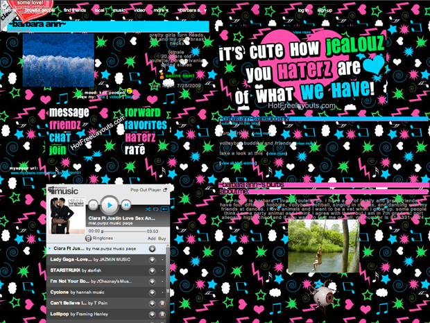
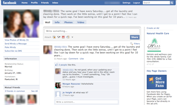
Of the people you know, how many could lay plans for their own house, paint a beautiful portrait worthy of hanging in your living room or perform cosmetic surgery? Chances are, few. There are just certain things that some people have no business doing, either lawfully or for the sake of the rest of us. Designing websites is one of those things. Designers are in a unique class of professionals, and good web design is an exact art and science. MySpace disagrees, however, and allows their users to hack everything in the page until nothing is usable, legible or tolerable. Bad-MySpace-Design-620 Pages are riddled with high-res backgrounds, text isn’t protected, and colors, styles and sizes are fully unlocked—just to name a few. All of this creates a design playground which breeds annoying layouts that distract from the page's content. In contrast, Facebook has chosen to restrict at least the foundational framework of the site. Facebook-Design-Restriction-620 While customization is an important aspect, it shouldn’t be allowed at the risk of the functional system—the very heart of a social networking site’s brand and reputation.
2: Auto-play music

People love music. It’s one of the few ubiquitous facets of life. In fact, Apple’s famed comeback as a technological and cultural superpower was all a carefully conceived plan to tap into our common love for music—and they rode that all the way to billion-dollar profits. In contrast, MySpace taps into music to annoy the living hell out of most of us. In fact, it should be noted that all non-prompted audio anywhere, on any page, is a widely unacceptable and an unwanted "feature."” This goes for ads, auto-play videos, and most important, unexpected, blaring music overlaid on what you might be listening to already.

3: Identities

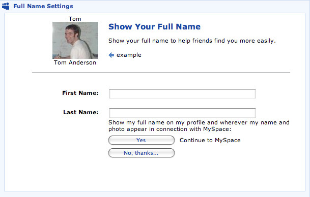
The days of Internet handles are coming to a close. Yes, there was a time when one would be known as “Biker5445,” as systems continued to use usernames as main identifiers. Of course, Internet e-mail systems will still use some form of handles for some time. Most of today’s websites, however, no longer need to do this—particularly social networking sites. This is even more important due to recent news and events concerning privacy and security. The use of a handle is only good for concealing identity, and that doesn’t mix well in a site intended to connect people. What good can come from that policy in a social networking site? Bad-MySpace-Handles-620 MySpace did eventually get clued into this basic, fundamental issue and started asking its users for their real name as an option: Bad-MySpace-Finally-Asks-For-Real-Names-620 Again, too little too late.

4: Little focus on content with a horrible user interface

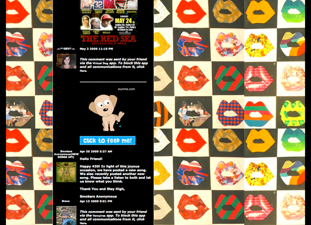
There’s actually too much of this subject matter to fit within this article’s short space. One could write volumes about the sheer usability and UI issues that plague MySpace. One thing is for sure, this aspect is a website killer, no matter if you are local deli or a major social networking site. In the case of MySpace, most interactions and conversations occur within a never-ending, scrolling guestbook. These “comments” also have very little restrictions and are filled with a cacophony of text, pictures, videos and animated gifs—all without any context in the conversation. Ultimately, the interface leaves everyone reading essentially one-half of an e-mail conversation between two people and no one else. Bad-MySpace-Horrible-Interface-2-640 That’s just the beginning. Features that are, at best, a one-time read about a person’s interests, life story, and favorite music, movies, books, television shows, heroes and foods are typically placed near the top of the page in one long column. Whether you have an interest in any of this stuff or not, you’re treated to it every time. Bad-MySpace-Horrible-Interface-3-640 The list goes on, but we just can’t stomach any more.
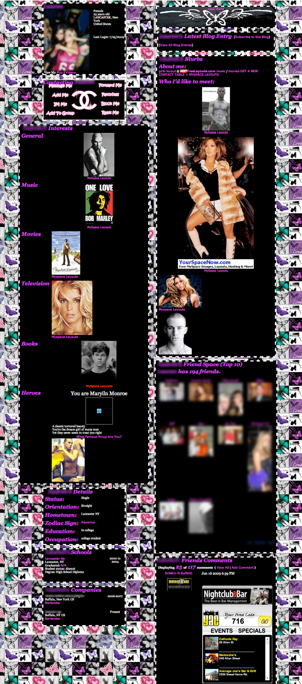
5: MySpace has cultivated a raunchy, immature base

MySpace’s culture—formed by the foundation created by its architects—has without a doubt developed an immaturity and a raunchiness that is unique to MySpace. It’s widely known that MySpace has sold-out to become a platform built around dating, which doesn’t help its state in terms of the quality of content. You can easily find all the "vital" statistics that you want from a date on most pages—everything from sexual orientation, build types, even income takes headline status. The archetypical “MySpace photo” is often mocked and mimicked today by a photo with the person in a sexually suggestive pose, with bright light and the camera aiming down from above. Bad-MySpace-Immature-Framework-620 It’s not just about sexually suggestive material, but about the framework of how MySpace works. The site can’t be responsible for user’s content, or perhaps lack of content, but what MySpace’s architects have built promotes an underlying immaturity that is not present in Facebook—at least not yet. Coupled with all the other out-of-control elements, a light click-through of MySpace easily resembles a walk down a tattered, defaced red light district. And why is Facebook not facing this degree of the problem? Its architects have planned better. Perhaps it’s embracing the common sense of restricting anonymity. Perhaps it’s because Facebook doesn’t allow layouts and its interface to go nuts. Either way, it’s well-known that Facebook has attracted a more mature presence and left MySpace with the rest. If you have never experienced this cultural difference, click around random pages in MySpace—if you dare. Chances are, you don't need to and you're just nodding along with the rest of us.
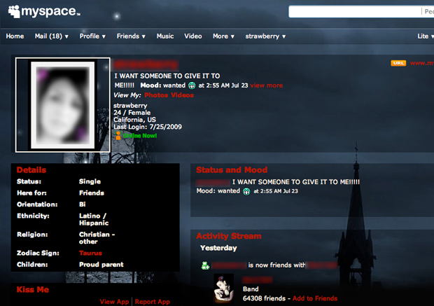
6: Inordinate number of ads

News Corp is definitely profit-centric. Whatever soul MySpace ever had, it was sold to the highest bidder ages ago. The number of large, animated, irritating, irrelevant and sometimes offensive ads compared to what matters—content and utility—is terribly imbalanced. Bad-MySpace-Ads-640 While Facebook has yet to turn a profit at the date of this article, it will eventually need to solve this problem and will most certainly shift its balance as well. Until the day comes when Facebook burns through its cash faster than investors can pour it in, this difference makes it an easy switch from MySpace to Facebook.
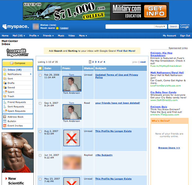
7: Spam

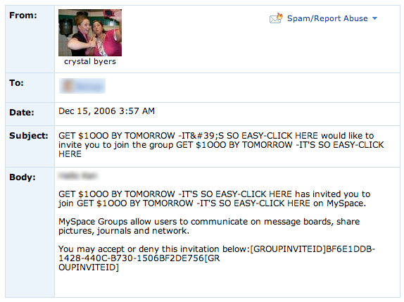
If there’s one thing that’s notorious on MySpace, it’s spam. The site’s spam comes in many forms, but the most prevalent are the spam bots for sex and dating sites. They pose as skanky figures, companies, scam artists, music groups and interest groups, which scour friend lists in public profiles and send out friend requests to drive traffic to their MySpace page or other shady website. Bad-MySpace-Spam-620 MySpace came to its senses in recent times, figuring that this was annoying people beyond limits and started to ruthlessly crackdown. Again, too late. The brand of MySpace, “A Place for Friends,” became “MySpace—A Place For Sleazy Marketers.”
The Future

While MySpace's reputation is dead, Facebook isn’t perfect either. In fact, more and more people are becoming annoyed with its limitations and methods as well. It is still plagued with its own problems, some of them similar to MySpace in terms of its core usage. Simply put, there are things that “social networking” sites should be doing and they are not, along with things that they are doing and shouldn’t be. Facebook is—for the moment—simply a better option. But it’s got a thin line to walk as well, not the least of which is to actually turn a profit. With MySpace as good as buried, look to Facebook to begin making changes to address the pressures of creating more revenue. The balance between utility and profits will be tilted. The question is how much will it tilt and how much will be sacrificed when the next social networking site comes along and ups the ante?

More...

MySpace Helps News Corp Lose $363 Million [Mashable]