We are the digital agency
crafting brand experiences
for the modern audience.
We are Fame Foundry.

See our work. Read the Fame Foundry magazine.

We love our clients.

Fame Foundry seeks out bold brands that wish to engage their public in sincere, evocative ways.


WorkWeb DesignSportsEvents

Platforms for racing in the 21st century.

Fame Foundry puts the racing experience in front of millions of fans, steering motorsports to the modern age.

“Fame Foundry created something never seen before, allowing members to interact in new ways and providing them a central location to call their own. It also provides more value to our sponsors than we have ever had before.”

—Ryan Newman

Technology on the track.

Providing more than just web software, our management systems enhance and reinforce a variety of services by different racing organizations which work to evolve the speed, efficiency, and safety measures, aiding their process from lab to checkered flag.

WorkWeb DesignRetail

Setting the pace across 44 states.

With over 1100 locations, thousands of products, and millions of transactions, Shoe Show creates a substantial retail footprint in shoe sales.

The sole of superior choice.

With over 1100 locations, thousands of products, and millions of transactions, Shoe Show creates a substantial retail footprint in shoe sales.

WorkWeb DesignRetail

The contemporary online pharmacy.

Medichest sets a new standard, bringing the boutique experience to the drug store.

Integrated & Automated Marketing System

All the extensive opportunities for public engagement are made easily definable and effortlessly automated.

Scheduled promotions, sales, and campaigns, all precisely targeted for specific demographics within the whole of the Medichest audience.

WorkWeb DesignSocial

Home Design & Decor Magazine offers readers superior content on designer home trends on any device.


  • By selectively curating the very best from their individual markets, each localized catalog comes to exhibit the trending, pertinent visual flavors specific to each region.


  • Beside the swaths of inspirational home photography spreads, Home Design & Decor provides exhaustive articles and advice by proven professionals in home design.


  • The art of home ingenuity always dances between the timeless and the experimental. The very best in these intersecting principles offer consistent sources of modern innovation.

WorkWeb DesignSocial

  • Post a need on behalf of yourself, a family member or your community group, whether you need volunteers or funds to support your cause.


  • Search by location, expertise and date, and connect with people in your very own community who need your time and talents.


  • Start your own Neighborhood or Group Page and create a virtual hub where you can connect and converse about the things that matter most to you.

December 2016
By Kimberly Barnes

Going the Distance: Four Ways to Build a Better Customer Loyalty Program for Your Brand

Loyalty programs are no longer a novelty. That means that yesterday’s strategies won’t work moving forward, so look for ways to rise above the noise, setting yourself apart from the cloying drone of countless other cookie-cutter programs.
Read the article

Going the Distance: Four Ways to Build a Better Customer Loyalty Program for Your Brand

article-thedistance-lg It’s easy enough for a customer to join your loyalty program, especially when you’re offering an incentive such as discounts. All your customer has to do is give out some basic information, and voila! They’re in the fold, a brand new loyalty member with your company. From there, it’s happily ever after. You offer the perks; they stand solidly by you, bringing you their continued business. Simple. Or is it? In reality, just how many of those customers are act ively participating in your loyalty program? Do you know? Sure, loyalty program memberships are on the rise according to market research company eMarketer, having jumped 25 percent in the space of just two years. However, that figure may be a bit misleading. The truth is that, while loyalty program sign-ups may be more numerous, active participation in such programs is actually in decline. At the time of the study, the average US household had memberships in 29 loyalty programs; yet consumers were only active in 12 of those. That’s just 41 percent. And even that meager figure represents a drop of 2 percentage points per year over each of the preceding four years, according to a study by loyalty-marketing research company COLLOQUY.

When discounts just aren’t enough

So what’s a brand to do? How can you make your loyalty program worth your customer’s while—as well as your own? After all, gaining a new loyalty member doesn’t mean much if your customer isn’t actively participating in your program. Consider this: Does your customer loyalty program offer members anything different from what your competitors are offering? Chances are your program includes discounts. That’s a given. And what customer doesn’t appreciate a good discount? But when every other company out there is providing this staple benefit in comparable amounts, it becomes less and less likely that customers will remain loyal to any one particular brand. Frankly, it’s all too easy for customers to get lost in a sea of loyalty member discounts. They’re everywhere. In fact, just under half of internet users perceive that all rewards programs are alike, according to a 2015 eMarketer survey. The key to success, then, is to differentiate your business from the crowd. If you can offer your customers something unique and valuable beyond the usual discount, chances are they’ll be more likely to stick with your brand. Here’s some inspiration from companies who get it.

Virgin: Reward more purchases with more benefits.

That’s not to say you need to get rid of discounts entirely. In fact, nothing could be further from the truth. Customers still love a good discount. The goal is to be creative in terms of the loyalty perks you offer. Take the Virgin Atlantic Flying Club, for example. As part of its loyalty program, the airline allows members to earn miles and tier points. Members are inducted at the Club Red tier, from which they can move up to Club Silver and then Club Gold. Here, it’s not just a discount. It’s status. And people respond to feeling important, elite. Still, even where the rewards themselves are concerned, Virgin is motivating loyalty customers with some pretty attractive offers. At the Club Red tier, members earn flight miles and receive discounts on rental cars, airport parking, hotels and holiday flights. But as members rise in tiers, they get even more. At the Club Silver tier, members earn 50 percent more points on flights, access to expedited check-in, and priority standby seating. And once they reach the top, Club Gold members receive double miles, priority boarding and access to exclusive clubhouses where they can get a drink or a massage before their flight. Now that’s some serious incentive to keep coming back for more. Discounts are still part of the equation – but they are designed with innovation and personal value in mind, elevating them to more than just savings.

Amazon Prime: Pay upfront and become a VIP.

What if your customers only had to pay a one-time upfront fee to get a year’s worth of substantial benefits? It may not sound like the smartest business idea at first glance. But take a closer look. Amazon Prime users pay a nominal $99 a year to gain free, two-day shipping on millions of products with no minimum purchase. And that’s just one benefit of going Prime. It’s true that Amazon loses $1-2 billion a year on Prime. This comes as no surprise given the incredible value the program offers. But get this: Amazon makes up for its losses in markedly higher transaction frequency. Specifically, Prime members spend an average of $1,500 a year on Amazon.com, compared with $625 spent by non-Prime users, a ccording to a 2015 report from Consumer Intelligence Research Partners.

Patagonia: Cater to customer values.

Sometimes, the draw for consumers isn’t saving money or getting a great deal. The eco-friendly outdoor clothing company Patagonia figured this out back in 2011, when it partnered with eBay to launch its Common Threads Initiative: a program that allows customers to resell their used Patagonia clothing via the company’s website. Why is this program important to customers? And how does it benefit Patagonia? The company’s brand embraces environmental and social responsibility, so it was only fitting that they create a platform for essentially recycling old clothing rather than merely throwing it away. The Common Threads Initiative helps Patagonia build a memorable brand and fierce loyalty by offering its customers a cause that aligns with deep personal values. OK, so their customers get to make a little money, too. Everybody wins.

American Airlines: Gamify your loyalty program.

If you’re going to offer your customers a loyalty program, why not make it f un? After all, engagement is key to building a strong relationship with your customer. And what better way to achieve that goal than making a game of it. American Airlines had this very thing in mind when it created its AAdvantage Passport Challenge following its merger with USAirways. The goal: find a new way to engage customers as big changes were underway. Using a custom Facebook application, American Airlines created a virtual passport to increase brand awareness while offering members a chance to earn bonus points. Customers earned these rewards through a variety of game-like activities, from answering trivia questions to tracking travel through a personalized dashboard. In the end, participants earned more than 70 percent more stamps than expected – and the airline saw a ROI of more than 500 percent. The takeaway: people like games.

Stand out from the crowd.

Your approach to your customer loyalty program should align with your overall marketing approach. Effective branding is about standing out, not blending it. Being memorable is key. To this end, keep in mind that loyalty programs are no longer a novelty. That means that yesterday’s strategies won’t work moving forward, so look for ways to rise above the noise, setting yourself apart from the cloying drone of countless other cookie-cutter programs.


407 Email offenders: Who they are and how to stop them

Reclaim your inbox from those who drain your productivity with their lack of detail, poor communication skills or inability to commit to a plan.

June 2021
Noted By Joe Bauldoff

The Making and Maintenance of our Open Source Infrastructure

In this video, Nadia Eghbal, author of “Working in Public”, discusses the potential of open source developer communities, and looks for ways to reframe the significance of software stewardship in light of how the march of time constantly and inevitably works to pull these valuable resources back into entropy and obsolescence. Presented by the Long Now Foundation.
Watch on YouTube

775 Boost email open rates by 152 percent

Use your customers’ behavior to your advantage.

May 2014
By Jeremy Girard

Requiem for the Flash Intro: Seven Dying Trends in Website Design

If your site features one or more of these passé design trends, it’s time for a refresh to avoid looking as dated as acid-wash jeans and a bad perm.
Read the article

Requiem for the Flash Intro: Seven Dying Trends in Website Design

Thanks to the now ubiquitous #TBT (that’s “throwback Thursday” for those of you who don’t speak hashtag), every week we’re all treated to a cringe-inducing trip down memory lane that takes us on a tour of our most regrettable fashion choices, whether it’s the bad perms and acid-washed jeans we sported in the 80s, the grunge-era plaid shirts and Doc Martens of the 90s or the velour sweatsuits and Carrie Bradshaw-inspired nameplate necklaces we left behind in the early aughts. TBT Just as in fashion, website design trends come and go. What’s popular one day is old news the next. And just as you wouldn’t wear shoulder pads and stirrup pants to a sales meeting, you don’t want your website to be an embarrassing amalgamation of passé design trends. After all, if your website looks dated, it won’t inspire confidence among prospective customers that you’re on top of your game – no matter what game it is that you’re playing. Here are seven once-popular design trends that are fading fast – and that you should purge from your website as soon as you can:
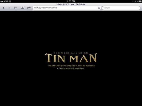
1. Flash intros

Once upon a time, everybody and their brother wanted a Flash intro to create a memorable first impression. These days, though, having a Flash intro is a recipe for disaster. Flash First, in today’s era of mobile surfing, speed and simplicity win the day. Keep in mind, too, that Flash and iOS do not mix, so your site won’t even be accessible to users on Apple gadgets. Also, today’s visitor demands more control and fewer bells and whistles that only serve as obstacles to accomplishing their end goal.
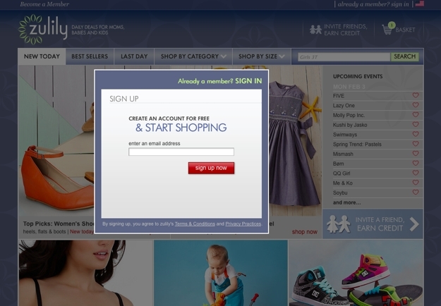
2. Pop-over windows

As site owners became increasingly eager to turn their web presence into full-blown conversion engines, the pop-over window rose to popularity. As soon as a new visitor lands on the site, BAM! they are greeted with a request to complete a form to provide their contact information in exchange for a welcome discount offer or to follow the company on Facebook for future updates and promotions, thus giving the company all the ammunition they need to continue their engagement long after that visitor has moved on to other corners of the Web. Zulily But while these pop-overs are good for site owners (at least in theory), they are very disruptive for the user and provide roadblocks that only make it more difficult for them to accomplish what they originally came to the site to do. As a result, any value that might be gained in collecting the user’s data is quickly negated if that user has no interest in continuing their as a result of this negative first encounter. Thankfully, good UX is winning this battle, and the pop-over is falling quickly out of favor. Reality has set in that no one comes to a site for the express purpose of helping the site’s owner market to them, so it’s hardly the best way to lay a foundation for a successful long-term relationship. Instead of leading off the conversation with your survey request, Facebook follow prompt or current promotion, simply allow your visitors to dive right into the site to find the information they’re seeking or complete their desired task. Keep your mailing list sign-up and Facebook links in your site’s universal framework, and if you do your job in creating a positive experience for them, your visitors will willingly allow you to become a presence in their email inbox or their Facebook news feed all on their own. Read more: Deal-Breakers and Dead-Ends: Six Turn-Offs That Alienate Website Visitors
3. Animated billboards

Oversized, rotating slideshows have become a common fixture on home pages in recent years, largely because they provide a way to present several key messages to the visitor without requiring them to scroll or to click past the initial page. However, UX tests show that these animated presentations are not as effective as we’d like to think. While the initial message in the carousel often prompts a click, the effectiveness of subsequent messages in the loop drops dramatically because many users do not stick around to see all of the slides. Other users ignore these animated areas completely, perceiving them as banner advertisements that should be glossed over in search of more meaningful content. The billboard remains a popular design feature; however, the trend is growing toward featuring a singular strong message in this area combined with a striking visual image. Streamlining and simplifying allows this one key idea to come across loud and clear rather than being lost among a muddled array of messages that are presented indiscriminately in the hopes that one will result in the desired outcome.

4. Information overload

Continuing with the theme of reductionism, today’s most successful websites pare down the information presented on the home page in order to create a cleaner, more focused presentation. This is in stark contrast to the approach that many sites took for years, which was to stuff the home page with as much information as possible in the hopes that visitors would find whatever they might be looking for on that page without having to dig any deeper. The result is a page that is utterly lacking in direction; nothing is emphasized because everything is emphasized. In the end, instead of being guided intuitively toward the information they seek, users are driven away by an overwhelming mess of content that is not properly organized and prioritized. To avoid this pitfall, focus on only the most important information for visitors while providing easy pathways, such as search tools and user-friendly site navigation, to help them find the content that lies deeper in the site. This approach will ultimately yield a better experience for your users and therefore better results for your company.

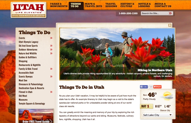
5. Drop-down menus

For years, the drop-down menu has been the go-to solution for streamlining a site’s primary navigation options while providing easy access to secondary pages. But with the advent of touch-based devices, which do not have a hover state, drop-down menus no longer serve the needs of all users. The simple fact of the matter is that with the rapid growth of mobile Web use, you simply can’t afford to risk leaving these visitors stranded with no way to delve beyond your site’s home page. Instead, a better solution for modern websites is to feature secondary page navigation options along the top or side of the page within the relevant section of the primary navigation. Utah Read more: 3 Simple Rules for Navigation That Will Boost Your Website’s Performance
6. Contact forms

The contact form has long been a staple of websites – so much so that it’s often used in place of providing other means of contacting a company, such as a phone number or email address. However, more and more, site owners are choosing to eliminate this form altogether in an effort to provide a more personal, service-driven experience. Instead of having a visitor’s first interaction with their company occur via a cold, faceless web form that goes to an anonymous recipient and assures no timeline for response, the company elects to provide only their phone number so that the customer’s needs can be addressed immediately and directly by a live human being. While contact forms are not likely to disappear completely anytime soon, what is going away is the practice of relying on these forms as the sole vehicle for communication with customers and prospects.

7. Third-person narratives

Your website should embody the voice and personality of your brand. As such, it simply makes no sense for the content to be written from a third-person perspective, as if it’s being read to the user by a distant omniscient narrator. Instead, writing in the first-person creates a softer, more approachable tone that puts a human face on your company. It’s the difference between saying, “At Sanford & Son Remodeling, their goal is to ensure your satisfaction.” and “At Sanford & Son Remodeling, our goal is to ensure your satisfaction.” Which one feels more authentic? More warm and personable?

Beyond keeping up with the Jonses

Remember: keeping pace with the latest trends in website design is more than skin-deep. It’s not about having more bells and whistles than your competition; it’s about providing the best experience for all users, no matter how or where they’re accessing your site. By staying ahead of the curve, you’ll ensure that your site continually evolves to meet the needs and expectations of users who are constantly adapting to new devices and technologies.
October 2010
By The Author

Death by Liking

If people don't hate you, you're doing something wrong.
Read the article

Death by Liking

outofbusiness What if you create a good product that everyone likes? What if you keep feeding the demand by making more and more of that product? What if you maintain this endless rinse-and-repeat cycle with what you know works? What if you never stray from the safety of the familiar? How could you not be successful?

Blockbuster brands

Simple math will tell you that you will be successful for awhile – years, even – if enough people like your brand. Therein lies the problem: people like your brand. They choose your product when it's convenient for them. They tolerate it in the absence of a more appealing option. But what happens when you hit a bump in the road? What happens when a new competitor arrives on the scene? What happens when they realize they can live without you? Let's ask Blockbuster, shall we? For years, it was smooth sailing for Blockbuster. At the height of their success, there was a store on practically every street corner. People went there as a course of habit. Going to Blockbuster to rent a movie became as deeply ingrained in our routines as going to the grocery store or the dry cleaner. And it was good to be Blockbuster. blockbuster_closingThat is, until Netflix happened. Suddenly, the idea of driving to a store and paying $4 to rent a movie for a few days didn't seem like such a nice convenience. Driving it back to the store according to Blockbuster's timetable wasn't so tolerable. People discovered they didn't like Blockbuster quite as much as they thought they did. One by one, the once ubiquitous blue and yellow signs started disappearing. No one cheered their departure. And no one felt the sting of their absence.

Apple brands

What if you create a product that some people love? What if those people tell everyone who will listen how great your product is? What if they are willing to seek out your product even when they have to pay more or drive farther to get it? What if they still choose your brand even when someone else comes along with an alternative that is cheaper, newer and flashier? The flip side of that coin is that there will be people who hate you. They'll align themselves with other people who share their hatred. Hating you will become their rallying cry. How do you survive when you've polarized the market? Ask McDonald's. Ask Starbucks. Ask Apple. Hardly anyone is just lukewarm about their fast food preference. For everyone who must have a regular Big Mac fix, there's someone else who will gladly give you an earful about why Wendy's is a far superior choice and they'll never set foot within 100 yards of a McDonald's. You could stage a re-enactment of West Side Story with the Jets who take pride in bearing the white cup with the green seal and the Sharks who feel their own smug sense of self-satisfaction in sporting the nondescript cup from the locally owned corner coffee shop. For everyone who evangelizes for Apple, there's someone on another message board tearing them to shreds. love_hate_apple You don't even have to be a computer geek to have a dog in this fight. There's a reason the "I'm a Mac/I'm a PC" ad campaign resonated with people on both sides of the aisle. If you're a Mac, you're a Mac through and through, and you probably own an iPhone and an iPod, too. The Apple brand is part of your identity.

Make waves or drown treading water

Doing things as they've always been done is comfortable and safe. You're not going to offend anyone. But you're not going to inspire anyone, either. Everyone who likes you one day can be gone the next. But people who love you stand by you. In every industry and in every market, there is the opportunity to be a revolutionary. You don't have to invent the next iPad. You might just develop a network of trustworthy, reliable home maintenance professionals that can be reached with one call to one phone number and dispatched to solve any problem that might arise. You might start a car-buying concierge service that saves your clients the hassle and guesswork of negotiating a car deal. You might bring an authentic 24-hour French bakery and cafe to a mid-sized southern city. Everyone who likes you one day can be gone the next. But people who love you stand by you. Give the tribe of people who share a passion for what you do something meaningful to rally around. Show them that you understand them and you care about meeting their needs. Draw a line in the sand. Demonstrate what you stand for. Be equally proud of what you are and what you are not. Be bold. Be unapologetic. Be arrogant if that's what it takes. It shows passion. It shows conviction. It's better than being imminently forgettable. Let go of the safety net of liking. Make waves of love and hate. You'll make the choice for your customers an easy one every time.