Check Your Ego at the Door: Embracing User-Centered Website Design
June 2012
By Jeremy Girard

The creation of a new website is a process filled with important decisions. As the owner, CEO, or decision maker at the organization for which the new site is being designed and developed, you will be asked for your feedback or approval a number of times along the way – but what are you using as the basis for that feedback?
Too often decisions are made during a website’s creation that are based on the preferences of the site’s “owners” and not on the needs of the people who will actually use the website. This is the wrong way to go about making decisions for a project, because the reality is that your website should not be designed for you, it should be designed for your audience.
In this article, we will take a look at how you can shape the decisions you make on a website’s creation, or its subsequent upkeep, to help you meet the needs of your website’s most important audience - the clients and customers that will bring you business and ultimately make your site a success.
Making design decisions
No one wants to have a website they don’t like the look of, but the fact of the matter is that design decisions are not made for aesthetic reasons only. Visual choices for a project should be made by taking the needs of your audience, and your business’s goals for the website, into account.
Many people assume that their website should be a reflection of their personal tastes or sense of style. That is not the case. It’s sometimes hard to hear, but your preferences of what looks good and what doesn’t should be secondary to what is appropriate for your site’s users. You certainly want something that you are proud of, but when reviewing design options, but sure to consistently ask yourself, “what would my audience think?” Or better yet, ask some of your actual users for their feedback and use that data in your decision making process.
In the end, the goal is to come up with a design that you love and which properly represents your company, but will also meet the needs of your audience. When in doubt, however, defer to your users’ needs and remember that old saying – “the customer is always right.”
Give users what they want
While a great design is certainly important, the reality is that your customers are not coming to your website to be “wowed” by its visual design - they are coming to your site for its content. If you want your site to succeed, it has to offer the content your audience is looking for and make it easy for them to find it.
When considering what content should be presented on the website, and also where it should be presented, you should once again ask yourself what is right for your audience. You may be very proud of the awards your company has won or feel that the “Message from the President” is insightful, but be truthful - is that what your site visitors are coming to find? If not, then does it make sense to present that content on your homepage or someplace else with similar prominence?
Oftentimes website content is prioritized based on company egos or a sense of what they want to see, rather than what users are looking for. We are proud of our accomplishments, so we want them front and center for all to see. Our President runs the company, so his words must be important, right? While these may both be true, if your site visitors are not looking for this content, and yet you place them in a spot of prominence instead of content that your audience actually wants, then you are putting your needs or opinions ahead of theirs.
Leave the ego aside when making content decisions for the website. Those awards announcements and presidential messages can certainly have a place on the site, just make sure it’s an appropriate place that doesn’t interfere with what your users come to the website to see.
I want my website to do something cool!
Website owners love pizzazz. We see another site that does something “cool” and we want something similar on our own site. Unfortunately, we rarely ever stop to consider whether that awesome animation or cool feature is actually effective or if it helps meet the goals of your site.
When considering adding something you think is “awesome”, you should once again (I imagine you are starting to see a pattern here) ask yourself how that addition will help meet your business’s goals or your users’ needs. Does it help at all, or is it just something cool to add? Almost always, it is the later – nothing more than some “wow factor.” That alone would not be a bad thing, but too often, the “wow” that is added actually makes it harder for our users to do what they came to the website for in the first place.
Take animated introductions or “welcome” videos on websites, features that are one of the more popular requests made to add some wow to a site. Would you ever start a business meeting with a song and dance number, trying to entertain your audience before the meeting begins? Probably not – yet that is exactly what you are doing when to you add that animated blast of pizzazz to your website. It is all show and no substance and your site visitors will see right through it – that is if they stick around long enough to even see it. Oftentimes, overblown effects such as unnecessary animation, videos, or music files that play when the site is loaded do the opposite of “wowing” your audience. Instead, those effects often drive them away. If you surprise site visitors with an audio track or a video that autoplays on page load, a likely response is to quickly click the ‘BACK’ button – taking the traffic you worked hard to get away from your website and your business.
Your customers, and potential customers, come to your site for a reason. Anything that gets in the way of what they are looking to accomplish lowers the chance that they will continue deeper into your site to complete their task. When adding wow factor to make your site more memorable, always be sure that whatever you add is not done at the expense of your site’s usability. Furthermore, ask yourself if you really even need it, because a site that welcomes visitors and easily allows them to find the information they need to complete the task they came to complete is certainly doing “something cool” – it is meeting your users’ need and driving business results for you.
Let’s take a minute to look at a few examples of wow factor added in appropriate, and inappropriate, ways so we can compare the two.
Video – the right way vs. the wrong way
We’ve already mentioned adding “welcome” videos to a website. Often, this video takes the form of a commercial or advertisement that a company ran on television. They receive a web- ready copy of the spot and, wanting to make the investment they made in that video stretch as far as possible, they decide to add it to the website. But for what purpose? If the goal of the initial commercial was to introduce viewers to your company and get them to the website, then why put it on the website to show users who are already there?
The website for cosmetic dentist Gary D. Light & Associates starts with a video that pops up on the site and autoplays, distracting users from the rest of the site’s information.

Even worse, if you’re in Internet Explorer – which many of your users will be, the video opens again on every single page you visit, even though you may have already closed it two or three times. That is a recipe for annoying your audience.
The website for car dealership
Tasca also begins with a video that autoplays, showing one of the company’s commercials. Visit the site for the first time and the video overtakes the screen with a commercial. It’s a bit jarring if you are not expecting it the video and audio to begin blaring out of your speakers. Overall, this is a quality website with lots of useful features for someone shopping for a vehicle. Does that opening video help in that search or does it drive you away when it pops up unexpectedly?
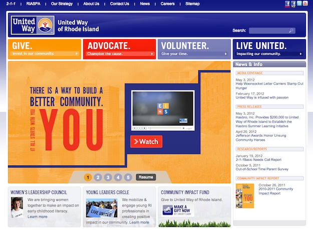
A better way to present video is what you will see at the United Way of Rhode Island.

Their annual “campaign video” is one of the feature pieces of content for the website, and it is presented directly on the homepage in the large billboard area. Rather than autoplay the video, however, a site visitor has to request to see it by clicking the large red “Watch” button. In this way, the video is made readily available to those who want to see it, without interrupting the user experience of those who do not.
The three questions
When new visitors come to your website, they will ask themselves a few questions, namely:
- Who is this company?
- What do they do?
- What do I do next?
Not only do users ask these questions, they do it quickly, in as little as 4-8 seconds once they visit the page. To successfully meet your users’ needs, you need to make sure the content you place in front of them helps answer these questions and directs their experience.
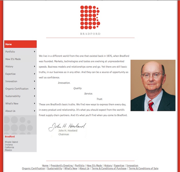
The website for Bradford Soapworks is a nice looking site with quality information throughout, but the homepage opens with a letter from the company chairman. There is no mention of what the company actually does, no images of their products and no clear calls-to-action to answer the question of “what do I do next?” That message from the Chairman, however important to the company, does not seem to be in line with the needs of site visitors.

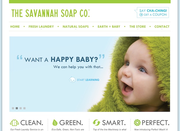
In contrast, the website for The Savannah Soap Company does a great job of answering these 3 basic questions and the eye-catching visuals, presented in the site’s large billboard area, also include calls-to-action to “start learning” or to “learn more”, giving visitors a clear direction as to what to do next.

When presenting content on your website, consider the answers to the 3 visitor questions outlined above and consistently ask yourself whether the placement of the content you are using is appropriate to meet your visitors’ needs and answer those questions.
Talk to your audience
If you truly want a site that will be a success, continually ask yourself what your customers would want as you make decisions on the site – both during initial design and development phases and again later on during the site’s maintenance. Or, as I mentioned earlier, take it a step further and don’t only ask yourself what your users would want – actually ask them!
Whenever appropriate, ask real customers how you are doing on your website. Did the decisions you made along the way help them in the ways you intended? What else could you do to make their experience better? You will be amazed at the quality feedback you can get simply by asking a few questions.
Now, this doesn’t mean you should simply put a “tell us how we are doing” form on your site and call it a day. The most likely submissions you will get through those forms are spam-bots or angry visitors who are more likely to fill out such a form when they are upset. While you certainly want to know if someone is upset with the site, this feedback form alone will give you a very skewed picture of how you are doing.
Soliciting feedback from your site means truly interacting with your audience. Pick up the phone and call some customers to ask them your questions – or work with a firm that specializes in user testing and see how the site holds up in those tests. However you gather the data, the best way to meet your users’ needs is to learn what those needs are and the best way to learn what they are is to speak to your audience.
Love your website
A website is a reflection of our business, so it makes sense that we want it to also be a reflection of us – our likes and preferences. We want our website to be “ours” - but in the end, while the website itself may be yours, the experience it creates belongs to your audience. If you truly want to make the site a success, start by making sure that the experience it creates - from the design visuals, to the content presented, to the wow factor you decide to (or not to) add, is a wonderful experience for your users. Meet their needs and they will make your site a success. I don’t know about you, but to me, a site that does that is about as “cool” as it gets.
Jeremy Girard has been designing for the web since 1999. He is currently employed at the Providence, Rhode Island-based firm Envision Technology Advisors and also teaches website design and front-end development at the University of Rhode Island. In addition, Jeremy contributes regularly to a number of websites and magazines focused on business and the Web, including his personal site at Pumpkin-King.com.