Survival of the Fittest: Conquering Responsive Website Design
September 2012
By Sufyan bin Uzayr

With the proliferation of smartphones and tablets today, serving the needs of mobile browsers is no longer acondary consideration when it comes to designing (or redesigning) your website.
From the ground up, it’s critically important to ensure that you are building a platform that will look beautiful and perform elegantly no matter where or how a user might access it.
While you can create a dedicated mobile site or app, responsive design offers a smarter, more flexible, more agile solution that will ultimately deliver a greater long-term return for your investment.
Defining responsive design
Responsive design is the concept of building a website so that the layout of the site adapts and changes according to the resolution of the user’s browser.
Using this approach, you can build a single site that will look just as good on a monitor that’s 2048 pixels by 1080 pixels as it will on an iPhone that’s 320 pixels by 480 pixels and all browser sizes in between without the need to build a separate dedicated mobile version of your website.
Ethan Marcotte, the forerunner in the field, identifies the three key ingredients of responsive design as follows:
- Fluid grids
- Flexible images
- Media queries
Wait, fluid what? Media what?
Let’s take a step back and define these terms in plain English.
Every website is developed based on a grid that governs the scale of and relative position of objects (such as navigation menus, images and text) to one another. A fluid grid has the ability to shift and reposition select elements of the site based on certain conditions in order to preserve the properly defined scale for layout, size and spacing.
“Flexible images” mean that the images contained within the site’s design should scale in size and shift in position according to the dimensions of the device being used to access the site (larger images on large displays, smaller ones on phone screens, etc.)
And media queries? Media queries are used to intelligently detect the size of the browser window and the device being used to access the site and bring back the correct layout for optimal viewing and navigation according to those parameters.
But these technical elements only govern the mechanics of the site. What ultimately determines the success of a website that’s built on a responsive design framework is its ability to provide a user interface that’s both visually pleasing and easy to use. After all, responsive design isn't only about resizing stuff to fit within different screen resolutions; it’s about presenting users with a the best possible experience, both in terms of layout and content.
With that in mind, here are five key UX/UI factors that must be taken into consideration in order to maintain the integrity of the user interface and protect the quality of the user experience when employing a responsive design framework.
Catering to the needs of visitors
Users accessing your website from different devices have different needs.
For example, if someone visits your website from their iPad during their daily commute on the train, they’re only going to dig so deep. For example, while they’ll likely be interested in perusing your latest blog post, they’re not going to be looking for the bios of your board of directors or your privacy policy.
You must think about each type of user that will be visiting your site and let their needs and interests dictate the way your site molds and conforms itself to the size of their browser or device.
Intuitiveness
Being innovative is a good thing; being too innovative is not.
If, for instance, you decide to change the color of hyperlinks to an indistinguishable shade of black or invent new navigational conventions that perplex your visitors, you’ll send them running in the opposite direction,and the design will be a total failure.
The purpose of responsive web design is to empower users to visit your website and browse freely and according to the conventions that are most natural and familiar to them, irrespective of the device they are using.
Touchability
Who can refute the fact that touchscreens are growing more popular with every passing day? Almost all major smartphones and tablets use touchscreen interfaces, and even certain laptops and desktops are being offered with touch functionality.
Touchscreens needs to be treated differently. For example, in the world of the touchscreen, there is no such thing as a hover state. If, for example, you have “previous” and “next” buttons that would normally appear only when a mouse rolls over them, those elements would be unavailable to your touchscreen users.
For finger-friendly navigation, all elements must be big, bold and obvious. Buttons that require users to mouse over them to get a sense of action must be replaced with style enhancements that draw attention to their “pressability.”
It’s also a good idea when catering to touchscreen users to keep the navigation or sub-navigation menu to the right. Why? Because the majority of your users will be right-handed, so the menus will be more conveniently accessible if they’re on the right rather than on the top or left.
Images
While layouts, structural elements and text can be made flexible, images require special attention.
Improper alignment of images can ruin even the greatest of designs. Images need to be automatically adjusted to ensure that the website looks awesome in either portrait or landscape mode (remember: most portable devices nowadays can switch instantaneously between views, depending on the user's whims and wishes).
Also, when resizing images on the basis of the screen resolution of the device, care needs to be taken so that the images do not lose their quality. If a given image contains the logo or the name of the website, it needs to be given prominence, whereas footer images can take a back seat.
The best is to load the images in their original size, unless the viewing area becomes too narrow for the purpose. When that happens, it means the user is on a mobile device, and the image needs to be narrowed in accordance with the screen width. This is the very essence of how smart responsive web design works.
What to show (and what to hide)
With responsive design, we have the ability to rearrange web elements and make every thing fit on the screen, no matter how small it is.
However, making every single aspect of a normal web page available to mobile users is not only unnecessary but it can render your site practically unusable on smaller screens.
For mobile devices, navigation, content and functionality must be pared down significantly to focus on those features that are most useful to users while on the go.
For example, while mobile users frequently comparison shop on their phones, they might not be as likely to actually go through the entire purchase process on their handheld device. Therefore, while product information and pricing is key, e-commerce options should be extremely streamlined.
A Showcase of Responsive Design
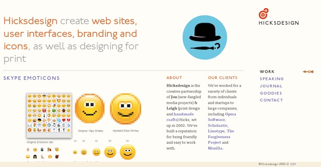
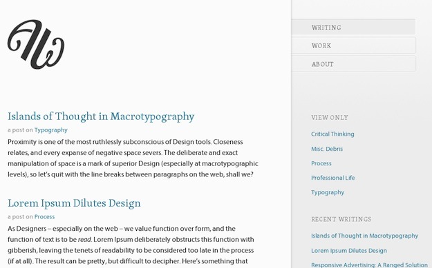
To demonstrate just how effective responsive can be, let’s take a look at a few examples of companies that have embraced this new approach in building their sites.
In each example, the full version of the site is show first, followed by a version as it appears on a mobile device.
Hicksdesign

Art Equals Work

City Crawlers: Berlin


8Faces


Sufyan bin Uzayr is a freelance writer, artist and photographer based in India. He serves as Editor-in-Chief for the e-journal Brave New World and also writes for several technology blogs and print magazines. His primary areas of interest include open source, mobile development, web CMS and vector art. You can visit his website or friend him on Facebook and Google+.