We are the digital agency
crafting brand experiences
for the modern audience.
We are Fame Foundry.

See our work. Read the Fame Foundry magazine.

We love our clients.

Fame Foundry seeks out bold brands that wish to engage their public in sincere, evocative ways.


WorkWeb DesignSportsEvents

Platforms for racing in the 21st century.

Fame Foundry puts the racing experience in front of millions of fans, steering motorsports to the modern age.

“Fame Foundry created something never seen before, allowing members to interact in new ways and providing them a central location to call their own. It also provides more value to our sponsors than we have ever had before.”

—Ryan Newman

Technology on the track.

Providing more than just web software, our management systems enhance and reinforce a variety of services by different racing organizations which work to evolve the speed, efficiency, and safety measures, aiding their process from lab to checkered flag.

WorkWeb DesignRetail

Setting the pace across 44 states.

With over 1100 locations, thousands of products, and millions of transactions, Shoe Show creates a substantial retail footprint in shoe sales.

The sole of superior choice.

With over 1100 locations, thousands of products, and millions of transactions, Shoe Show creates a substantial retail footprint in shoe sales.

WorkWeb DesignRetail

The contemporary online pharmacy.

Medichest sets a new standard, bringing the boutique experience to the drug store.

Integrated & Automated Marketing System

All the extensive opportunities for public engagement are made easily definable and effortlessly automated.

Scheduled promotions, sales, and campaigns, all precisely targeted for specific demographics within the whole of the Medichest audience.

WorkWeb DesignSocial

Home Design & Decor Magazine offers readers superior content on designer home trends on any device.


  • By selectively curating the very best from their individual markets, each localized catalog comes to exhibit the trending, pertinent visual flavors specific to each region.


  • Beside the swaths of inspirational home photography spreads, Home Design & Decor provides exhaustive articles and advice by proven professionals in home design.


  • The art of home ingenuity always dances between the timeless and the experimental. The very best in these intersecting principles offer consistent sources of modern innovation.

WorkWeb DesignSocial

  • Post a need on behalf of yourself, a family member or your community group, whether you need volunteers or funds to support your cause.


  • Search by location, expertise and date, and connect with people in your very own community who need your time and talents.


  • Start your own Neighborhood or Group Page and create a virtual hub where you can connect and converse about the things that matter most to you.

June 2021
Noted By Joe Bauldoff

The Making and Maintenance of our Open Source Infrastructure

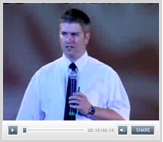
In this video, Nadia Eghbal, author of “Working in Public”, discusses the potential of open source developer communities, and looks for ways to reframe the significance of software stewardship in light of how the march of time constantly and inevitably works to pull these valuable resources back into entropy and obsolescence. Presented by the Long Now Foundation.
Watch on YouTube

084 - FF Rewind - Top 10 tips of the quarter: Once you've captured their attention, don't betray their trust

Today we continue reviewing our most popular tips to date with advice on how to protect the relationships you build in virtual

March 2021
Noted By Joe Bauldoff

The Case for Object-Centered Sociality

In what might be the inceptive, albeit older article on the subject, Finnish entrepreneur and sociologist, Jyri Engeström, introduces the theory of object-centered sociality: how “objects of affinity” are what truly bring people to connect. What lies between the lines here, however, is a budding perspective regarding how organizations might better propagate their ideas by shaping them as or attaching them to attractive, memorable social objects.
Read the Article

December 2016
By Kimberly Barnes

Going the Distance: Four Ways to Build a Better Customer Loyalty Program for Your Brand

Loyalty programs are no longer a novelty. That means that yesterday’s strategies won’t work moving forward, so look for ways to rise above the noise, setting yourself apart from the cloying drone of countless other cookie-cutter programs.
Read the article

Going the Distance: Four Ways to Build a Better Customer Loyalty Program for Your Brand

article-thedistance-lg It’s easy enough for a customer to join your loyalty program, especially when you’re offering an incentive such as discounts. All your customer has to do is give out some basic information, and voila! They’re in the fold, a brand new loyalty member with your company. From there, it’s happily ever after. You offer the perks; they stand solidly by you, bringing you their continued business. Simple. Or is it? In reality, just how many of those customers are act ively participating in your loyalty program? Do you know? Sure, loyalty program memberships are on the rise according to market research company eMarketer, having jumped 25 percent in the space of just two years. However, that figure may be a bit misleading. The truth is that, while loyalty program sign-ups may be more numerous, active participation in such programs is actually in decline. At the time of the study, the average US household had memberships in 29 loyalty programs; yet consumers were only active in 12 of those. That’s just 41 percent. And even that meager figure represents a drop of 2 percentage points per year over each of the preceding four years, according to a study by loyalty-marketing research company COLLOQUY.

When discounts just aren’t enough

So what’s a brand to do? How can you make your loyalty program worth your customer’s while—as well as your own? After all, gaining a new loyalty member doesn’t mean much if your customer isn’t actively participating in your program. Consider this: Does your customer loyalty program offer members anything different from what your competitors are offering? Chances are your program includes discounts. That’s a given. And what customer doesn’t appreciate a good discount? But when every other company out there is providing this staple benefit in comparable amounts, it becomes less and less likely that customers will remain loyal to any one particular brand. Frankly, it’s all too easy for customers to get lost in a sea of loyalty member discounts. They’re everywhere. In fact, just under half of internet users perceive that all rewards programs are alike, according to a 2015 eMarketer survey. The key to success, then, is to differentiate your business from the crowd. If you can offer your customers something unique and valuable beyond the usual discount, chances are they’ll be more likely to stick with your brand. Here’s some inspiration from companies who get it.

Virgin: Reward more purchases with more benefits.

That’s not to say you need to get rid of discounts entirely. In fact, nothing could be further from the truth. Customers still love a good discount. The goal is to be creative in terms of the loyalty perks you offer. Take the Virgin Atlantic Flying Club, for example. As part of its loyalty program, the airline allows members to earn miles and tier points. Members are inducted at the Club Red tier, from which they can move up to Club Silver and then Club Gold. Here, it’s not just a discount. It’s status. And people respond to feeling important, elite. Still, even where the rewards themselves are concerned, Virgin is motivating loyalty customers with some pretty attractive offers. At the Club Red tier, members earn flight miles and receive discounts on rental cars, airport parking, hotels and holiday flights. But as members rise in tiers, they get even more. At the Club Silver tier, members earn 50 percent more points on flights, access to expedited check-in, and priority standby seating. And once they reach the top, Club Gold members receive double miles, priority boarding and access to exclusive clubhouses where they can get a drink or a massage before their flight. Now that’s some serious incentive to keep coming back for more. Discounts are still part of the equation – but they are designed with innovation and personal value in mind, elevating them to more than just savings.

Amazon Prime: Pay upfront and become a VIP.

What if your customers only had to pay a one-time upfront fee to get a year’s worth of substantial benefits? It may not sound like the smartest business idea at first glance. But take a closer look. Amazon Prime users pay a nominal $99 a year to gain free, two-day shipping on millions of products with no minimum purchase. And that’s just one benefit of going Prime. It’s true that Amazon loses $1-2 billion a year on Prime. This comes as no surprise given the incredible value the program offers. But get this: Amazon makes up for its losses in markedly higher transaction frequency. Specifically, Prime members spend an average of $1,500 a year on Amazon.com, compared with $625 spent by non-Prime users, a ccording to a 2015 report from Consumer Intelligence Research Partners.

Patagonia: Cater to customer values.

Sometimes, the draw for consumers isn’t saving money or getting a great deal. The eco-friendly outdoor clothing company Patagonia figured this out back in 2011, when it partnered with eBay to launch its Common Threads Initiative: a program that allows customers to resell their used Patagonia clothing via the company’s website. Why is this program important to customers? And how does it benefit Patagonia? The company’s brand embraces environmental and social responsibility, so it was only fitting that they create a platform for essentially recycling old clothing rather than merely throwing it away. The Common Threads Initiative helps Patagonia build a memorable brand and fierce loyalty by offering its customers a cause that aligns with deep personal values. OK, so their customers get to make a little money, too. Everybody wins.

American Airlines: Gamify your loyalty program.

If you’re going to offer your customers a loyalty program, why not make it f un? After all, engagement is key to building a strong relationship with your customer. And what better way to achieve that goal than making a game of it. American Airlines had this very thing in mind when it created its AAdvantage Passport Challenge following its merger with USAirways. The goal: find a new way to engage customers as big changes were underway. Using a custom Facebook application, American Airlines created a virtual passport to increase brand awareness while offering members a chance to earn bonus points. Customers earned these rewards through a variety of game-like activities, from answering trivia questions to tracking travel through a personalized dashboard. In the end, participants earned more than 70 percent more stamps than expected – and the airline saw a ROI of more than 500 percent. The takeaway: people like games.

Stand out from the crowd.

Your approach to your customer loyalty program should align with your overall marketing approach. Effective branding is about standing out, not blending it. Being memorable is key. To this end, keep in mind that loyalty programs are no longer a novelty. That means that yesterday’s strategies won’t work moving forward, so look for ways to rise above the noise, setting yourself apart from the cloying drone of countless other cookie-cutter programs.


May 2012
By Tara Hornor

The Good, the Bad and How You Can Do It Better: An Analysis of 8 Great (And Not So Great) Landing Pages

The purpose of a landing page is simple: convincing visitors to take one specific action. All of the website design elements that go into motivating them to take that action? Not so simple.
Read the article

The Good, the Bad and How You Can Do It Better: An Analysis of 8 Great (And Not So Great) Landing Pages

landing_article

In the world of business promotion and growth, landing pages have a singular purpose: to compel visitors to take a specific action that will further their engagement with your company.

Whether that action is registering for something (an event, an account, a newsletter, etc.), downloading something (a white paper, perhaps) or purchasing something, the goal is to persuade the visitor to complete that action and that action alone – not to tell them everything they could ever want to know about your company, its history and all it has to offer.

A good landing page makes it easy for visitors to understand what you want them to do and why they should do it while simultaneously keeping the process of taking that action streamlined and free of distractions and hassles.

A strong landing page is a critical component of any marketing campaign, whether offline or online. You've convinced someone to take their time to visit the page, so now you need to seal the deal by motivating them to take the next step. While this is no easy task, there are many ways to improve your odds of success.

One of the best ways to understand the dos and don’ts of landing page design is to see them in practice. Here we’ll examine eight very different landing pages and offer our analysis of what they’ve done right, what they’ve done wrong and how you can do it better.

UserTesting.com

062-testing

The Good: The heading presents a direct, relevant sales message, and the subhead provides excellent support. The copy is clear and to-the-point while the video offer the opportunity for users to learn more without leaving the page.

The "Pricing and Signup" button is very prominent, so visitors know where they need to go next, while the mention of the one-year money-back guarantee provides an important trust-building element to motivate them to take that step.

The Bad: On this site, the landing page is the home page, which is a mistake because there are a number of distractions present that can draw visitors away from the path to conversion.

The navigation elements are too prominent, and the top search bar is completely unnecessary, only providing yet another element of disruption. The display image for the video is a bit cluttered as well.

How You Can Do it Better: When you have a very specific marketing or sales objective to achieve (again, think signing up for your newsletter, downloading free content, launching a new product, etc.), use a landing page.

Your home page needs to serve a diverse array of functions and users. A landing page allows you to provide a completely customized experience focused on helping a more targeted group of users reach one specific conversion point.

Team Treehouse

04-training

The Good: This landing page is clean, simple, focused and presents a clear pricing plan right off the bat. The navigation elements aren't so prominent that they distract, but they are definitely easy to find if a user wants to do more research. You know you're getting training videos, but the question remains...

The Bad: What kind of training videos? This landing page took simplicity so far to the extreme that it forgot to tell visitors what they're getting, even if they read all the text on the page. It’s impossible to understand what the offer is without leaving the page, which is a glaring oversight.

How You Can Do it Better: Minimalism is good but only when used within reason.

You must present enough information about your offer on the landing page itself for the user to feel confident in taking the next step. This requires good balance of content and design. It may also necessitate getting a bit creative in how you present your message. Often, a brief demonstration video can take the place of 1,000 words in providing more information about your product or service.

Windows Azure

07-azure

The Good: Here's a fairly solid landing page. The design is minimalist, the call to action is easy to find and who doesn't like getting something for free?

The heading and description are clear and easy to understand. The superframework (where the logo and log-in links live) is sufficiently muted and out of the way. Overall, the layout is clean and makes it easy for the eye to navigate the page.

The Bad: The main navigation is messy and overly complex. There are two tiers with various buttons highlighted in light blue, which introduces and element of confusion and distraction in an otherwise very clean and streamlined design.

How You Can Do it Better: Navigation is a make-or-break element of every website design, and landing pages are no exception.

When it comes to your landing page, remember that the goal is to persuade the user to take one specific action. Focus on providing them with only the information they need in order to take that action without leaving the page if possible.

If more information is needed than will be effectively served by a single page, keep the navigation streamlined and limited only to those options that serve the landing page’s core purpose.

RightBanners!

10-banner

The Good: The layout of the page is simple and easy to follow, and the navigation bar is tucked out of the way. The clear pricing structure gives users the critical information they need to know. Plus, the colors are engaging and exciting.

The Bad: The "Submit Your Order Now" heading reads like a button, but it isn't a button at all. Instead, the user must scroll down to create an order – a process that's quite confusing.

There are also too many different sizes of text on the page, which is a direct result of trying cram too much information into the banner area.

This page would work much more effectively if it were broken into a two-step process: a streamlined landing page leading the user to a second page where they could complete their order.

How You Can Do it Better: When it comes to user interface design, the devil is in the details. You must always consider the cues and conventions that users expect when interacting with a page and use those to your best advantage.

For example, navigational buttons are so commonplace that we tend to take them for granted, but they play an important role in your landing page.

Pairing call-to-action statements like “Submit Your Order Now” with a button that performs that specified action is a simple but effective way to provide a familiar interface cue that helps users understand the process that they’re engaging in.

When these things don’t work as expected – as in the example above – it creates confusion and uncertainty that can inhibit the user from taking the action you desire.

PSD2HTML

052-psd

The Good: This is an excellent landing page. The call to action is clear, and the message is concise. Overall, it's easy to tell what you're getting and where to go next.

The Bad: The page is a bit cluttered, which leads the eye away from the primary point of focus.

How You Can Do it Better: As always, whitespace is your friend.

If the design is cramped, the page will seem visually intimidating to your user. By contrast, allowing the elements on the page room to breathe makes it easier for the user to draw distinctions between different types of information.

DealFuel.com

09-themify

The Good: Deal Fuel pulls off the home page/landing page combo successfully because it's designed first and foremost to be a landing page.

The design is clever, and the value proposition is prominent. Navigation elements have been scaled way back to allow the header section where the call to action lives to take center stage. Pricing information is easy to find, and the layout of the page helps guide the visitor through the information presented in a logical order.

The Bad: The description paragraph is too long; it's just too much information to include in a call to action area.

Also, the color of the "Buy Now!" button should also be different than the brown used in the gas pump because it fades into the background.

How You Can Do it Better: Never underestimate the importance of color in website design. Color and contrast play a very important role in directing the user’s attention to key elements and establishing a hierarchy of information.

For example, on the DealFuel.com page, simply swapping the colors on the "Today's price" banner and the "Buy Now!" button would create better cohesiveness within the design and make the call to action button more prominent.

AppSumo

08-app

The Good: This is a unique landing page that offers a the user a chance to win a prize in exchange for giving the company their contact information.

The call to action button is impossible to miss, and the process draws you in because it's so easy to answer the (very obvious) question and fill out the form.

The Bad: The design is cluttered and the message is difficult to find right away. The heading says "Win the Top 40 Books...", but you don't know why or how immediately. The description that follows is difficult to read because there’s not enough contrast between the color of the text and the background.

Also, putting the books on the left side of the page (where the eye naturally goes first) is distracting. These should be positioned either to the right or below the call to action in this example.

It's also a mistake to offer a reward at such a superficial level of engagement. Users can provide their contact information and enter the contest without knowing anything about AppSumo or what they offer. The brand would be much better served if the page included even a short, single-line description of AppSumo's value proposition.

How You Can Do it Better: Before you create a landing page, you must clearly define the business growth objective that you want it to serve, and then you must decide how best that objective can be achieved in a way that delivers value for both your brand and your customers.

In the AppSumo example, the engagement between the visitor and the brand is fleeting and shallow. While AppSumo does gain the benefit of the user’s information, there’s nothing to qualify this user as a potential customer and no motivation for the user not to simply unsubscribe when they start receiving communication from a company that they still know nothing about.

While capturing a user’s contact information is a legitimate and useful business growth goal, it would be better achieved by offering the user something of greater value in return than simply a one-in-many-thousands chance of winning a prize.

Instead, think of a way to structure the exchange that promotes greater long-term engagement between your brand and this user, whether it’s a providing free white paper that showcases your expertise or offering a free trial of your services.

TemplateSOLD

03-themes

The Good: The design is modern, and the colors are interesting and engaging. The bold, concise heading makes the purpose of the page very clear. Prices are displayed upfront, so there are no surprises when the user moves to the next step.

The Bad: What is the next step, exactly? There's no one clear call to action. Instead, there are a LOT of calls to action here that muddy the design. The page wants you both to "Signup Now" and to "Download" the themes. There are also a number of different prices displayed on the page, each of which acts as a call to action in its own right.

Last but far from least, there's a major conflict in messaging. While the bold text claims to sell $40,866 worth of themes for just $59.95, the fine print cites a 50 theme limit. This type of marketing gimmick only serves to create confusion and make potential buyers wary of what they're really getting into.

How You Can Do it Better: Whatever you do, never, ever use any kind of gimmick or trickery in your presentation. No matter what action you want your users to take, they’re not going to do it if you don’t first establish a foundation of trust.

Instead, go above and beyond in your efforts to reduce the user’s perceived risk for taking action. When possible, offer a money-back guarantee or free trial period. Make sure you address potential sales objections, and provide social proof to reinforce believability and trust.


August 2014
By Kimberly Barnes

Focus, Technology and Personalization: A Master Class in Branding from Apple’s Angela Ahrendts

You don’t need the resources of Apple or Burberry to emulate their phenomenal success; you just need to follow in the footsteps of Angela Ahrendts: Keep a clear focus on your brand story. Find your audience and learn to speak their language. And discover ways to differentiate your product through personal service.
Read the article

Focus, Technology and Personalization: A Master Class in Branding from Apple’s Angela Ahrendts

Angela Ahrendts was recognized as a branding and marketing powerhouse well before Apple tapped her as their senior vice president of retail and online sales. Her eight-year track record at Burberry is very nearly legendary — and with good reason. When Ahrendts came to Burberry in 2006, growth at the venerable company had nearly come to a standstill, but within just a few years, she had re-established the brand as a force to be reckoned with in the luxury market. Through a combination of savvy use of technology and some hard-nosed business moves, she rebuilt the Burberry label brick-by-brick, and by the time she left for Apple, had nearly tripled the company’s annual revenue. And while your company’s marketing budget and resources surely are a drop in the bucket compared to Apple’s or Burberry’s, that doesn’t mean we can’t take a page from her syllabus and learn to how to emulate her innovative approach to branding building. So why don’t we all turn our attention to Professor Ahrendts, and let her teach us how to embrace the principles and practices that brought her phenomenal success at Burberry and got Apple’s attention.

Focus, focus, focus

When Ahrendts became CEO of Burberry, she inherited a brand in turmoil. The venerable 150-year old name was no longer synonymous with luxury; instead it had become the label of choice for British hooligans — so much, in fact, that some pubs refused to allow patrons inside if they were wearing Burberry. Outside the UK, the situation was even worse. Burberry had forged licensing agreements with more than a dozen international companies, and those companies were creating their own inferior products, then stamping them with the Burberry label. While Burberry was foundering, the luxury market as a whole was growing. Ahrendts found herself competing against well-established brands in a competitive market where her company had lost all advantage. Her response? Focus.

The brand

She began by finding what she refers to in interviews as her “white space” — the niche in the market that only Burberry could fill. And she found Burberry had two things that made it completely unique: it was British, and it had a history that spanned 150 years back to a single overcoat. These two features have been the touchstones guiding Burberry ever since in every piece of marketing, every fashion show and every story the brand has told — British models on the runway, British music on the website and in stores, and those classic trenchcoats always on prominent display.

The market

With a clear focus for the brand established, Ahrendts moved into market research to find the white space among consumers. Research told her something interesting – something that competing brands had either completely missed or ignored. The demographic group spending the most money on luxury consumer goods, especially in emerging markets, was the Millennial generation. So she landed upon the concept of “democratic luxury” as a way to bring the Burberry brand to a younger generation, avoiding the stuffy image many luxury brands promoted and making Burberry young, exciting and friendly.

The vision

Her final area of concern was all those licenses that were diluting the brand. Burberry bought back the licenses and established tight control over every single item that carried the Burberry label, from products to marketing campaigns. The new rule was simple: anything visible to the consumer passed through the hands of Chief Creative Officer Chris Bailey, the keeper of Burberry’s brand vision.

Digital first

trench Ahrendts has said that she views digital technology as a force for driving change rather than a marketing tool – a philosophy that is front and center in all of Burberry’s online outreach efforts. Take, for example, the Art of the Trench and the Burberry Kisses campaigns. Neither is designed as a direct-sell campaign but rather as a way to connect with, engage with and delight consumers. Then there’s Acoustic Burberry — a showcase of up-and-coming British musicians featured online and in Burberry stores. acoustic This integration of online and physical worlds is another of Ahrendts’ trademarks, and it’s embodied in Burberry’s flagship store, opened under her direction in 2012. Her stated goal was to make walking through a store exactly like browsing the Burberry website, and that goal is more than met. The store leverages cutting-edge technology to create a truly unique experience for customers. One great example is the use of chips embedded into selected products to activate interactive screens showcasing the story behind each item. Even runway shows blur the line between online and physical reality. Burberry now live-streams their fashion shows and allows online viewers to purchase items they see on the runway — well before they’re actually available in stores. It’s this seamless integration of worlds that has made the Burberry brand unique among its peers.

And always personal

Angela Ahrendts has also pioneered the use of technology to truly personalize the Burberry brand experience. In the stores, associates carry iPads with access to an international database of customers that provide purchase histories and personal preferences in order to allow them to provide their clients with a higher level of service. And online, customers are given the opportunity to customize items with nameplates and personalized technology. Orders placed online are even confirmed by a personal call from a Burberry rep.

Your takeaway

Angela Ahrendts has established herself as a branding genius — and Apple stands to benefit immeasurably under her guidance. Take her philosophy as an example, and reap some of the same benefits in your own market and on your own scale: Keep a clear focus on your brand story. Maintain control over your brand. Find your audience and learn to speak their language, which Ahrendts would say is digital. And discover ways to differentiate your product through presentation and personal service.