We are the digital agency
crafting brand experiences
for the modern audience.
We are Fame Foundry.

See our work. Read the Fame Foundry magazine.

We love our clients.

Fame Foundry seeks out bold brands that wish to engage their public in sincere, evocative ways.


WorkWeb DesignSportsEvents

Platforms for racing in the 21st century.

Fame Foundry puts the racing experience in front of millions of fans, steering motorsports to the modern age.

“Fame Foundry created something never seen before, allowing members to interact in new ways and providing them a central location to call their own. It also provides more value to our sponsors than we have ever had before.”

—Ryan Newman

Technology on the track.

Providing more than just web software, our management systems enhance and reinforce a variety of services by different racing organizations which work to evolve the speed, efficiency, and safety measures, aiding their process from lab to checkered flag.

WorkWeb DesignRetail

Setting the pace across 44 states.

With over 1100 locations, thousands of products, and millions of transactions, Shoe Show creates a substantial retail footprint in shoe sales.

The sole of superior choice.

With over 1100 locations, thousands of products, and millions of transactions, Shoe Show creates a substantial retail footprint in shoe sales.

WorkWeb DesignRetail

The contemporary online pharmacy.

Medichest sets a new standard, bringing the boutique experience to the drug store.

Integrated & Automated Marketing System

All the extensive opportunities for public engagement are made easily definable and effortlessly automated.

Scheduled promotions, sales, and campaigns, all precisely targeted for specific demographics within the whole of the Medichest audience.

WorkWeb DesignSocial

Home Design & Decor Magazine offers readers superior content on designer home trends on any device.


  • By selectively curating the very best from their individual markets, each localized catalog comes to exhibit the trending, pertinent visual flavors specific to each region.


  • Beside the swaths of inspirational home photography spreads, Home Design & Decor provides exhaustive articles and advice by proven professionals in home design.


  • The art of home ingenuity always dances between the timeless and the experimental. The very best in these intersecting principles offer consistent sources of modern innovation.

WorkWeb DesignSocial

  • Post a need on behalf of yourself, a family member or your community group, whether you need volunteers or funds to support your cause.


  • Search by location, expertise and date, and connect with people in your very own community who need your time and talents.


  • Start your own Neighborhood or Group Page and create a virtual hub where you can connect and converse about the things that matter most to you.

December 2016
By Kimberly Barnes

Going the Distance: Four Ways to Build a Better Customer Loyalty Program for Your Brand

Loyalty programs are no longer a novelty. That means that yesterday’s strategies won’t work moving forward, so look for ways to rise above the noise, setting yourself apart from the cloying drone of countless other cookie-cutter programs.
Read the article

Going the Distance: Four Ways to Build a Better Customer Loyalty Program for Your Brand

article-thedistance-lg It’s easy enough for a customer to join your loyalty program, especially when you’re offering an incentive such as discounts. All your customer has to do is give out some basic information, and voila! They’re in the fold, a brand new loyalty member with your company. From there, it’s happily ever after. You offer the perks; they stand solidly by you, bringing you their continued business. Simple. Or is it? In reality, just how many of those customers are act ively participating in your loyalty program? Do you know? Sure, loyalty program memberships are on the rise according to market research company eMarketer, having jumped 25 percent in the space of just two years. However, that figure may be a bit misleading. The truth is that, while loyalty program sign-ups may be more numerous, active participation in such programs is actually in decline. At the time of the study, the average US household had memberships in 29 loyalty programs; yet consumers were only active in 12 of those. That’s just 41 percent. And even that meager figure represents a drop of 2 percentage points per year over each of the preceding four years, according to a study by loyalty-marketing research company COLLOQUY.

When discounts just aren’t enough

So what’s a brand to do? How can you make your loyalty program worth your customer’s while—as well as your own? After all, gaining a new loyalty member doesn’t mean much if your customer isn’t actively participating in your program. Consider this: Does your customer loyalty program offer members anything different from what your competitors are offering? Chances are your program includes discounts. That’s a given. And what customer doesn’t appreciate a good discount? But when every other company out there is providing this staple benefit in comparable amounts, it becomes less and less likely that customers will remain loyal to any one particular brand. Frankly, it’s all too easy for customers to get lost in a sea of loyalty member discounts. They’re everywhere. In fact, just under half of internet users perceive that all rewards programs are alike, according to a 2015 eMarketer survey. The key to success, then, is to differentiate your business from the crowd. If you can offer your customers something unique and valuable beyond the usual discount, chances are they’ll be more likely to stick with your brand. Here’s some inspiration from companies who get it.

Virgin: Reward more purchases with more benefits.

That’s not to say you need to get rid of discounts entirely. In fact, nothing could be further from the truth. Customers still love a good discount. The goal is to be creative in terms of the loyalty perks you offer. Take the Virgin Atlantic Flying Club, for example. As part of its loyalty program, the airline allows members to earn miles and tier points. Members are inducted at the Club Red tier, from which they can move up to Club Silver and then Club Gold. Here, it’s not just a discount. It’s status. And people respond to feeling important, elite. Still, even where the rewards themselves are concerned, Virgin is motivating loyalty customers with some pretty attractive offers. At the Club Red tier, members earn flight miles and receive discounts on rental cars, airport parking, hotels and holiday flights. But as members rise in tiers, they get even more. At the Club Silver tier, members earn 50 percent more points on flights, access to expedited check-in, and priority standby seating. And once they reach the top, Club Gold members receive double miles, priority boarding and access to exclusive clubhouses where they can get a drink or a massage before their flight. Now that’s some serious incentive to keep coming back for more. Discounts are still part of the equation – but they are designed with innovation and personal value in mind, elevating them to more than just savings.

Amazon Prime: Pay upfront and become a VIP.

What if your customers only had to pay a one-time upfront fee to get a year’s worth of substantial benefits? It may not sound like the smartest business idea at first glance. But take a closer look. Amazon Prime users pay a nominal $99 a year to gain free, two-day shipping on millions of products with no minimum purchase. And that’s just one benefit of going Prime. It’s true that Amazon loses $1-2 billion a year on Prime. This comes as no surprise given the incredible value the program offers. But get this: Amazon makes up for its losses in markedly higher transaction frequency. Specifically, Prime members spend an average of $1,500 a year on Amazon.com, compared with $625 spent by non-Prime users, a ccording to a 2015 report from Consumer Intelligence Research Partners.

Patagonia: Cater to customer values.

Sometimes, the draw for consumers isn’t saving money or getting a great deal. The eco-friendly outdoor clothing company Patagonia figured this out back in 2011, when it partnered with eBay to launch its Common Threads Initiative: a program that allows customers to resell their used Patagonia clothing via the company’s website. Why is this program important to customers? And how does it benefit Patagonia? The company’s brand embraces environmental and social responsibility, so it was only fitting that they create a platform for essentially recycling old clothing rather than merely throwing it away. The Common Threads Initiative helps Patagonia build a memorable brand and fierce loyalty by offering its customers a cause that aligns with deep personal values. OK, so their customers get to make a little money, too. Everybody wins.

American Airlines: Gamify your loyalty program.

If you’re going to offer your customers a loyalty program, why not make it f un? After all, engagement is key to building a strong relationship with your customer. And what better way to achieve that goal than making a game of it. American Airlines had this very thing in mind when it created its AAdvantage Passport Challenge following its merger with USAirways. The goal: find a new way to engage customers as big changes were underway. Using a custom Facebook application, American Airlines created a virtual passport to increase brand awareness while offering members a chance to earn bonus points. Customers earned these rewards through a variety of game-like activities, from answering trivia questions to tracking travel through a personalized dashboard. In the end, participants earned more than 70 percent more stamps than expected – and the airline saw a ROI of more than 500 percent. The takeaway: people like games.

Stand out from the crowd.

Your approach to your customer loyalty program should align with your overall marketing approach. Effective branding is about standing out, not blending it. Being memorable is key. To this end, keep in mind that loyalty programs are no longer a novelty. That means that yesterday’s strategies won’t work moving forward, so look for ways to rise above the noise, setting yourself apart from the cloying drone of countless other cookie-cutter programs.


523 Marketing Minute Rewind: Is your brand Pinteresting?

As our review of the top five episodes of the past quarter concludes today, we uncover the secret to using Pinterest as a tool to connect with your customers and encourage your evangelists.

775 Boost email open rates by 152 percent

Use your customers’ behavior to your advantage.

June 2021
Noted By Joe Bauldoff

The Making and Maintenance of our Open Source Infrastructure

In this video, Nadia Eghbal, author of “Working in Public”, discusses the potential of open source developer communities, and looks for ways to reframe the significance of software stewardship in light of how the march of time constantly and inevitably works to pull these valuable resources back into entropy and obsolescence. Presented by the Long Now Foundation.
Watch on YouTube

May 2015
By Carey Arvin

Behavior-Triggered Emails: The Secret to Boosting Your Open Rates by 152%
A little good data goes a long way toward helping you engage more effectively with your customers.
Read the article

Behavior-Triggered Emails: The Secret to Boosting Your Open Rates by 152%

article_behavioremails-lg

When it comes to email marketing, personalization is the secret to success. But how can you effectively personalize a tool that is by its very nature designed for mass communication?

The answer? Behavior-triggered emails.

Behavior-triggered email is a versatile personalization technique that allows your business to engage with customers at timely touch points. For example, when RunKeeper, a pedometer app, sends a message to one of their registered users with a prompt that reads, “You went running last Saturday at this time. Why not go for a run now?” — that’s a behavior-triggered email. Although highly personal to the recipient, messages like these are easy to automate by taking advantage of data points that are relatively easy to mine and collect thanks to modern technology.

While there is an almost limitless range of ways to execute behavior-triggered emails, the keys to crafting a successful campaign are specificity and creativity. To help you better understand what this is all about and provide inspiration that you can implement in your own marketing, let’s take a look at just a few of the brands that are using this tactic effectively to connect with their customers:

Harris Teeter: Welcome
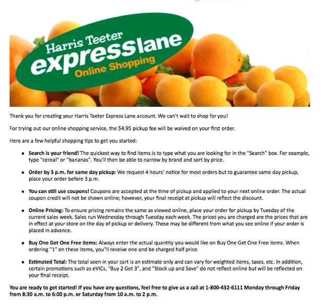
harris teeterThe strategy: Sending a welcome email is standard protocol almost any time someone signs up for an account on your website or app. However, this message from grocery store chain Harris Teeter goes a couple of extra steps beyond extending the typical thank-you for registering.

First, it offers a discount on the service fee, providing an extra kick-in-the-pants incentive for new account holders to seize the day and place their first order.

Second, it takes advantage of this inbox inroads to remind customers of the benefits of their personal online shopping service and offer a few helpful hints for getting started, thereby reinforcing the sales messages that prompted the user to sign up for an account in the first place.

Soap: Come back
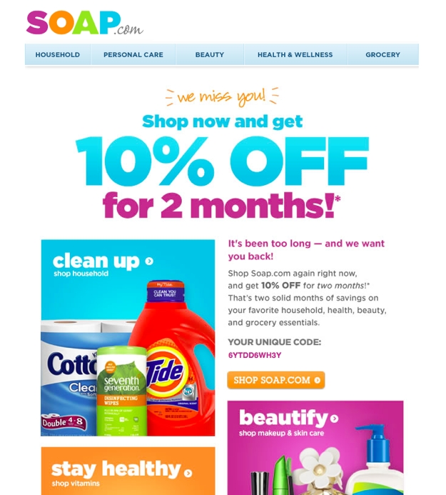
soap come back

The strategy: In most relationships between customers and brands, there comes a time when the customer begins to drift away, whether because another competitor has caught their eye or because any of life’s myriad responsibilities and distractions have bumped their need for your products or services down in their list of priorities.

If it’s been a while since a customer last visited your site or made a purchase, it’s time to reach out and give them a gentle reminder that you’re still here for them, which is exactly the objective behind this message from Soap.com. Their approach is particularly effective because it is not just a one-time offer that might entice a customer back only to lose them again after making one purchase in order to reap the benefit of the discount. Rather, the offer code is good for every purchase made for two months, a smart sales strategy aimed at coaxing the customer back into becoming a habitual Soap shopper.

Williams-Sonoma: Abandoned cart
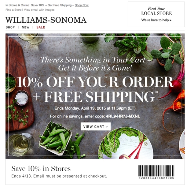
williams sonoma abandoned cart

The strategy: Another staple of e-commerce email marketing is the abandoned cart reminder. While this strategy is not earthshakingly innovative, it is nevertheless effective.

Williams-Sonoma takes this approach to the next level by including a unique discount code that provides a strong incentive for the customer to return to the site – or the store – to complete their purchase. The code is valid for less than 24 hours, creating a sense of urgency to take advantage of the deal.

One caveat to this approach: You shouldn’t always include a discount offer in your abandoned cart reminder email, or you’ll run the risk of training your customers to put their desired items into the cart and then wait patiently for your message to arrive before checking out with their discount code. Rather, mix up your pitches and include a discount code in some messages but not all. Below is an example of a follow-up email from Williams-Sonoma that does not rely on a special offer to create an urgency to act but rather a mention of limited quantities and a reminder that the previously selected items will soon be cleared from the cart.
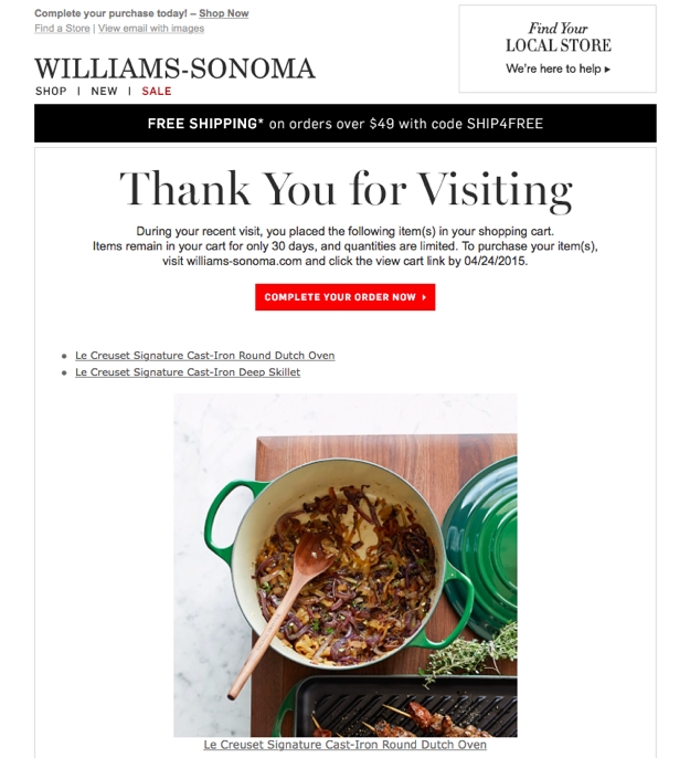
williams sonoma abandoned cart second

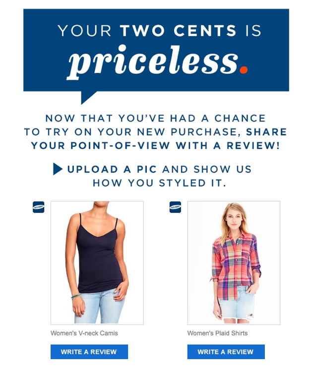
Old Navy: Product review

old navy reviewThe strategy: If you’ve ever purchased something online, you’ve undoubtedly received one of these emails. Again, the reason they’re so popular is that they’re so effective.

Reaching out to someone who has already made a purchase from you to ask them to share their opinion about the product or services they received is a winning approach all the way around. The simple act of making the request conveys to your customer that you’re a brand that cares about your customers and their satisfaction. Moreover, when they click through to provide their review, you’re getting the benefit of a first-hand testimonial that will help you sell that product to future customers. You’ve also successfully brought an existing customer back to your site, where hopefully something new will catch their eye, leading to a purchase that will begin the cycle all over again.

Grovemade: Survey
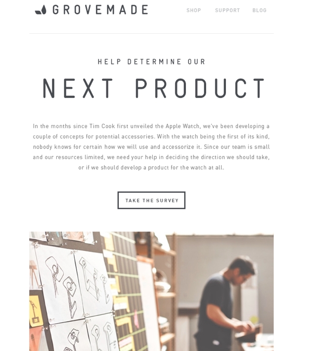
grovemade

The strategy: The survey request is another sure-fire winner. Similar to the product review prompt, the survey request conveys to the recipient that their needs and opinions are valued.

In this example from Grovemade, customers who have previously purchased a related product are sent a link to a survey to provide input to the company on the design of accessories for the new Apple Watch. This accomplishes two smart marketing objectives. First, it gives the company valuable insights to shape their new product line so that it delivers exactly what their customers want. Second, it creates anticipation among their customer base for an upcoming line of products even while they are still in the R&D phase.

Nike: Celebrate a milestone
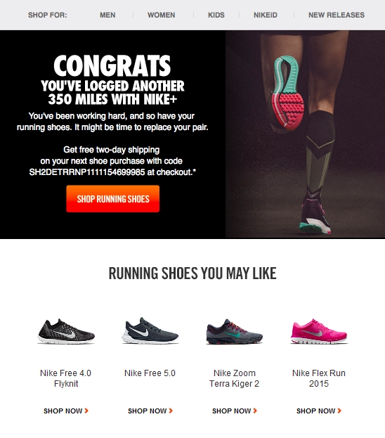
nike milestoneThe strategy: If you have a website or app that tracks customer activity, you likely have data that will allow you to recognize your customer for reaching a milestone, whether it’s a birthday, the anniversary of their becoming your customer or even a personal accomplishment based on activity logged via the site or app.

This example from Nike is a great case-study in how to make this particular approach work for you. In the email, Nike puts the recipient front and center by keeping acknowledgment of their achievement the primary focus. As a secondary message, Nike includes a “reward” for reaching this milestone in the form of a discount on Nike running shoes. While this is obviously a bit self-serving on Nike’s part, it’s also a great way to foster customer loyalty by providing an incentive to buy at a time when the recipient is most likely to be in need of their product.

The proof is in the results

Market research shows that behavior-triggered emails are a valuable but underused tactic. EmailMonks reports that open rates for triggered emails are 152% higher than those for traditional email marketing messages. Even so, over 75% of marketers are not yet using behavior-triggered emails or auto-responders.

A word of caution

Before you go all-in on behavior-triggered emails, take a moment to consider how your correspondence will come across to the recipient.

Online privacy is a hot-button issue these days. Just because you can capture and use data about your customers doesn’t necessarily mean that you should. The last thing you want to do is alienate a prospect or customer because you are blatantly tracking their activities without their consent. The best approach is to apply the principles of trustcasting and allow your customers to opt in to receiving your messages and to tell you what types of communication they’d like to get. The simple courtesy of obtaining permission can make all the difference between being perceived as a helpful partner or an obtrusive snoop.

Also, as with any email marketing strategy, make sure you don’t wear out your welcome in your customers’ inboxes. Use good sense and restraint in the timing and frequency of your emails. For example, if I browse your e-commerce store, don’t make a purchase, get an email, browse again but still don’t commit, are you going to send me another reminder that I still have items in my cart? These are the kinds of rules and parameters  that you’ll need to establish judiciously for your campaign in order to walk the fine line between smart marketer and pushy salesperson.

Getting started

If you’re not so sure about diving in without your water wings, there are tools that specialize in sending triggered emails, like Vero for e-commerce, Intercom for B2B and SparkPage for B2C campaigns. If email marketing is one of the primary vehicles you rely on to win and retain customers, then it may be worthwhile for you to partner with an experienced software development company to design a customized system that integrates with your website and your CRM and SFA systems to effectively capture and leverage the customer data you need to create the most powerful conversion engine possible.

Setting up an automated behavior-triggered email program does require an investment of time and tactical thinking upfront, but once it’s implemented, your company will reap the benefits of having a razor-sharp communication strategy that resonates with your customers by providing timely information that caters to their interests, preferences and habits.


April 2014
By Jeremy Girard

Mythbusters: Website Edition

Are these myths and misconceptions of website design undermining the quality of the user experience on your site?
Read the article

Mythbusters: Website Edition

keyboard As a web designer, I routinely speak with business owners and marketing managers who are in the midst of a website redesign project for their company. During these conversations, I am always amazed by the myths about user experience and interface design that they mistakenly cling to. Many of these misconceptions are the by-product of previous website projects – leftover relics from an Internet of old. Others are more baffling, as their tenets are not now and never were true. So in the interest of championing the best practices and principles of modern website design, we’re channeling our inner myth busters and blowing the lid off five of these most persistent myths (dramatic explosions not included):

Myth #1: Visitors need/want instructions on how to use your site.

The Internet is no longer a new and unfamiliar medium, yet many companies still populate their websites with content that seems targeted to someone who has never actually navigated the Web before. When you include instructions for visitors about how to use to your website, you are adding a lot of extra words, which in most cases only serve to weigh down your pages with unnecessary visual clutter. In fact, the goal of any good design is to create an interface that is so intuitive that no instruction or explanation is necessary to help visitors move from one page to the next and complete routine processes such as making a purchase or signing up for an account. As a result, if you feel instructions are necessary, that inclination is a major red flag for serious design flaws that must be addressed in order to provide a quality experience for your user. To be fair, there are certainly instances where some level of guidance is needed. Complex interactions or applications that are truly unlike anything that has come before on the Web will require some level of training for your users, but the vast majority of websites do not fall into this category. If your site is, well, just a website (and there’s nothing wrong with that!), forego the instructions and have faith that your users are savvy enough to know and understand the well-established conventions of using the Internet.

Myth #2: These days, everyone has a high bandwidth connection.

Over the last few years, the average size of a webpage has doubled, largely due to our profuse use of images. Current design trends that call for giant, page-spanning photographs combined with the drive to deliver high-resolution images for retina displays mean that the file size of the images we are using continues to climb. Many people argue that this is acceptable because, as the size of our webpages grow, so does the bandwidth speed of our Internet connections. But is this really the case? It is true that the number of people with access to high bandwidth connections continues to increase, but the belief that all visitors have the benefit of a lightning-fast connection is nothing more than wishful thinking. There are still many areas of the country and the world that are shackled to the type of slower connections that are only a distant memory for many of us. Also, keep in mind as well that mobile visitors may be operating on a network that is either unreliable or has data download limits. In both of these instances, a website that is bloated with large content (i.e., giant videos, unoptimized images, etc.) will pose a problem. Ensuring that your website is optimized for performance is as important today as it has ever been, regardless of how fast connection speeds may be. After all, no one has ever said, “Wow, this website loaded TOO quickly for me!” Better performance and faster downloads improve the quality of experience for all users.

Myth #3: There may be some users visiting your site on a mobile device, but not that many.

Years ago – when the iPhone was still a novelty and everyone and their 12-year-old brother didn’t walk around with a smartphone in their pocket – this may have been the case. But today, visitors are accessing your website on a wide variety of devices with a range of different screen sizes. Examining the hundreds of websites that we manage reveals that an average of 30 percent of all traffic to those sites comes from mobile devices of one kind or another, and for some, it’s as high as 50 percent or more. This is consistent with the forecasts of industry analysts, who predict that by 2015 – that’s next year, folks! – the majority of all Web traffic will come from mobile devices. Additionally, not only are visitors accessing your site on mobile devices, but the same visitor is likely using multiple devices to access your content. We call this the “muti-device user”. As we covered previously in our article “Website Design for a Multi-Device World”: The multi-device world is populated by multi-device users. While a staggering variety of devices are, indeed, being used to access web content today, it’s also important to remember that the same user is often using multiple different devices to access your website – and they expect that site to work well regardless of which device they happen to be using at the time. Gone are the days of “mobile users” coming to your site only to locate your phone number or directions to your office. Today’s mobile users – and multi-device users – expect convenient, on-demand access to the same content that they can find on the desktop version of the site. Clinging to an outdated belief that “no one has a reason to visit my website on a mobile device” will quickly translate to “no one has a reason at all to visit my website at all.” Read more: Website Design for a Multi-Device World

Myth #4: You should open off-site links in a new tab/window.

This is the most common myth that I hear from clients, who insist that all links that lead to another site must open in a new tab or window. This request stems from a belief that if a visitor leaves your website to look at content somewhere else on the Web, they will never find their way back. By opening that link into a new tab, your website remains open in the user’s browser for them to return to at any time. Or at least, that’s how it works in theory. Unfortunately, I have seen this practice backfire on a number of occasions. Why would this be the case? Think of the Web as a linear experience. You move from one page to another and another. You can travel seamlessly to and from any point along  this timeline by using the browser’s back and forward buttons. But when you open a link in a new tab, you start a new timeline for the user. Having observed many website users over the years, I can tell you that the back button is a feature that they are intimately familiar with. If that user clicks a link and visits a new page, and they then want to return to your site, they will intuitively click the back button until they get there. However, if you’ve opened the off-site link in a new tab or window, then the back button eventually leads to a dead-end for that visitor. Your site, which they want to return to, is not part of their current timeline because it is open in a completely separate tab. Of course, all the user needs to do is close the current tab, and your site will be in front of them again, but I’ve seen many visitors who are unaware of or confused by this. Instead, when the linear experience of the back button doesn’t bring them to your site as they expected, they instead type your website’s URL into the browser’s address bar, thinking that something went wrong along the way. They now have two instances of your website open, so in your efforts to “help” them easily get back to your site, you’ve actually confused the user experience. Does this mean you should never open links in a new tab or window? No, it doesn’t. For example, it’s a good practice to open PDF files in a new tab because these documents feel like they are separate from the linear experience of browsing a site. Additionally, opening links in new tabs is not “wrong,” per se. It is an acceptable solution, but if you choose to use that approach, do so for a reason other than the mistaken belief that if visitors leave your site, they will never find their way back. The linear experience of web browsing – and using the back button to return to a webpage – is a well-understood convention, so don’t be afraid to let your visitors explore in the manner that is most natural to them.

Myth #5: Visitors absolutely will/absolutely will not complete a form.

The final myth we will debunk concerns web forms. Interestingly, I hear competing opinions from clients regarding forms on their websites. Some believe that visitors will not fill out a form no matter what. Others think that their users will gladly complete a lengthy questionnaire for almost no reason at all. As usual, the truth lies somewhere in the middle of these two extremes. Gathering information from website visitors is a valuable exercise. It allows you to understand who is coming to your site so you can follow up with them, engage with them and hopefully convert them into paying customers for your business. Just asking for visitor’s information is not enough, however. Very few people will be willing to complete a form unless they have a clear understanding of what they will receive in return – and what they receive needs to be of greater value to them than receiving more marketing from you. This value can come any number of different ways, such as receiving a free whitepaper or application download or registering for an event or webinar. In each of these cases, there is a legitimate reason for your site visitors to complete a form that gives you their personal information. If, however, your form simply says, “Sign up for updates!” without any further information about what those updates entail, how frequent they will be delivered or what potential value they hold, then there is a slim chance anyone will be inclined to complete that form. Creating a valuable offer is step one. Step two is the design of the form itself. Asking for too much information will be a roadblock for many visitors, who will either perceive a form with a large number of fields as being too cumbersome or too intrusive to complete, so the best course of action is to ask for only the information you need. If you never intend to call someone, then don’t ask for their phone number because that’s one less obstacle you’ll have to overcome. The more concise and easy your form is to complete, the more likely your visitors will do so. Website visitors will fill in forms, as long as you make those forms easy to complete and provide value to them in exchange for sharing their information with you.

R.I.P. myths and misconceptions

The Web and the behavior of its users are constantly evolving. Since the last time you engaged in a website redesign project, there have undoubtedly been a number of shifts in trends and tendencies, and what you learned through that experience even just two or three years ago may not be applicable today. Because of this ever-changing landscape, the importance of working with web development firm that keeps pace with these changes and the best practices of modern website design cannot be understated. Such a partnership will ensure that the decisions driving the the design of your site are relevant to today’s Web and are not relics of a time gone by.