8 Keys to a Lead-Catching LinkedIn Company Page
May 2013
By Jason Ferster
Given the mind-boggling speed of all things social media, it's easy to lose perspective on the passage of time. So try not to choke on your chai latte when you read these words: LinkedIn is now officially a decade old.
Yep. It launched in May of 2003 – when Mark Zuckerberg was still an unknown Harvard freshman. Facebook's predecessor MySpace, now having its midlife crisis and hanging out with rock stars, hadn't even been born. And Twitter was three or four years from hatching.
While logic would suggest that businesses would be the earliest adopters of any platform that’s founded on the concept of virtual networking, LinkedIn has been sluggish in giving brands a seat at the community table.
In the latter half of the 2000s, Facebook and Twitter quickly adapted for business users as marketers chased customers into those exploding communities. LinkedIn, however, didn't even allow companies the ability to post status updates until late 2011.
But in the last year and a half, LinkedIn's evolution has picked up the pace, and newly redesigned Company Pages were rolled out in September 2012, giving brands the ability to market products, recruit new talent and engage more directly with the greater community than ever before.
So if you've passed on LinkedIn to focus on Facebook, Twitter and Pinterest, now is the time to grow your presence on the network built for business. Here's what you need to know to build a killer LinkedIn Company Page that will capture new eyes and convert new leads:
1. Getting started
If you have employees on LinkedIn, you likely have a Company Page already. LinkedIn creates them automatically via data from a third-party service – probably Dun & Bradstreet, though it's difficult to tell. But be warned. If you have one of these robo-profiles, it's little more than a short description, some contact details and a link to your website, so you'd better take control.
The first step is to establish an admin (or several) with editing privileges. These individuals need to meet LinkedIn's basic requirements, which in summary are:
- They must be a current employee.
- They need a company email listed on their LinkedIn profile.
- The company's email domain must be unique (e.g., jdoe@example.com), Sorry, Gmail won't work.
- They must have filled out their personal profile to a reasonable extent.
- They must have some connections.
If for some reason, you don't have a Company Page, the setup process is pretty straightforward after meeting the above admin requirements. Here's how according to LinkedIn.
Click Companies near the top of your home page.
Click the Add a Company link in the upper right area of the page.
Enter your company's official name and your work email address.
Click Continue and enter your company information.
If the work email address you provide is an unconfirmed email address on your LinkedIn account, a message will be sent to that address. Follow the instructions in the message to confirm your email address and then use the instructions above to add the Company Page.
A red error message may appear if you have problems adding a Company Page.
A preview of your completed Company Page is not available. When you publish the page, it is live on our website.
2. Look like you mean business
Once you've moved in, it's time to hang your open-for-business shingle on the door.
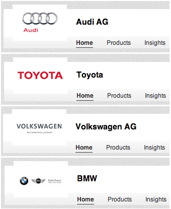
First, upload a company logo. For now, logo size is severely limited and the display quality is poor. It seems that LinkedIn is downsampling logos – removing pixels, and therefore sharpness – to save file space and speed page loads. So focus on keeping logos simple and legible at small scale. For example, compare the readability of the first two automotive logos below with the latter two.
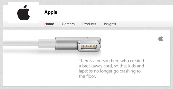
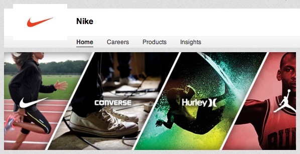
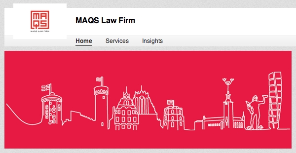
Next to your logo, the banner image on your home page is your primary way to distinguish your brand visually. It's an at-a-glance way to say something about your company, and that expression can take any form you like.
Apple's banner conveys in both layout and message the brand's commitment to minimalist, functional design.
Nike, with its global corporate footprint, had a lot of ground to cover to represent its extensive brand portfolio in such a small space.
MAQS Law Firm is described as "a modern law firm combining professionalism and tradition with creativity and efficiency." Their logo/banner combination definitely says "creativity and efficiency" with a look that's more design firm that law firm.
3. Give 'em something to talk about
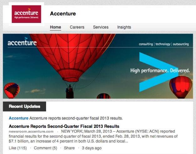
Like Facebook, Twitter and most other social sites, the front-and-center feature of your Company Page is an update feed.
It's worth noting, however, that its functionality is little more than broadcast medium, like the news page of your website. As a company, you won't be able to reply to comments or "like" another LinkedIn user's updates. That kind of give-and-take engagement is reserved for real people, like your employees.
So with this limitation in mind, focus your updates on topics that seed conversations and get shared across the LinkedIn community. Post news about your organization or links, with commentary, to interesting content around the Web.
Utilize colleagues to engage further with followers and commenters. Employees are also a great way to syndicate your updates as they share content with personal networks.
Unfortunately, creating engagement this way is like attending a networking event with your hands tied behind your back – it's kinda tricky and what you say had better be really good.
4. Promote your products and services
Nowhere do Company Pages offer more flexibility or marketing power as in the Products & Services tab.
A dozen parameters are available for describing and promoting each product or service in your portfolio. There are basics like description, title and links as well as the ability to identify key contacts, a sidebar area for special promotions and one for YouTube video embeds.
In addition, a header image slider drives visitor traffic to specific services listed below or to external-pointing links, back to your website for example. (This is a great way to build inbound links for you SEO-ers out there.)
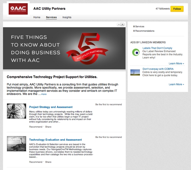
To get started, provide a short description of each product or service along with a thumbnail image and link to your website. Believe it or not, this will put you ahead of many of the organizations using LinkedIn Company Pages today.
Once you've got the basics in place, slider images, videos and promotions can turn your Products & Services page into a compelling sales lead tool.
5. Audience segmentation
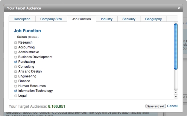
LinkedIn has built into the Products & Services tab powerful audience segmentation filters that allow you tailor your Products tab to different types of visitors. These filtering options are mapped to data from member profiles, such as company size, job function, industry, seniority level and geography.
6. Promote your groups
If your organization manages one or more LinkedIn groups, be sure to promote them on your Company Page.
If not, groups are a great way to build out your corporate LinkedIn presence and drive engagement with customers or those in your industry. When creating a group, try to focus on a topic or industry niche that lets you position your brand as an authority or that serves users in a way that’s unique to your brand.
For example, a private user group exclusive to your customers would let you gather insights for product development, provide another customer service channel and directly address criticism within a relatively closed environment and in front of your other customers.
Whatever group you run or may eventually run, be sure to let people know about it on your Company Page.
7. Analytics
Built into Company Pages are some pretty handy analytics tools, which LinkedIn refers to as "Insights."
Accessed via the blue "Tools" button in the header of your Company Page, Insights provide a straightforward view into how users are engaging with your brand, including:
- Page views broken down by Company Page tabs
- Update engagement by impressions, clicks, likes and shares
- Visitor demographics by seniority level, industry, job function, geographic region and company size
- Follower identification and demographics, broken down by seniority level, industry, job function, geographic region and company size
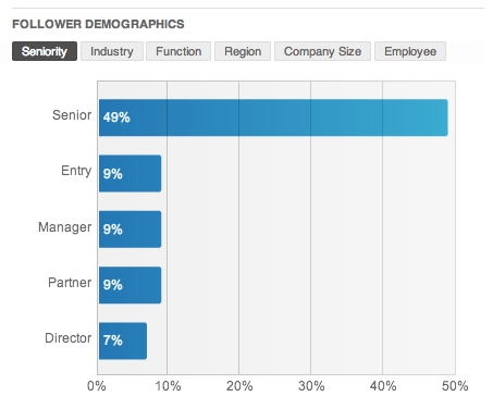
If you're familiar with professional analytics tools, LinkedIn's Insights will seem pretty light. But because they are built on user data behind LinkedIn's membership wall, Insights provide detail about your company's LinkedIn engagement that other analytics suites cannot. Ignore Insights at your own peril.
8. A word on Career Pages
If you see a Careers tab on an organization's Company Page, it's because that business is using LinkedIn's paid Talent Solutions services.
Talent Solutions offer powerful recruiting tools that, like audience segmentation, utilize LinkedIn's vast user data to drive more qualified candidates into HR departments. More than half of LinkedIn's revenues come from Talent Solutions, so it makes sense that the social giant would invest heavily in this tool.
If your organization is paying for Talent Solutions, make sure your careers tab keeps those recruiting leads excited about the possibility of working for you. The features are too extensive to cover here, but that's okay. For the price tag of Talent Solutions, you should have access to someone at LinkedIn who can help get you started.
For some Careers Page inspiration, look to companies that are widely known as great places to work. Here are a few to get you started:
Starbucks Careers Page
Zappos Careers Page
Google Careers Page
Inspiration to go
Now that you know what goes into a killer Company Page on LinkedIn, all that's left is to go build your own.
We've avoided specific step-by-step instructions in this article because they are subject to change as features are added or updated. But don't worry. LinkedIn provides guidance notes within the editing areas of Company Pages as well as an extensive help center with setup guides, FAQs, user forums and more.
Still, sometimes there's nothing like seeing it all in action, so I'll leave you with this 90-second snapshot of LinkedIn Company Pages. And don't forget to follow Fame Foundry on LinkedIn for additional digital marketing insights and news.
By day, Jason Ferster is the marketing manager of an IT consulting firm, where he contends daily with the marketing challenges common to small and mid-sized businesses. By nights and weekends, he writes about insights gained from those experiences. Visit FersterFiles.com for more or connect with Jason on Twitter.