We are the digital agency
crafting brand experiences
for the modern audience.
We are Fame Foundry.

See our work. Read the Fame Foundry magazine.

We love our clients.

Fame Foundry seeks out bold brands that wish to engage their public in sincere, evocative ways.


WorkWeb DesignSportsEvents

Platforms for racing in the 21st century.

Fame Foundry puts the racing experience in front of millions of fans, steering motorsports to the modern age.

“Fame Foundry created something never seen before, allowing members to interact in new ways and providing them a central location to call their own. It also provides more value to our sponsors than we have ever had before.”

—Ryan Newman

Technology on the track.

Providing more than just web software, our management systems enhance and reinforce a variety of services by different racing organizations which work to evolve the speed, efficiency, and safety measures, aiding their process from lab to checkered flag.

WorkWeb DesignRetail

Setting the pace across 44 states.

With over 1100 locations, thousands of products, and millions of transactions, Shoe Show creates a substantial retail footprint in shoe sales.

The sole of superior choice.

With over 1100 locations, thousands of products, and millions of transactions, Shoe Show creates a substantial retail footprint in shoe sales.

WorkWeb DesignRetail

The contemporary online pharmacy.

Medichest sets a new standard, bringing the boutique experience to the drug store.

Integrated & Automated Marketing System

All the extensive opportunities for public engagement are made easily definable and effortlessly automated.

Scheduled promotions, sales, and campaigns, all precisely targeted for specific demographics within the whole of the Medichest audience.

WorkWeb DesignSocial

Home Design & Decor Magazine offers readers superior content on designer home trends on any device.


  • By selectively curating the very best from their individual markets, each localized catalog comes to exhibit the trending, pertinent visual flavors specific to each region.


  • Beside the swaths of inspirational home photography spreads, Home Design & Decor provides exhaustive articles and advice by proven professionals in home design.


  • The art of home ingenuity always dances between the timeless and the experimental. The very best in these intersecting principles offer consistent sources of modern innovation.

WorkWeb DesignSocial

  • Post a need on behalf of yourself, a family member or your community group, whether you need volunteers or funds to support your cause.


  • Search by location, expertise and date, and connect with people in your very own community who need your time and talents.


  • Start your own Neighborhood or Group Page and create a virtual hub where you can connect and converse about the things that matter most to you.

June 2021
Noted By Joe Bauldoff

The Making and Maintenance of our Open Source Infrastructure

In this video, Nadia Eghbal, author of “Working in Public”, discusses the potential of open source developer communities, and looks for ways to reframe the significance of software stewardship in light of how the march of time constantly and inevitably works to pull these valuable resources back into entropy and obsolescence. Presented by the Long Now Foundation.
Watch on YouTube

515 Break away from the brochure on glass

Design your website to serve the needs of your community first and foremost, and you'll reap rich rewards of long-term engagement.

March 2021
Noted By Joe Bauldoff

The Case for Object-Centered Sociality

In what might be the inceptive, albeit older article on the subject, Finnish entrepreneur and sociologist, Jyri Engeström, introduces the theory of object-centered sociality: how “objects of affinity” are what truly bring people to connect. What lies between the lines here, however, is a budding perspective regarding how organizations might better propagate their ideas by shaping them as or attaching them to attractive, memorable social objects.
Read the Article

February 2021
Noted By Joe Bauldoff

Has the Pandemic Transformed the Office Forever?

In what feels like the universe's own swinging the pendulum back from the trend of the open floor plan, the corporate world has been forced to use the COVID-19 pandemic as opportunity for workspace experimentation, perhaps in ways that will outlast any stay-at-home order.
Read the Article

November 2011
By Kendra Gaines

Cashing In: 5 Ways to Optimize Your Website's Conversion Rate

Traffic doesn’t mean a thing if the cash register doesn’t ring.
Read the article

Cashing In: 5 Ways to Optimize Your Website's Conversion Rate

Got a website? Check. Strong traffic numbers? Check. Think you’ve got this online marketing thing licked? Think again. It doesn’t matter how many people are coming to your site if they aren’t taking action once they get there. If you want to make those traffic numbers count, you must find a way to convert visitors into customers. Some people would have you believe that all it takes is a nice website and a great product, and you’ll have customers beating down your doors. By this mode of thinking, if your sales are lackluster, it’s most likely an indication that something is wrong with your products, so you work day and night tweaking and tinkering your offering to give the people what you think they want. In reality, it’s more likely that you’ve overlooked some key elements in the design of your website, and now it’s costing you. If your website is performing well in traffic numbers but lacking in sales, it’s time to re-evaluate your site. Here are five key elements to examine and improve to ensure that you’re maximizing your opportunities to capture customers online:

1. Tell them where to go and what to do.

It’s a fact as simple as it is true: when you have a product or service to sell, you want to make sure people know exactly how to buy that product or service. There’s no point in saying you offer consulting services unless you provide a straightforward path to contact and hire you. There’s no point in displaying a product when there’s no immediately visible way to purchase it. Make sure you present a call to action that is obvious and direct. firefox Look at your website through the eyes of the most technologically challenged user – one who has no clue how to navigate through a website or purchase something online. At every step of the way, do you provide the easiest and most direct route from Point A to Point B so that they can progress intuitively through your site? If you have a picture of a product, is there a call to action next to it? Remember, too, that a call to action is not a wordy description that says “Hey, this item is on sale like many others, so look at them all blah blah blah.” It’s a concise statement of action – usually in the form of a button or link – that prompts the user to take the next step. Maybe you want them to “buy now” or maybe you want them to “learn more.” Whatever the next logical step might be, it must be clearly stated. Attention spans on the Web are short; if your site is lacking calls to action, chances are good that you’re losing many conversions to the ever-present element of distraction.

2. Put the kibosh on clutter.

The universal rule of the Web is that less is more. cheesemonger Clutter comes in many forms – too many pictures, too much copy, too many buttons and links. Whatever is clogging up your site, get rid of it immediately. In order to determine what should stay and what should go, you must identify the primary goal of your website and make sure everything is geared toward that one singular objective. If your site exists to sell your products, then sell on every page. Even on your “About” page, your customer cares less about where you went to school and more about how your products came to be. You need a clear message – one that’s easy to understand and easy to share. Don’t stuff every last thing you do down someone’s throat and expect them to make a decision. Give them choices, but don’t make them think too much. You’ll only confuse your visitors, and a confused visitor is not going to stick around and figure it out; they’ll just go elsewhere instead.

3. Focus on feelings, not features.

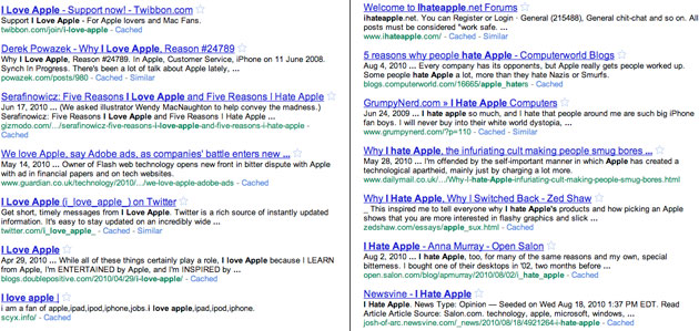
It’s always difficult to fight the temptation to cover every single aspect and feature of your product or service in painstaking detail in order to make sure that visitors have all the information they could possibly need to make a decision. Sometimes this works, but more often than not, it doesn’t. Why? Because people don’t really spend their money on the products that have the most bells and whistles; they spend their money on what makes them feel good on the inside. They buy things they believe will make them a better person or make their lives easier or solve a problem they face every day. People don’t purchase iPods because they like the device itself; they purchase iPods because doing so makes them feel like part of a greater tribe of iPod (and, by extension, Apple) enthusiasts. Features are really only a secondary consideration. ipod In trying to convert potential customers, your most important job is to convey how you can fulfill their deeper needs. Figure out how your products or services connect with people on an emotional level, bottle up that feeling and build your website around it.

4. Don’t ask for too much.

Don’t you hate when you walk into a clothing store and an associate follows you around constantly pestering you with questions? Doesn’t it irk you when you’re ready to check out and they ask you to sign up for their store credit card and their rewards card and to give them your email address so they can put you on their mailing list? Don’t make the same mistakes online. It’s critically important to provide a user experience that makes your visitors feel at ease. Avoid using pop-ups and other disruptive elements that create hassles during the shopping process. And when it’s time to check out, just let them check out. Don’t require them to create an account, don’t make them answer a laundry list of questions about their purchase and don’t make them give you a bunch of personal information. In short, don’t make your customers jump through hoops to spend money with you. If you try to get more information out of your customers than you actually need to process their order, you’ll raise red flags of mistrust. They’ll immediately recognize your game, and they’ll likely jump ship mid-transaction in order to avoid being bombarded with future marketing. In reality, all you need to be able to continue your relationship with that customer is an email address and permission to send them updates from time to time.

5. Be creative within reason.

Of course you want your website to be memorable. You want visitors to be wowed by its design. You want a unique look and feel that sets your company apart from your competitors. All of these are valid goals as long as you keep the level of creativity within reason. melbournefoodandwine Don’t try to reinvent the wheel in an attempt to be remembered for originality and innovation. If your site deviates too far from familiar conventions, you’ll end up alienating a lot of potential customers because they’ll have no idea how to get around and find what they need. Be creative, but don’t overdo it. After all, less is more.
October 2009
By The Creator

8 Fame Foundry iPhone Wallpapers

Fame Foundry presents 8 beautiful wallpapers for your iPhone.
Read the article

8 Fame Foundry iPhone Wallpapers

Camo

Fame Foundry Camo

Metal Door

Fame Foundry Metal Door

Bling

Fame Foundry Bling

Stripes

Fame Foundry Stripes

Circuit Board

Fame Foundry Circuit Board

Seizure

Fame Foundry Seizure

Stencil

Fame Foundry Stencil

Halloween

Fame Foundry Halloween