We are the digital agency
crafting brand experiences
for the modern audience.
We are Fame Foundry.

See our work. Read the Fame Foundry magazine.

We love our clients.

Fame Foundry seeks out bold brands that wish to engage their public in sincere, evocative ways.


WorkWeb DesignSportsEvents

Platforms for racing in the 21st century.

Fame Foundry puts the racing experience in front of millions of fans, steering motorsports to the modern age.

“Fame Foundry created something never seen before, allowing members to interact in new ways and providing them a central location to call their own. It also provides more value to our sponsors than we have ever had before.”

—Ryan Newman

Technology on the track.

Providing more than just web software, our management systems enhance and reinforce a variety of services by different racing organizations which work to evolve the speed, efficiency, and safety measures, aiding their process from lab to checkered flag.

WorkWeb DesignRetail

Setting the pace across 44 states.

With over 1100 locations, thousands of products, and millions of transactions, Shoe Show creates a substantial retail footprint in shoe sales.

The sole of superior choice.

With over 1100 locations, thousands of products, and millions of transactions, Shoe Show creates a substantial retail footprint in shoe sales.

WorkWeb DesignRetail

The contemporary online pharmacy.

Medichest sets a new standard, bringing the boutique experience to the drug store.

Integrated & Automated Marketing System

All the extensive opportunities for public engagement are made easily definable and effortlessly automated.

Scheduled promotions, sales, and campaigns, all precisely targeted for specific demographics within the whole of the Medichest audience.

WorkWeb DesignSocial

Home Design & Decor Magazine offers readers superior content on designer home trends on any device.


  • By selectively curating the very best from their individual markets, each localized catalog comes to exhibit the trending, pertinent visual flavors specific to each region.


  • Beside the swaths of inspirational home photography spreads, Home Design & Decor provides exhaustive articles and advice by proven professionals in home design.


  • The art of home ingenuity always dances between the timeless and the experimental. The very best in these intersecting principles offer consistent sources of modern innovation.

WorkWeb DesignSocial

  • Post a need on behalf of yourself, a family member or your community group, whether you need volunteers or funds to support your cause.


  • Search by location, expertise and date, and connect with people in your very own community who need your time and talents.


  • Start your own Neighborhood or Group Page and create a virtual hub where you can connect and converse about the things that matter most to you.

775 Boost email open rates by 152 percent

Use your customers’ behavior to your advantage.

414 Marketing Minute Rewind: From inbox to in-store

As our countdown of the top five episodes of the past quarter continues, we've got helpful tips and tricks for using email marketing to lure customers away from their keyboards and into your store.

774 Feelings are viral

Feelings are the key to fueling likes, comments and shares.

June 2021
Noted By Joe Bauldoff

The Making and Maintenance of our Open Source Infrastructure

In this video, Nadia Eghbal, author of “Working in Public”, discusses the potential of open source developer communities, and looks for ways to reframe the significance of software stewardship in light of how the march of time constantly and inevitably works to pull these valuable resources back into entropy and obsolescence. Presented by the Long Now Foundation.
Watch on YouTube

April 2013
By Jeremy Girard

3 Simple Rules for Navigation That Will Boost Your Website's Performance

Lead the way to sales by following the three Cs of effective navigational structure – be concise, be clear and be consistent.
Read the article

3 Simple Rules for Navigation That Will Boost Your Website's Performance

navigation-article At the outset of every new website design project, I ask clients to list a few adjectives that would describe their ideal new site. Inevitably, “easy to use” is almost always at the top of the list. Naturally, no one wants their website to be difficult to use. After all, in today’s era of unlimited choice, a great user experience is an absolute necessity. You work too hard to attract visitors and prospects to your website only to drive them away because that site’s interface presents them with frustrations and challenges. In that vein, the ease with which visitors can navigate through your website and its content will have a significant impact on the success of your site. If users can’t quickly identify how to accomplish their goals – whether it’s obtaining more information or making a purchase – they are likely to make a quick exit, taking their business with them. It’s up to your site’s navigational structure to do the heavy lifting in supporting their objectives and answering their questions, guiding them through the site to find what they need and complete the actions appropriate to those needs. This could be purchasing an item, filling out a membership or information request form, or simply finding your phone number so they can call you and open the lines of communication with your business. Regardless of your site’s “win,” an intuitive navigation structure is what will lead them there, so make sure your website follows these three Cs of good navigation in order to ensure that you make the most of every opportunity to capture and convert new customers.

1. Be concise.

In his book The Laws of Simplicity, renowned designer and current President of the Rhode Island School of Design John Maeda offers the following advice as part of his First Law of Simplicity: “The simplest way to achieve simplicity is through thoughtful reduction.” When weighing various options, the fewer choices that are available, the easier the decision process becomes. Give me four items to choose from, and I will be able to select one much more quickly than if you present me with eight. The same principle holds true for website navigation. Presenting your audience with fewer choices will allow them to more easily identify the one that pertains to their specific needs. Considering how impatient typical website visitors are, this can have a very positive impact on your site’s user experience. Look again at John Maeda’s quote, and you will notice that he is not an advocate for arbitrary editing but rather “thoughtful reduction.” Paring down the elements of your website’s primary navigation structure from nine or 10 choices down to four or five is great, but you need to be strategic in how you do it. Start by looking at the pages outlined in your sitemap and deciding how they can be categorized or grouped together in order to reduce the number of topline options. One of my favorite examples of this practice is the common testimonials page. Businesses love to include a testimonials page on their websites, but based on traffic numbers, these are typically among the least visited pages on any site. Traffic numbers are the ultimate arbiters of value and importance. If your visitors aren’t accessing certain content, then that content shouldn’t be given the same prominence as those pages that they actively seek out and use. In the case of testimonials, removing that link from your primary navigation and establishing it as a subpage under your “Our Company” or “About Us” section works very well. The same applies to any pages that you have that are dedicated to company history, management team profiles, staff bios, your company’s mission statement and the like. While these items are valid information for someone who’s really digging in to vet your qualifications, the majority of your visitors will never look at them, so let them take a back seat to the content that’s really going to seal the deal. Of course, this is where the “thoughtful reduction” principle comes into play. While each of the examples above could be grouped together, that doesn’t mean it is the right choice for your site. The goal is to examine your sitemap with a critical eye and decide which elements are truly important to your audience, which ones are secondary, and how you can treat them accordingly to provide as few choices as possible within your site’s primary navigation.

2. Be clear.

Everyone wants their website to be unique. Sometimes, this leads to the temptation to try to reinvent the wheel when it comes to the organization and presentation of its navigational structure, whether that’s by replacing links with icons or coming up with clever names for major content areas. While this may sound like a great idea that will help set your site apart from your competitors’, it can easily backfire. Visitors want to make quick, logical choices as they navigate through your website, which means that the options presented to them need not only to be concise but also to be clear. The navigation on your website needs to conform to the expected conventions that your visitors instinctively know and recognize. This does not mean that your primary navigation should be designed to look like large, beveled buttons with faux‐3D effects. That treatment may make for an obvious “button,” but it is also not in keeping with the aesthetic of today’s Web. On the other hand, you don’t want buttons or links that are so subtle with so little contrast that they fade into the design to the point of becoming invisible. There is a happy medium to be achieved where all links can be obvious and attractive at the same time. Labels are also an important part of clear navigation. Having a navigation link labeled “About Our Company” directly conveys to users what they can expect to find on that page. Trying to be creative and instead name that link “Unlock the Magic” is anything but clear and will confuse and frustrate visitors who simply want to find more background information about your company. That’s not to say that exploring interesting and innovative avenues in the design of your website is always a bad thing. It can certainly help differentiate your site from others and make for a memorable experience. Just make sure that you are not sacrificing clarity for creativity and confusing the user experience in the process.

3. Be consistent.

The final rule of website navigation is consistency. If you’ve designed a clear, concise navigational structure that your visitors can quickly and easily understand and use, then it’s important to maintain that structure throughout the rest of your site. Your website is not a video game, where each level provides new challenges that are the purpose of the game itself. Your users do not wish to relearn how to use your site at every step along the way. They are there solely to obtain information or complete an action, and anything that gets in the way of their mission is reason enough for them to abandon your site. Consistency is about more than just your primary navigation, however. The way that submenus are presented on the interior pages of your site should remain the same from section to section as well, and the same holds true for treatment of text links or buttons. If you use a certain color for text links, consider using that same color for buttons. Users will quickly learn which color – red, for instance – denotes a clickable area, which will help them to continue moving through your site quickly and intuitively rather than being bogged down by simply trying to locate the pathways to their desired destination.

How does your site measure up?

While there are many factors that ultimately contribute to your website’s performance, a well‐designed navigational structure goes a long way toward ushering your visitors from point A (your home page) to point B (the point of conversion, whether that’s placing an order, sending you an email or picking up the phone to initiate conversation). Look at your site and evaluate its navigation based on the principles covered in this article.
  1. Is there anything you can do to make your navigational structure more concise through thoughtful reduction?
  2. Are there any changes you can make to make your navigation clearer to your audience?
  3. Are you consistent throughout your entire site with the way navigation is designed and presented?
Even if you are not ready to undertake a major site overhaul, you can still refine and tweak your existing site to improve its navigation and realize the rewards of presenting a better user experience to visitors that have found your website and are looking to do business with you.
February 2014
By Jeremy Girard

Five Seductive Pick-Up Lines That Leave Your Visitors Wanting More

Create a powerful first impression that grabs their attention, draws them in and keeps them coming back.
Read the article

Five Seductive Pick-Up Lines That Leave Your Visitors Wanting More

For many of your website’s visitors, the page that will greet them when they first arrive on the site is your homepage – and the section of your homepage that is likely to draw their attention upon arrival is the billboard.

Similar to roadside billboards that are meant to attract the attention of passing motorists and promote some company or service, homepage billboards are meant to grab the attention of a website visitor, welcome them to the site and convey some important message to them, and then send them forward to other content or actions within that site.

Take a look at just about any website today and you will see this “billboard” area. It is typically presented as a large, visually rich display that features striking imagery and/or powerful typography, important messages, and a subsequent call-to-action. Additionally, these messages can also be animated in some way to add an element of motion to the site and to allow you to use the billboard to display more than on message on your homepage.

While the purpose of the billboard is nearly identical on all websites, the way this section is executed varies from site to site. In this article, we will take a look at a few popular approaches to the website billboard.

1. Allow me to introduce myself.

Probably the most common billboard approach is what I call the “here’s who we are and what we do” technique. In these examples, the billboard message is all about your company.

Similar to an elevator pitch, this billboard approach quickly introduces your company and summarizes what you do. With attention spans online being as short as they are (many experts say that website visitors will scan a page and make a decision of what to do next, including leaving the site altogether, in as little as 3 seconds), this approach can be an effective way to get your message or value proposition across in a succinct fashion. If that message resonates with your visitors, you then have an opportunity to continue the conversation by driving them deeper into the website to learn more about what you have teased in the billboard message. You could provide links to read more about your services, products, or even just the company or organization itself.

A few examples of the “here’s who we are and what we do” method are below:

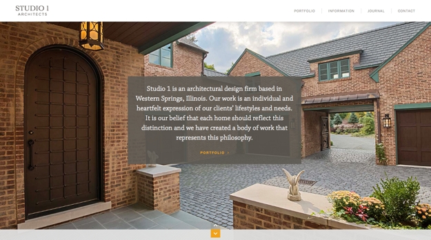
Studio1 Architects

This site uses very large images of the firm’s work (the images animate and multiple photos fade in and out over time), coupled with an opening message that explains what they do and a link to view their portfolio: http://studio1architects.com
Studio

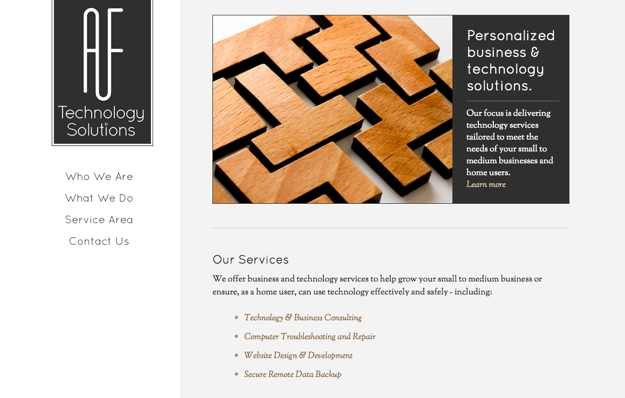
AF Technology Solutions

This site’s concise billboard message summarizes what the company does (business and technology solutions) and who their audience is (small to medium businesses) and includes a link to learn more about their services: http://af-techsolutions.com
AF

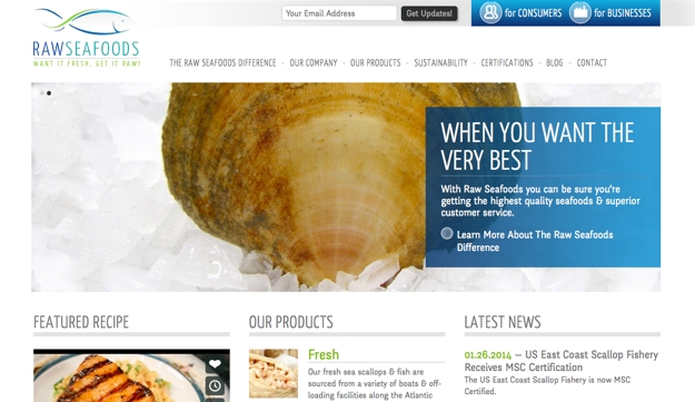
Raw Seafoods

This company uses their billboard to highlight their value proposition and then link visitors over to a page detailing what sets their products and services apart from their competition: http://www.rawseafoods.com
Raw2

2. What can I do for you?

While the “here’s who we are and what we do” approach is the most common way to utilize a billboard’s messaging, there is a downside to that tactic – it focuses solely on the company or organization and not on the audience they serve. As a variation to that approach, you can consider the “how may we help you?” method.

With the “how may we help you?” technique, the messaging focuses on the website’s audience, not the company that owns the website. Instead of being about that company, their products, or services, it instead looks to its users and illustrates about how that company can help them. The focus turns from “us” to “you”.

A few examples of the “how may we help you?” variation are below:

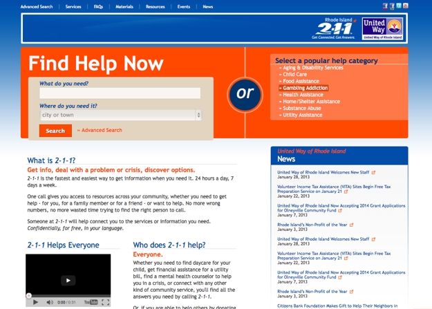
2-1-1 RI

This not-for-profit site run by the United Way does not use any imagery in its billboard. It instead turns to bold colors and large typography to display its message – “Find Help Now”. The billboard does not explain what the organization does (that content is below the billboard). Instead, the focus here is on the user and the action is all about getting them the help they need by answering two simple questions (what do you need and where do you need it) or by clicking on a popular category: http://www.211ri.org
United

RIHCA

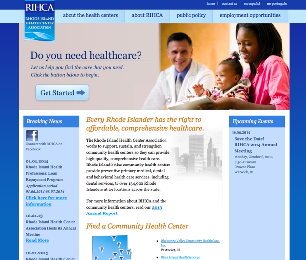
This site uses animated photos alongside a large message to attract their audience’s attention and address their main need – “Do you need healthcare?” The call to action is a simple and obvious button to “Get Started”: http://www.rihca.org
RIHCA

3. Tell me more about yourself.

Similar to the “how may we help you?” method, the “tell us who you are” approach speaks directly to your audience, but it does so in such a way so that it can ask that audience a specific question about who that audience is. The best example of this is a website that requires visitors to self-segment themselves.

Most websites have more than one audience and oftentimes there is different content on your website that is intended for these specific audiences. Having visitors “choose their path” by self-segmenting early on is one way you can drive them to content that is relevant for them, without worrying that they will have to get through pages that may not be necessary for them to see.

A few examples of self-segmentation on websites are below:

Traveler Beer Company

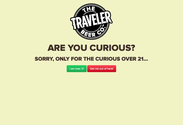
Any beer or liquor company will present this “Are You 21+?” message on their opening page to require that visitors confirm that they are of drinking age before entering the site. This is a form of self-segmentation: http://travelerbeer.com
Traveler

Cosmed Group

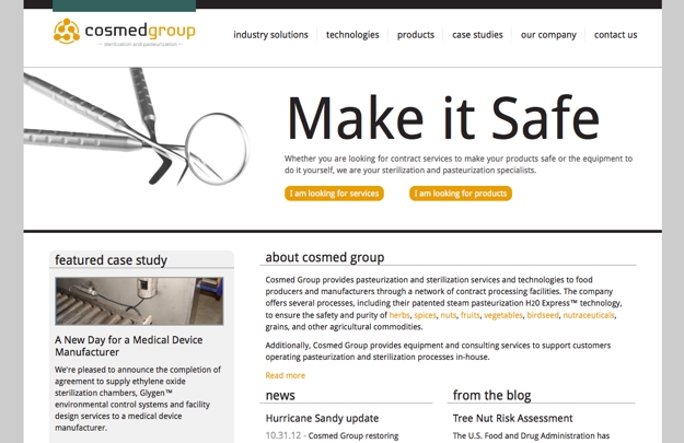
This company knows that their customers fall into one of two groups – those looking for the pasteurization services that they offer or those who want to buy the equipment to do it themselves. Therefore, they present these two paths (looking for services vs. looking for products) in their billboard so that visitors can self-segment based on their needs: http://cosmedgroup.com
Cosmed

4. Let’s get personal.

Taking self-segmentation a step further are sites that already know who you are. These are sites that you subscribe to or have a user account on. Based on your preference or previous activity on the site, the content that is displayed is deemed to be most relevant to your needs.

The most prominent example of this method is Amazon.com. Visit the Amazon homepage and, as long as you are logged in, the products that you see will be based on your previous browsing or purchase history.

Another good example would be eBay. That site will show you results from searches you have conducted in the past in an attempt to present you with new auction items that you would be interested in.

Many news sites work in this way as well. Content that is most relevant for you, based on your preferences or geographic location, will be presented to you up front to try to best tailor your site experience to you.

One note here is that in these examples, Amazon, eBay, and the typical news site, do not present this information in a true, billboard-style fashion - but the same principal of filtering content based on a users’ preference or past behaviors on the site could also be applied to a billboard area.

5. What’s new?

The final approach we will look at in this article is the “latest news and announcements” method. This approach ensures that your site’s billboard is continually updated with fresh content. It displays current promotions, latest news, or important announcements (and usually a link to read more about that content) instead of general marketing messages.
The value of this approach is in the aforementioned freshness it brings to your content and your display. The downside is that it requires you to be publishing that new content on a pretty regular basis and you need to make a commitment to doing so.

If your organization is already producing relevant press releases or running promotions, then this method may be a great fit for you.

A few examples of this method are below:

Fame Foundry

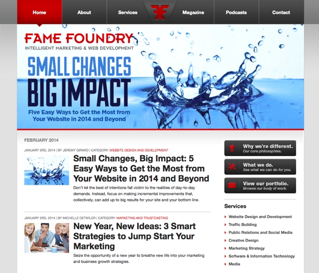
This approach is exactly what we do on our homepage. Each month, our latest articles are highlighted in our animated billboard.
FF

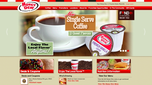
Honey Dew Donuts

Current promotions and seasonal menu items are featured in this site’s animated billboard. Those messages align with other marketing the company is doing - including print, radio, and television, to ensure that the latest content is always presented front and center: http://honeydewdonuts.com
Honeydew

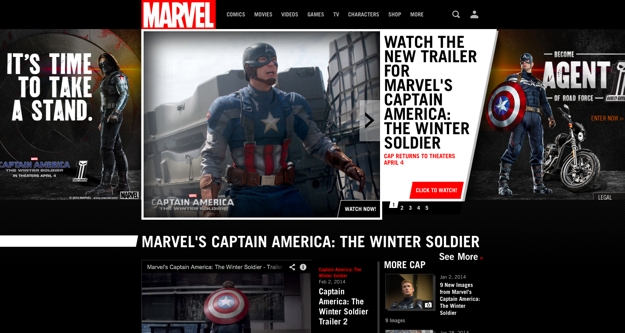
Marvel

Upcoming films, new comics, and other announcements are the focus of Marvel’s homepage billboard: http://marvel.com
Marvel

Mix and match

These billboard techniques are not mutually exclusive – you can mix and match them as you see fit. For instance, you may highlight a current promotion or announcement in your billboard, but then allow it to animate to a second and third and fourth, etc. message that is more generic – like the “here’s who we are and what we do” approach.

With so much space on your homepage being given over to the billboard’s display and understanding that the use of striking images, large typography, and animated messages will undoubtedly draw the focus of your visitors, it is important to make sure that the approach you choose for your billboard is the right choice for your business. Consult with your web design and development team to determine which approach, or which combination of different approaches, will best fit your overall goals and needs.