Viva La Viral! Takeaways From 10 of the Web's Mega-Popular Moments
May 2013
By Blaine Howard
For much of the population, computer and mobile screens have replaced water coolers as the gathering place of choice for conversations about cool stuff. But rather than rehashing what happened last night, people are sharing links, congregating in office cubicles and clustering around smartphones to view the most compelling content over and over again.
Score one for the Internet.
The Web is winning.
In fact, score one billion for the Internet – and counting. The Web's most-watched video of all time, South Korean pop music artist Psy's over-the-top production for his song, "Gangnam Style," became the first ever to reach one billion YouTube views in December 2012, and its total on YouTube now stands at more than 1.5 billion.
That’s more tracked encounters with a single piece of content than the world’s all-time #1 TV broadcast, top movie and most-played radio song combined.
By comparison, London newspaper
The Times reported that a verifiable audience of 984 million tuned in to some portion of the 2008 opening ceremony for the Beijing Olympics – the highest rating ever recorded. Average viewership during the ceremony was 538 million.
According to
Box Office Mojo, the most attended movie in history is “Avatar,” with approximately 270 million tickets sold worldwide.
In 1999 BMI, the world’s largest music publishing rights organization, touted "You've Lost That Lovin’ Feelin,” as radio’s most played song of all time with more than 8 million plays. More recent estimates put that number at between 9 and 10 million total plays as of the end of 2012.
These aren’t strict comparisons; one play on a radio station has thousands of potential listeners in a metro area, and a movie like Avatar’s DVD sales, rental and broadcast figures are not accounted for above. But one thing is certain: The Internet holds its own when big audience numbers are thrown around, and with every passing day, it’s wooing more of people’s time and attention away from more traditional media outlets.
“Going viral” has gone viral
To be sure, those outlets have taken notice. Watch an hour of network news or scroll through the headlines at any major online news source, and you’ll soon see a pattern: Whatever’s hot online is reported and given weight equal to other pop culture and business stories such as world tour announcements and new product releases. Viral Internet content has become a regular source of news in the standard media cycle.
For example, a glance at Yahoo.com’s home page, which includes the day’s top stories in a rotating slideshow format, usually yields at least one article on a viral Internet event, such as this feature of a young athlete gaining attention for his incredible moves on the basketball court. 14-year-old Seventh Woods’s “highlight reel” on YouTube clocks in at about two and a half minutes – and amassed more than 5.5 million views in just five days.

You’ll notice the story lead-in states “more than 3 million views.” Just a day after this item was first posted, the video had gained another two million-plus views, no doubt due (at least in part) to media coverage on Yahoo and elsewhere.
The common spark
Of course no one can predict the next billion-view video. But as more companies take a serious interest in the potential of viral content, there are lessons to be learned from the best the Web has to offer.
In recent weeks online outlets have featured – and fed into – several viral occurrences we’ll examine here. We’ll also consider other content that has rocketed to Internet fame – some ubiquitous and familiar, some with more of a niche appeal. What they all clearly have in common is a spark that makes people want to tell others they saw something cool.
It is this “shareability” that has the potential to take your brand to another level – whether that brand centers around a product, service or personality.
Read more:
The Anatomy of Viral Marketing
A word about numbers
Viral content has long since arrived as a pop-culture phenomenon, but as the Internet continues to evolve as both a marketing and entertainment platform, it is only natural that smart companies are figuring out better ways to crunch the numbers and quantify viral success more accurately. Measurables are in high demand, for good reason, as brands look to spend effectively in the ever-shifting Web marketing landscape.
And it does get complicated. Any truly viral content pollinates all over the Web across thousands of outlets, from a singular genesis out to hubs like Facebook, Twitter, Pinterest and Youtube up to news feeds and back down to countless personal blogs, emails and text messages.
To add another layer of meta-marketing, you’ll often see YouTube ads featuring one leading viral piece from a big player (say, Dove’s “Beauty Portraits” docu-ad) inserted at the beginning of another, more organically generated one (such as up-and-comer Woods’s clip.)
“Views” and “likes” are a good start, but new metrics like True Reach™ (which, according to AdAge, “includes clips uploaded by audiences across the web, showing the complete impact a campaign or viral phenomenon has online”) have emerged to give a more accurate picture. Using the True Reach™ metric, “Gangam Style’s” total approaches 3 billion actual views.
It’s also worth noting that active-user metrics like shares, pins and re-tweets, while usually much lower figures than likes or views, are rapidly gaining respect among brands and ratings entities like Nielsen and Klout.
The motivation to move content down the line is at the core of a viral event. That momentum originates from an accumulation of individuals, which then gains critical mass and enters a “feedback loop” as news outlets pick up the story and create waves of audience growth. Some of the numbers included below are given as an effort to highlight the first-generation element that really gets things rolling.
So without further adieu, let's get to the list, in no particular order:
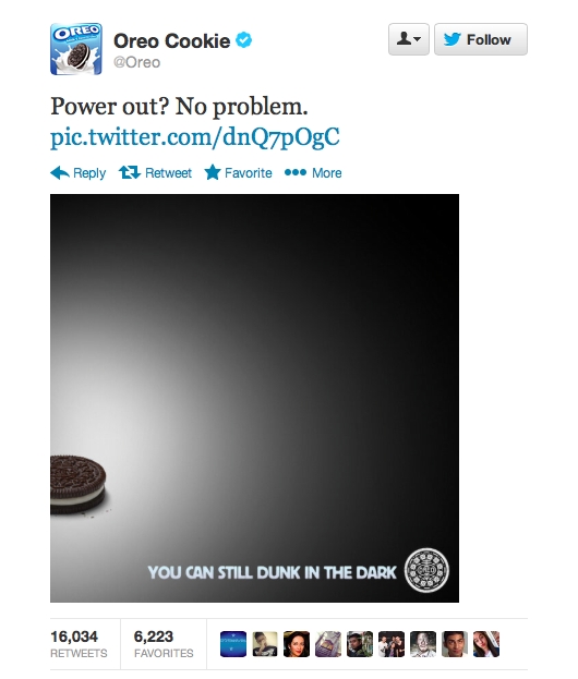
Oreo Super Bowl blackout tweet

Impact
Retweets: Over 16,000 (6,000+ Twitter favorites)
Hashtag trends: #Oreo got a huge initial bump, and #DunkInTheDark is still active.
Facebook: Almost 7,000 shares, over 21,000 likes
Takeaway
Be ready to seize the moment.
Oreo’s smart and timely reaction to the power outage during this year’s Super Bowl was a big win for the brand. The tweet and accompanying photo garnered instant raves and extensive coverage across the Internet and traditional media, with tech and marketing leaders’ immediate tweets followed up by a flurry of blog posts, articles and news spots in the days after.
This story highlights the power and marketing potential of real-time social media, but it couldn’t have happened without an initial audience of some size to spread the word. Oreo had an established presence on Twitter (thousands of tweets and over 70,000 followers) and a Facebook page “liked” by more than 30 million people at the time of the blackout, which provided the opportunity to fire off this simple ad and watch it spread. Build your audience today, so you can harness its power to seize the moment tomorrow.
Dove: “Real Beauty” sketches
Impact
YouTube views: 26.2 million (89,000 likes)
YouTube comments: Over 8,000
Facebook campaign video views: 1.7 million
Hashtag trend: #wearebeautiful (Dove’s non-exclusive preferred hashtag), 1,900 Twitter uses, April 21-24 – up more than 500% from the week prior
Takeaway
Use your brand to make a statement for the greater good – and attract an audience who cares.
Is there a compelling cultural element that relates well to your brand? Think about ways to engage directly in an effort that makes sense, rather than a “cause” that looks good but may not fit.
Dove has created a unique space for itself in the beauty industry with previous campaigns like its successful “Real Women” series, which featured confident, striking women with body types and looks that don’t necessarily fit the Hollywood standard of attractiveness. Expanding on the themes of self-esteem and self-perception, last week the company launched a new set of documentary-style “Real Beauty Sketch” ads that immediately went viral. Dove has maintained an active channel on YouTube for more than two years, but more than 75 percent of their total overall channel views came in the week following the launch of this new series.
While not all reaction has been positive, the ensuing coverage has been a noteworthy addition to the collective global debate about what constitutes “beauty.” With body image and appearance issues contributing to suicide and self-harm rates for girls and women around the world, Dove is to be applauded for this (albeit possibly flawed) effort to counteract stereotypes. The rapid spread of this ad series online and the ensuing media coverage are proof that Dove is contributing to a conversation that needs to happen.
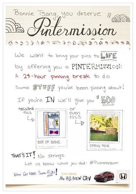
Honda’s “Pintermission” campaign

Impact
Pinterest hits: More than 4.6 million people were exposed to Honda’s #Pintermission boards
Repins: 5,000+ (nearly 2,000 likes)
Media impressions: Over 16 million
Takeaway
Find a great fit for your brand in a new place. Seek out the places where people gather around shared interests that reflect your brand’s aesthetic and values, and carve out a niche for yourself there.
Pinterest has exploded onto the social media scene in the last 18 months, reaching 10 million unique visitors faster than any standalone Web site in history in early 2012. As users come across lifestyle elements of interest on the Internet, they pin the items onto their personal Pinterest board. Many users take advantage of Pinterest’s instinctive environment to plan events and brainstorm remodeling ideas.
The site’s uniquely aspirational feel lends many user’s pages a beautiful, collage-like look – perfect for any brand wishing to highlight its classic appeal and reach out to affinitive audiences. And here’s another fact that bodes well for Pinterest as a marketing platform: About 80 percent of pins on the site are actually repins. Compared to just 2 percent of Twitter content being retweets, that is some serious viral mojo.
Just as Pinterest was reaching unprecedented momentum, Honda launched its presence in February 2012 on the site by engaging five prominent users who had garnered large followings. In other words, Honda identified people who created definitive Pinterest experiences and found a way to become part of that fabric. Honda invited these users to each take a personal “Pintermission” and live out some of the hopes and dreams adorning their Pinterest pages.
Who could say no? Millions of hits and mounds of goodwill later, Honda stands as a cornerstone brand using Pinterest in a truthful, relational way that feels less like marketing and more like lifestyle collaboration.
Virgin Blue’s Twitter near-giveaway

Impact
1000 tickets: Sold out as fast as they released them, all through Twitter
Lasting influence: Mainstay on “best-ever viral marketing campaigns” lists
Takeaway
If you’re thinking of offering a discount or giveaway as a way to gain lots of exposure, go big or stay on the ground. Make your deal memorable, accessible and easy to execute. The goal is to engage all the people who just miss out on your fantastic deal and keep the conversation going from there.
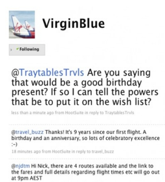
As a way to celebrate its ninth anniversary and bump its brand’s profile, Virgin Blue airlines (now Virgin Australia) offered 1,000 tickets exclusively through Twitter for the unheard-of price of $9.00. People responded by the thousands in a flash, and the tickets quickly sold out.
This one’s an oldie but a goodie, having taken place in 2009. It’s worth mentioning for three reasons: First, it helped establish the power of Twitter by taking place as an ad campaign exclusive to the site, then a young platform with more reach than proven value.
Second, the discount was hundreds of dollars off a high-demand item – a combination sure to attract attention, raise brand awareness and drive motivated traffic to desired points of contact. Third, it went off as smoothly as it could have. The transaction tech worked flawlessly, and customers who were lucky enough to get in on the deal were left with a positive, seamless experience from end to end. That’s the kind of brand encounter that creates loyalty and trust.
K-Mart: Ship My Pants
Impact
YouTube views: 15.1 million (70,000 likes) in two weeks
True Reach™: Over 20 million views
YouTube comments: Over 13,000
Twitter: 8,600 uses of #shipmypants, virtually all of them occurring since the clip launched
Related media: More than 30 official Kmart clips, each enjoying a mini-viral piggyback benefit
Takeaway
Yep, folks like to laugh. The key here is to get people laughing about your brand without…ahem…tainting your larger point.
Sure it’s a little cheap, and plenty of folks are wrinkling their noses at this huge hit’s unsavory implications. But the risks seem relatively low and the comedic shock value has clearly translated into higher brand awareness for this traditional bricks-and-mortar mainstay.
This clip accomplishes two things Kmart can really use during this uncertain time for big box retailers. First, the humor shows that Kmart knows how to laugh. Wide, bland product selection and longstanding customer familiarity may have led Kmart into a bit of brand fatigue – aka the shrug syndrome. “Ship My Pants” shakes that up.
Second, the focus here is on easy shipping; this is Amazon and eBay territory. If Kmart wants to break into that market in a big way, it needs to alert its substantial customer base that they don’t need to look elsewhere for such options. And maybe, just maybe, those customers will share the good word even as they spread the...er…pants shipping.
OK Go’s Needing/Getting Chevy clip
Impact
YouTube views: 24.8 million (233,000 likes)
Comments: 26,000+
Google+ shares: 5000+
Takeaway
When done well, collaboration can bring your brand to a whole new audience. If a raucous rock band can turn a shiny sedan into a musical instrument, your brand can find an unexpected partner and make a little marketing magic too.
And you thought there were no more original ideas. OK Go seemingly breathes creativity, having released some of the Web’s most-viewed and most-beloved viral videos (at least six more of their clips have garnered more than 2 million YouTube views each). Chevrolet was smart enough to underwrite one of the best examples of brand synergy the Internet has ever produced. OK Go seriously upped its public profile by way of Chevy’s Super Bowl ad purchasing clout, and Chevy showcased its product to a young, hip online demographic that trusted OK Go to create another slice of awesome. Mission accomplished all around.
Cake resignation letter

Impact
Retweets: 7,000+
Twitter favorites: More than 2,300
Facebook: 6,000+ likes, 6000+ mentions
Media coverage: Well over 100 features in major online news sources around the world
Takeaway
Serendipity is sweet. If your brand is captured in a candid moment that turns into a showcase, make sure you’re ready to meet expectations. And if you inject those moments with a little natural marketing flair, so much the better.
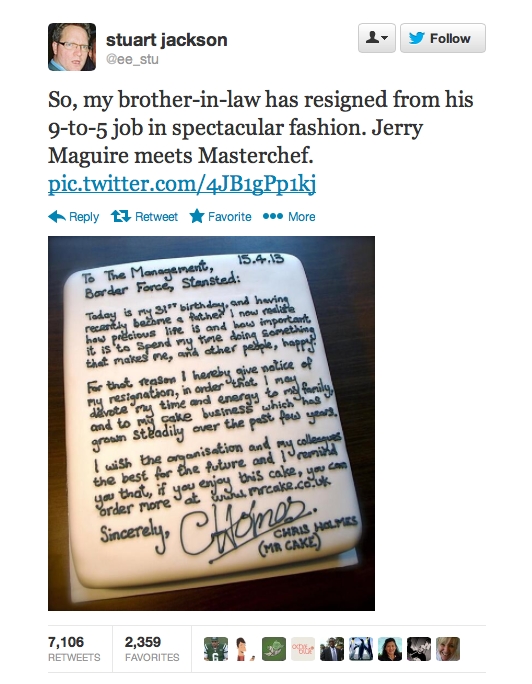
On the brink of his 31st birthday, Chris Holmes decided to go all-in on his then-sideline dream job: creating fabulous cakes. So he did a classy thing and added a little smart marketing on top (note his business handle and Web address in the icing above). His genuine gift of a cake to his soon-to-be-former employers made a hard day a little easier and left co-workers with a great last impression. Then the Internet got involved, with a little help from Holmes’s brother-in-law.
Dozens of interviews and thousands of retweets later, Holmes finds himself riding a nice wave of goodwill and publicity. And he was ready for it. A well-done
website, a Facebook page with big, ooh-aah photos and a Twitter page stocked with more than 1,000 tweets before the cake photo went viral all add up to something built to last long after the sugar rush of headlines and hashtags wears off.
Seventh Woods highlights clip
Impact
YouTube views: 5.5 million (22,000+ likes)
Comments: 7,600+
Takeaway
Do what you’re great at. Capture it. Then let the world take a look. If your brand is about sheer brilliance, the Internet is built to show it off. What would your highlight reel look like?
We may well be witnessing the birth of a brand. This one’s too fresh to show up on a True Reach™ chart, but rest assured: it will be at or near the top in a matter of weeks. This clip is a great example of niche appeal (sports) transcending genre and breaking into the general culture. Woods’s age is surely a factor, as is his remarkable ability to soar above his peers. It is likely that many people are opening the clip because of his age, but staying through to the end and sharing it because the clip delivers on its promise of something spectacular.
Psy’s “Gentleman”
Impact
YouTube views: 214 million (1.7 million likes)
True Reach™: Over 300 million views
Takeaway
Don’t repeat yourself, but don’t leave the ballpark either. If your brand recently enjoyed a bump in positive recognition for any reason, it may be time to play off that momentum in creative ways.
Talk about a feedback loop – Psy’s global moment spilled over to his latest video almost by default. But he didn’t waste the opportunity. Psy established a worldwide identity with “Gangnam Style.” Given that the vast majority of his audience had no idea who he was before his rise to viral glory, it would have been foolish for him to release a folk ballad for a follow-up.
Here Psy keeps his signature visual style, introduces another upbeat dance and ramps up the humor. The results gave Psy YouTube’s single day viewing record (more than 38 million views the first 24 hours) to go along with his top total views mark for “Gangnam Style.”
Veronica Mars Kickstarter campaign
Impact
Backers: Over 91,000
Money raised: $5.7 million
Facebook: 227,000 likes
Twitter: 25,000+ followers, 14,000 uses of #veronicamarsmovie
YouTube channel: 16,000+ subscribers, 450,000 total related clip views
Instagram: Over 11,500 followers
Takeaway
If your brand’s core demographic can be described as a “fanbase,” source that crowd and do something incredible – they could be waiting to fuel your vision. If your audience isn’t filled with fans yet, woo that crowd. Make something amazing that creates demand for a sequel.
This is a great piece to end on: cross-platform synergy galore, record-breaking numbers on the crowd-sourcing website Kickstarter.com and a just plain fun project to learn from.
Plenty of fine TV shows have shut down too early to suit their small but loyal groups of superfans. Most of the time things fade out in a dwindling cloud of blog posts and awkward, sparse comic-con flash mobs.
Not this time. After enduring seven long years since the show’s cancellation, the “Veronica Mars” fanbase remained so committed to its creators and actors that, when finally presented with an opportunity to get involved with making a movie based on the series, they swarmed Kickstarter and shattered every record the burgeoning crowd-sourcing movement had previously posted. In less than 11 hours, backers had committed more than $2 million dollars to the project. 30 days later, the final sum stood at more than $5.7 million, and 91,000-plus backers record had jumped on board.
To be sure, the show and the Internet are a perfect fit. “Veronica Mars” is the kind of show that’s rife with sharable clips (which have been endlessly passed around every known platform in the intervening years), and its central star, Kristen Bell, is adorable, funny and tech-savvy. Her enthusiastic involvement and level of fame (more than a million Twitter followers) fueled the campaign in a way few others could.
But crowdsourcing didn’t appear out of nowhere when Kristen Bell posted her first tweet about this movie. Kickstarter, Indiegogo and other similar sites have hosted thousands of campaigns in the last few years, most of them raising modest sums that fund less glamorous projects. But every one is a passion piece. Every crowd-sourcing success story starts with a few believers. Who knows – your brand could be one Kickstart away from the next level.
*Twitter hashtag statistics obtained using Topsy.com
Blaine Howard is a writer and editor with more than 20 years of experience crafting the art form of the written word in a wide variety of fields, from marketing and advertising to nonprofit and pop culture. Blaine currently serves as associate editor for Fame Foundry.