We are the digital agency
crafting brand experiences
for the modern audience.
We are Fame Foundry.

See our work. Read the Fame Foundry magazine.

We love our clients.

Fame Foundry seeks out bold brands that wish to engage their public in sincere, evocative ways.


WorkWeb DesignSportsEvents

Platforms for racing in the 21st century.

Fame Foundry puts the racing experience in front of millions of fans, steering motorsports to the modern age.

“Fame Foundry created something never seen before, allowing members to interact in new ways and providing them a central location to call their own. It also provides more value to our sponsors than we have ever had before.”

—Ryan Newman

Technology on the track.

Providing more than just web software, our management systems enhance and reinforce a variety of services by different racing organizations which work to evolve the speed, efficiency, and safety measures, aiding their process from lab to checkered flag.

WorkWeb DesignRetail

Setting the pace across 44 states.

With over 1100 locations, thousands of products, and millions of transactions, Shoe Show creates a substantial retail footprint in shoe sales.

The sole of superior choice.

With over 1100 locations, thousands of products, and millions of transactions, Shoe Show creates a substantial retail footprint in shoe sales.

WorkWeb DesignRetail

The contemporary online pharmacy.

Medichest sets a new standard, bringing the boutique experience to the drug store.

Integrated & Automated Marketing System

All the extensive opportunities for public engagement are made easily definable and effortlessly automated.

Scheduled promotions, sales, and campaigns, all precisely targeted for specific demographics within the whole of the Medichest audience.

WorkWeb DesignSocial

Home Design & Decor Magazine offers readers superior content on designer home trends on any device.


  • By selectively curating the very best from their individual markets, each localized catalog comes to exhibit the trending, pertinent visual flavors specific to each region.


  • Beside the swaths of inspirational home photography spreads, Home Design & Decor provides exhaustive articles and advice by proven professionals in home design.


  • The art of home ingenuity always dances between the timeless and the experimental. The very best in these intersecting principles offer consistent sources of modern innovation.

WorkWeb DesignSocial

  • Post a need on behalf of yourself, a family member or your community group, whether you need volunteers or funds to support your cause.


  • Search by location, expertise and date, and connect with people in your very own community who need your time and talents.


  • Start your own Neighborhood or Group Page and create a virtual hub where you can connect and converse about the things that matter most to you.

775 Boost email open rates by 152 percent

Use your customers’ behavior to your advantage.

369 Should there be an app for that?: The scale test

Great idea or waste of money? The difference comes down to the size of your customer base.

December 2016
By Kimberly Barnes

Going the Distance: Four Ways to Build a Better Customer Loyalty Program for Your Brand

Loyalty programs are no longer a novelty. That means that yesterday’s strategies won’t work moving forward, so look for ways to rise above the noise, setting yourself apart from the cloying drone of countless other cookie-cutter programs.
Read the article

Going the Distance: Four Ways to Build a Better Customer Loyalty Program for Your Brand

article-thedistance-lg It’s easy enough for a customer to join your loyalty program, especially when you’re offering an incentive such as discounts. All your customer has to do is give out some basic information, and voila! They’re in the fold, a brand new loyalty member with your company. From there, it’s happily ever after. You offer the perks; they stand solidly by you, bringing you their continued business. Simple. Or is it? In reality, just how many of those customers are act ively participating in your loyalty program? Do you know? Sure, loyalty program memberships are on the rise according to market research company eMarketer, having jumped 25 percent in the space of just two years. However, that figure may be a bit misleading. The truth is that, while loyalty program sign-ups may be more numerous, active participation in such programs is actually in decline. At the time of the study, the average US household had memberships in 29 loyalty programs; yet consumers were only active in 12 of those. That’s just 41 percent. And even that meager figure represents a drop of 2 percentage points per year over each of the preceding four years, according to a study by loyalty-marketing research company COLLOQUY.

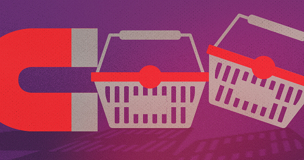
When discounts just aren’t enough

So what’s a brand to do? How can you make your loyalty program worth your customer’s while—as well as your own? After all, gaining a new loyalty member doesn’t mean much if your customer isn’t actively participating in your program. Consider this: Does your customer loyalty program offer members anything different from what your competitors are offering? Chances are your program includes discounts. That’s a given. And what customer doesn’t appreciate a good discount? But when every other company out there is providing this staple benefit in comparable amounts, it becomes less and less likely that customers will remain loyal to any one particular brand. Frankly, it’s all too easy for customers to get lost in a sea of loyalty member discounts. They’re everywhere. In fact, just under half of internet users perceive that all rewards programs are alike, according to a 2015 eMarketer survey. The key to success, then, is to differentiate your business from the crowd. If you can offer your customers something unique and valuable beyond the usual discount, chances are they’ll be more likely to stick with your brand. Here’s some inspiration from companies who get it.

Virgin: Reward more purchases with more benefits.

That’s not to say you need to get rid of discounts entirely. In fact, nothing could be further from the truth. Customers still love a good discount. The goal is to be creative in terms of the loyalty perks you offer. Take the Virgin Atlantic Flying Club, for example. As part of its loyalty program, the airline allows members to earn miles and tier points. Members are inducted at the Club Red tier, from which they can move up to Club Silver and then Club Gold. Here, it’s not just a discount. It’s status. And people respond to feeling important, elite. Still, even where the rewards themselves are concerned, Virgin is motivating loyalty customers with some pretty attractive offers. At the Club Red tier, members earn flight miles and receive discounts on rental cars, airport parking, hotels and holiday flights. But as members rise in tiers, they get even more. At the Club Silver tier, members earn 50 percent more points on flights, access to expedited check-in, and priority standby seating. And once they reach the top, Club Gold members receive double miles, priority boarding and access to exclusive clubhouses where they can get a drink or a massage before their flight. Now that’s some serious incentive to keep coming back for more. Discounts are still part of the equation – but they are designed with innovation and personal value in mind, elevating them to more than just savings.

Amazon Prime: Pay upfront and become a VIP.

What if your customers only had to pay a one-time upfront fee to get a year’s worth of substantial benefits? It may not sound like the smartest business idea at first glance. But take a closer look. Amazon Prime users pay a nominal $99 a year to gain free, two-day shipping on millions of products with no minimum purchase. And that’s just one benefit of going Prime. It’s true that Amazon loses $1-2 billion a year on Prime. This comes as no surprise given the incredible value the program offers. But get this: Amazon makes up for its losses in markedly higher transaction frequency. Specifically, Prime members spend an average of $1,500 a year on Amazon.com, compared with $625 spent by non-Prime users, a ccording to a 2015 report from Consumer Intelligence Research Partners.

Patagonia: Cater to customer values.

Sometimes, the draw for consumers isn’t saving money or getting a great deal. The eco-friendly outdoor clothing company Patagonia figured this out back in 2011, when it partnered with eBay to launch its Common Threads Initiative: a program that allows customers to resell their used Patagonia clothing via the company’s website. Why is this program important to customers? And how does it benefit Patagonia? The company’s brand embraces environmental and social responsibility, so it was only fitting that they create a platform for essentially recycling old clothing rather than merely throwing it away. The Common Threads Initiative helps Patagonia build a memorable brand and fierce loyalty by offering its customers a cause that aligns with deep personal values. OK, so their customers get to make a little money, too. Everybody wins.

American Airlines: Gamify your loyalty program.

If you’re going to offer your customers a loyalty program, why not make it f un? After all, engagement is key to building a strong relationship with your customer. And what better way to achieve that goal than making a game of it. American Airlines had this very thing in mind when it created its AAdvantage Passport Challenge following its merger with USAirways. The goal: find a new way to engage customers as big changes were underway. Using a custom Facebook application, American Airlines created a virtual passport to increase brand awareness while offering members a chance to earn bonus points. Customers earned these rewards through a variety of game-like activities, from answering trivia questions to tracking travel through a personalized dashboard. In the end, participants earned more than 70 percent more stamps than expected – and the airline saw a ROI of more than 500 percent. The takeaway: people like games.

Stand out from the crowd.

Your approach to your customer loyalty program should align with your overall marketing approach. Effective branding is about standing out, not blending it. Being memorable is key. To this end, keep in mind that loyalty programs are no longer a novelty. That means that yesterday’s strategies won’t work moving forward, so look for ways to rise above the noise, setting yourself apart from the cloying drone of countless other cookie-cutter programs.


June 2016
By Jeremy Girard

Small Changes, Big Impact: 5 Things You Can (and Should!) Do Today to Boost Your Website’s Performance

There’s no time like the present to implement these quick fixes and reap the rewards for months to come.
Read the article

Small Changes, Big Impact: 5 Things You Can (and Should!) Do Today to Boost Your Website’s Performance

artice-smallchanges-lg Every spring it happens like clockwork: the temperatures get warmer, the days get longer and everything in nature becomes more vibrant and colorful. Along with these changes in the great outdoors comes the irresistible urge to clean house and embrace a fresh start. Why not keep that motivational momentum going and apply it to your business – and, more specifically, to your website – as well? After all, there’s no time like the present to sweep away the old and outdated and bring in fresh new ideas and technologies. But you don’t necessarily need to dive head-first into a full redesign and all of the time and expense that entails to reap measurable results. Instead, here are five small steps you can – and should! – take today to ensure that your site is up-to-date, relevant and doing all it can to bring you new customers and grow the community around your brand:

1. Reposition your contact form.

For most website owners – especially those in service-based businesses such as law, accounting, consulting, real estate, etc. – the key “win” for their site is when it motivates a visitor to request more information or schedule a meeting. Contact forms are a ubiquitous website staple intended to provide a convenient – and highly measurable – avenue to initiate communication between an interested prospect and a company. However, perhaps because they are so commonplace, all too often these forms are given little strategic thought, resulting in a cookie-cutter name/email address/phone number format that yields more bogus spam submissions than legitimate new business opportunities. However, there is one simple change you can make that has been shown to get better results: reposition your standard “Contact us” form as an “Ask our experts” feature. By doing so, you shift the focus of the form to providing your visitors with an opportunity to submit a question that is specific to their needs and concerns. Rather than feeling like they are opening themselves up to an endless barrage of solicitation calls and emails, your visitors will sense that they are initiating a dialogue with an expert who will help them solve their particular problem. Make sure to respond to all inquiries within 24 hours, provide helpful advice that is free of charge and tailored to your prospect’s situation, and leave the door open to continue the conversation in a future meeting or phone call. By doing so, you will establish an important foundation of trust and confidence with your potential new client that will make them more inclined to engage your professional services. expert I have personally seen the submission rates on these types of forms increase dramatically. On one site where this small change was implemented, form submissions jumped from one or two per week to one or two per day – all legitimate business opportunities that were sparked simply by repositioning the focus of the form.

2. Productize your offering.

Another challenge that professional services organizations face in creating a website that works as an effective customer conversion engine is that they do not sell a specific product but rather a suite of services that can be customized to each client’s specific needs. This makes it terribly hard to market to visitors who come to their site and simply want to know “What exactly does this company sell, and how much does it cost?”. Because there are so many variables to the company’s offerings, there is not a quick and easy answer to these questions. If this challenge sounds familiar to you, one approach you can try is to “productize” what you have to offer. Create a bundle of services with a fixed price, and market that package on your site in a simple, straightforward manner that makes your offering easy to understand and helps visitors feel like doing business with your company is as simple as buying a product off the shelf at a store. package This is exactly what my company did with some of the technology consulting services that we offer. Instead of only listing the array of services we provide, we also created a product that representing a very specific offering. This made it so much easier to answer the “What do you sell?” question, and it gave us something tangible to promote in our marketing campaigns. In reality, this approach in no way limited the range of services we are able to offer our clients; rather, it merely served as a vehicle to open doors to new opportunities and made it easier to start conversations with new customers for whom we could ultimately provide a custom-tailored solution. Examine the services that you offer, and work with your marketing team to create an appealing package that you can market – understanding all the while that this “product” is really just a means for you to connect with customers and begin the sales process with something tangible that they can easily understand.

3. Lose your home page carousel.

One simple change that I have seen many websites make in the past year or so is to remove animated image carousels from their home pages. These carousels have long been a popular fixture of website design, but the reality is that they can sometimes do more harm than good. Home page carousels typically feature giant, screen-spanning images which carry with them heavy download requirements both for the images and for the scripts that power the animation sequences, thereby creating a potential stumbling block in performance for users on mobile devices or with slower connections. Additionally, studies have shown that click-through rates on animated carousels are extremely low, and they drop significantly from the first slide to the subsequent ones. This is why many companies are replacing rotating carousels with a singular static message instead. This one change can greatly reduce a page’s download size (when my company did this on our home page, its file size decreased by 75 percent) while having little to no effect on actual user engagement or click-through. In fact, because the page now loads more quickly, many sites actually see an uptick in user engagement because fewer people are abandoning a site due to poor performance. image Do you have a carousel on your website? If so, do you know whether or not it is working well for you? Your marketing team may be able to do some A/B testing between a version of your site with this animation feature and one without it to see which performs better. Since carousels do work well for some sites (like news organizations or sites with lots of frequently updated content), having this data can help you determine whether or not it’s time to ditch the carousel.

4. Update your image(s).

Stock photography is something of a necessary evil of website design, as more often than not, companies don’t have the budget to execute a full-fledged custom professional photo shoot. However, not all stock images are created equal. Stock photos that are overused or that look so obviously staged that they scream of their “stockiness” can cheapen a site’s design and leave visitors with a negative overall impression of the site. Replacing those images can make a big difference in a site’s visual appeal. If your site’s imagery is stale, you can make some simple image swaps to freshen it up. If you are going to change out old stock images for new stock images, make sure to seek out photos that feel fresh and that are not terribly overused (most stock photo sites will tell you how many times an image has been downloaded). An even better option is to try to add some unique imagery to your site. This could be photographs that you hire a professional to take or – in keeping with one of this year’s hottest trends – custom illustrations that you commission from an artist. illustration If your budget is tight, incorporating even just one or two such one-of-a-kind images in key spots on your site can really boost its visual impact. For instance, if you lose that aforementioned carousel on the home page and replace it with one truly compelling static image and message, it can make a really powerful first impression on your visitors.

5. Publish less.

Most experts agree that publishing original, value-add content on your site on a regular basis is key to optimizing its success – both from a sales and marketing standpoint and as an advantage in the never-ending battle of SEO. While I agree with this approach in principal, for many companies, the drive to publish regularly has resulted in putting out mediocre content simply to meet an inflexible standard of frequency. This is often an entirely counterproductive effort, as content that lacks in quality, original thought or value for the reader reflects poorly on the organization and its perceived level of expertise. Publishing original content to your site on a regular basis is still a best practice, but that content must offer value for it to succeed. Let’s say a visitor comes to your site and is impressed to find that you publish new articles weekly or monthly; however, once they click through the headline to see what they can glean from your writing, if what they find is mediocre at best, what motivation do they have to return to your site again in the future, let alone entrust you with their hard-earned dollars? If, on the other hand, you publish new content less frequently, but everything you produce is of the highest quality, then that same visitor will know that the time they spend on your site will always be worth their while, and they will look forward to the next time you post something new. Re-examine your current content marketing strategy, and ask yourself whether you are focused on quality or frequency. If it’s the latter, commit instead to writing less but to improving the quality of what you offer on your site. While this change may not have an immediate impact, it will absolutely yield long-term results that your visitors will appreciate and respond positively to.

In closing

Eventually, your website will need a redesign, but in the meantime you can make small, strategic, surgical changes that will pay immediate dividends in your site’s success. This approach of implementing gradual but regular modifications will also benefit you when it does come time for that full redesign. By making intelligent improvements over time, you will ultimately be closer to your end goal, leaving less to accomplish with the redesign and thereby paving the way for a smoother and less costly project.
September 2014
By Kimberly Barnes

Intelligent Design: Transform Your Website into a Sales Engine with Machine Learning

Machine learning may sound like science fiction, but in fact, it’s the new reality that’s redefining marketing and e-commerce.
Read the article

Intelligent Design: Transform Your Website into a Sales Engine with Machine Learning

computer-brain Machine learning: The phrase evokes images of computers playing chess or IBM’s Watson destroying two legendary Jeopardy! champions in a three-day tournament. The truth is, though, machine learning is no longer a novelty; it’s now an integral part of our daily lives. Every time you receive a product recommendation from Amazon, your email server weeds out spam before it reaches your inbox or you enjoy a playlist on Pandora, you’re seeing machine learning in action. In a nutshell, machine learning is the science of training computers to recognize data patterns and make adjustments automatically when those patterns change. While on the surface this may not sound very exciting, nothing could be further from the truth. In fact, machine learning is the key to transforming your website into a lean, mean selling machine.

Understanding machine learning in 100 words or less

Machine learning uses algorithms to build models from data; as more data is collected, the algorithms are “trained” to adapt to changes. There are two ways in which machine learning can be implemented: supervised and unsupervised. Supervised learning algorithms are used to create models that establish relationships between types of data — the relationship between purchase data and user clickstream data, for example. Unsupervised learning uses algorithms to gain insights into customer behaviors and preferences by looking for patterns within the data. Both of these methodologies are designed to make marketing and e-commerce more exact, more personal and more profitable.

Putting machine learning to work

Netflix, Pandora and Amazon are all familiar examples of machine learning in action. All three use recommender systems powered by complex algorithms. These systems collect data about your browsing activities, past selections and any ratings or reviews you may have provided. Then they segment you into clusters with other customers who have demonstrated similar interests or behaviors and use this data to suggest items that might appeal to you based on the browsing and purchasing habits of these other customers. You see this on Netflix as the category titled “Because you watched...” and on Amazon as “Customers who viewed this also viewed...” Amazon2 To gain a deeper understanding of how these algorithms work, let’s take a closer look at Amazon. To Amazon, you are a very long row of numbers in a massive table of data. Your row represents everything you’ve looked at, clicked on, purchased (or, equally as important, not purchased) or reviewed on the site. The other rows in this gargantuan table encompass the same thing for the millions of other customers who shop on Amazon. With every click, visit and purchase, more data is added to your row, which allows Amazon to constantly mold and shape the products it recommends to you and the special offers you receive based on an ever-evolving stream of information about you that is being collected and stored. Another innovative example is True Fit, a retail software start-up that is on a mission to apply data analytics to increase customer confidence in online clothing purchases while decreasing the number of returns for e-railers. Well-known fashion retailers, including Nordstrom, Macy’s and Guess, have implemented True Fit’s algorithms on their e-commerce sites. When customers shop on these sites, they’re asked to create a profile that includes their height, weight and perhaps most importantly, the size and brand of their favorite piece of clothing. TrueFit Using that data, True Fit is able to recommend the correct size for a specific brand and article of clothing. Even more importantly, as customers continue to use the True Fit system, it learns more about their personal style and preferences and steers them toward purchases they’ll be more likely to keep and enjoy rather than return.

How machine learning drives smarter marketing

You don’t need the resources of major e-commerce giants like Amazon or Netflix to take advantage of machine learning to to improve your e-commerce site and your online marketing efforts. By enhancing your existing site with systems that allow you to create a virtual marketing intelligence brain, you can create a more personalized – and therefore higher quality – shopping experience for your customers. By establishing this type of marketing intelligence ecosystem, you can mine the data provided by customers every time they visit your site to answer vital questions that will help you fine-tune your site and your online marketing strategy – questions like these:
  • How likely is a given website visitor to convert?
  • What behaviors characterize customers who are likely to buy?
  • What behaviors characterize customers who are likely not to buy?
  • How can new visitors be identified as high-potential long-term customers?
  • Which type of web traffic has the most value?
  • Which products or services appeal most to a given segment of customers?
  • Given the contents of a particular customer’s shopping cart, which additional products are high-potential recommendations?
  • How can website visits be optimized to provide the best possible experience for each individual customer?

Making it personal

The final question in the list above is one that deserves special notice because of the staggering potential for using machine learning to create a more personalized shopping experience – one of the key drivers for increasing online sales. Not only can the data collected via such marketing intelligence ecosystems be used to drive recommender systems, it can also be used to create personalized advertising based on market segments — or even individual profiles — that can be distributed across a variety of desktop, mobile and social platforms. This type of advertising can be tailored to any number of personal preferences and demographic information, including age, marital status, location, lifestyle choices, typical purchases, brand preferences and so on. Ads can be focused to such a granular level that they reflect specific colors a given customer prefers, and their individual purchase drivers, such as status or cost-effectiveness. Another exciting aspect of machine learning-based personalization is the development of individual customer profiles. You can even combine online and offline customer data to create a more complete picture of a given user. Types of data included in this profile might include online and in-store purchases, membership and activity in rewards programs, product ratings and clothing sizes. Just imagine how much more powerful your marketing efforts could be if you were armed with this level of information. One of the most important aspects of a successful marketing intelligence ecosystem is how data mined from customer activities is combined with sound business rules in order to make smart recommendations that are well received by customers and that do not compromise their trust in your brand. For example, most people who walk into a supermarket like bananas and will often buy some. So shouldn’t the recommender simply recommend bananas to every customer? No – because it wouldn’t help the customer, and it wouldn’t increase banana sales. So a smart supermarket recommender would always include a rule to exclude recommending bananas. At the other end of the spectrum, the recommender shouldn’t push high-margin items just because it’s beneficial to the seller’s bottom line. It’s like going to a restaurant where the server steers you toward a particular high-dollar entree. Is it really his favorite? Or did the chef urge the staff to push the dish because it comes with a side order of premium mark-up? To build trust, the best recommender systems strive for some degree of transparency by giving customers clues as to why a particular item was recommended and letting them adjust their profile if they don’t like the recommendations they’re receiving.

Science fact, not fiction

Machine learning can give your business a serious competitive edge by opening the door new opportunities in the marketplace. It can help you personalize and improve your customer experience dramatically and thereby drive sales and revenues. Creatives and developers alike are rapidly pioneering new and innovative ways for marketers to use machine learning — and the future of marketing built on these ideas has seemingly endless possibilities.
June 2012
By Jeremy Girard

Check Your Ego at the Door: Embracing User-Centered Website Design

When it comes to the design of your website, there's only one opinion that really matters, and it's not yours or your web designer's.
Read the article

Check Your Ego at the Door: Embracing User-Centered Website Design

user-center-article The creation of a new website is a process filled with important decisions. As the owner, CEO, or decision maker at the organization for which the new site is being designed and developed, you will be asked for your feedback or approval a number of times along the way – but what are you using as the basis for that feedback? Too often decisions are made during a website’s creation that are based on the preferences of the site’s “owners” and not on the needs of the people who will actually use the website. This is the wrong way to go about making decisions for a project, because the reality is that your website should not be designed for you, it should be designed for your audience. In this article, we will take a look at how you can shape the decisions you make on a website’s creation, or its subsequent upkeep, to help you meet the needs of your website’s most important audience - the clients and customers that will bring you business and ultimately make your site a success.

Making design decisions

No one wants to have a website they don’t like the look of, but the fact of the matter is that design decisions are not made for aesthetic reasons only. Visual choices for a project should be made by taking the needs of your audience, and your business’s goals for the website, into account. Many people assume that their website should be a reflection of their personal tastes or sense of style. That is not the case. It’s sometimes hard to hear, but your preferences of what looks good and what doesn’t should be secondary to what is appropriate for your site’s users. You certainly want something that you are proud of, but when reviewing design options, but sure to consistently ask yourself, “what would my audience think?” Or better yet, ask some of your actual users for their feedback and use that data in your decision making process. In the end, the goal is to come up with a design that you love and which properly represents your company, but will also meet the needs of your audience. When in doubt, however, defer to your users’ needs and remember that old saying – “the customer is always right.”

Give users what they want

While a great design is certainly important, the reality is that your customers are not coming to your website to be “wowed” by its visual design - they are coming to your site for its content. If you want your site to succeed, it has to offer the content your audience is looking for and make it easy for them to find it. When considering what content should be presented on the website, and also where it should be presented, you should once again ask yourself what is right for your audience. You may be very proud of the awards your company has won or feel that the “Message from the President” is insightful, but be truthful - is that what your site visitors are coming to find? If not, then does it make sense to present that content on your homepage or someplace else with similar prominence? Oftentimes website content is prioritized based on company egos or a sense of what they want to see, rather than what users are looking for. We are proud of our accomplishments, so we want them front and center for all to see. Our President runs the company, so his words must be important, right? While these may both be true, if your site visitors are not looking for this content, and yet you place them in a spot of prominence instead of content that your audience actually wants, then you are putting your needs or opinions ahead of theirs. Leave the ego aside when making content decisions for the website. Those awards announcements and presidential messages can certainly have a place on the site, just make sure it’s an appropriate place that doesn’t interfere with what your users come to the website to see.

I want my website to do something cool!

Website owners love pizzazz. We see another site that does something “cool” and we want something similar on our own site. Unfortunately, we rarely ever stop to consider whether that awesome animation or cool feature is actually effective or if it helps meet the goals of your site. When considering adding something you think is “awesome”, you should once again (I imagine you are starting to see a pattern here) ask yourself how that addition will help meet your business’s goals or your users’ needs. Does it help at all, or is it just something cool to add? Almost always, it is the later – nothing more than some “wow factor.” That alone would not be a bad thing, but too often, the “wow” that is added actually makes it harder for our users to do what they came to the website for in the first place. Take animated introductions or “welcome” videos on websites, features that are one of the more popular requests made to add some wow to a site. Would you ever start a business meeting with a song and dance number, trying to entertain your audience before the meeting begins? Probably not – yet that is exactly what you are doing when to you add that animated blast of pizzazz to your website. It is all show and no substance and your site visitors will see right through it – that is if they stick around long enough to even see it. Oftentimes, overblown effects such as unnecessary animation, videos, or music files that play when the site is loaded do the opposite of “wowing” your audience. Instead, those effects often drive them away. If you surprise site visitors with an audio track or a video that autoplays on page load, a likely response is to quickly click the ‘BACK’ button – taking the traffic you worked hard to get away from your website and your business. Your customers, and potential customers, come to your site for a reason. Anything that gets in the way of what they are looking to accomplish lowers the chance that they will continue deeper into your site to complete their task. When adding wow factor to make your site more memorable, always be sure that whatever you add is not done at the expense of your site’s usability. Furthermore, ask yourself if you really even need it, because a site that welcomes visitors and easily allows them to find the information they need to complete the task they came to complete is certainly doing “something cool” – it is meeting your users’ need and driving business results for you. Let’s take a minute to look at a few examples of wow factor added in appropriate, and inappropriate, ways so we can compare the two.

Video – the right way vs. the wrong way

We’ve already mentioned adding “welcome” videos to a website. Often, this video takes the form of a commercial or advertisement that a company ran on television. They receive a web- ready copy of the spot and, wanting to make the investment they made in that video stretch as far as possible, they decide to add it to the website. But for what purpose? If the goal of the initial commercial was to introduce viewers to your company and get them to the website, then why put it on the website to show users who are already there? The website for cosmetic dentist Gary D. Light & Associates starts with a video that pops up on the site and autoplays, distracting users from the rest of the site’s information. gary-light Even worse, if you’re in Internet Explorer – which many of your users will be, the video opens again on every single page you visit, even though you may have already closed it two or three times. That is a recipe for annoying your audience. The website for car dealership Tasca also begins with a video that autoplays, showing one of the company’s commercials. Visit the site for the first time and the video overtakes the screen with a commercial. It’s a bit jarring if you are not expecting it the video and audio to begin blaring out of your speakers. Overall, this is a quality website with lots of useful features for someone shopping for a vehicle. Does that opening video help in that search or does it drive you away when it pops up unexpectedly? A better way to present video is what you will see at the United Way of Rhode Island. United-Way-Rhode-Island Their annual “campaign video” is one of the feature pieces of content for the website, and it is presented directly on the homepage in the large billboard area. Rather than autoplay the video, however, a site visitor has to request to see it by clicking the large red “Watch” button. In this way, the video is made readily available to those who want to see it, without interrupting the user experience of those who do not.

The three questions

When new visitors come to your website, they will ask themselves a few questions, namely:
  1. Who is this company?
  2. What do they do?
  3. What do I do next?
Not only do users ask these questions, they do it quickly, in as little as 4-8 seconds once they visit the page. To successfully meet your users’ needs, you need to make sure the content you place in front of them helps answer these questions and directs their experience. The website for Bradford Soapworks is a nice looking site with quality information throughout, but the homepage opens with a letter from the company chairman. There is no mention of what the company actually does, no images of their products and no clear calls-to-action to answer the question of “what do I do next?” That message from the Chairman, however important to the company, does not seem to be in line with the needs of site visitors. Bradford In contrast, the website for The Savannah Soap Company does a great job of answering these 3 basic questions and the eye-catching visuals, presented in the site’s large billboard area, also include calls-to-action to “start learning” or to “learn more”, giving visitors a clear direction as to what to do next. savannah-soap When presenting content on your website, consider the answers to the 3 visitor questions outlined above and consistently ask yourself whether the placement of the content you are using is appropriate to meet your visitors’ needs and answer those questions.

Talk to your audience

If you truly want a site that will be a success, continually ask yourself what your customers would want as you make decisions on the site – both during initial design and development phases and again later on during the site’s maintenance. Or, as I mentioned earlier, take it a step further and don’t only ask yourself what your users would want – actually ask them! Whenever appropriate, ask real customers how you are doing on your website. Did the decisions you made along the way help them in the ways you intended? What else could you do to make their experience better? You will be amazed at the quality feedback you can get simply by asking a few questions. Now, this doesn’t mean you should simply put a “tell us how we are doing” form on your site and call it a day. The most likely submissions you will get through those forms are spam-bots or angry visitors who are more likely to fill out such a form when they are upset. While you certainly want to know if someone is upset with the site, this feedback form alone will give you a very skewed picture of how you are doing. Soliciting feedback from your site means truly interacting with your audience. Pick up the phone and call some customers to ask them your questions – or work with a firm that specializes in user testing and see how the site holds up in those tests. However you gather the data, the best way to meet your users’ needs is to learn what those needs are and the best way to learn what they are is to speak to your audience.

Love your website

A website is a reflection of our business, so it makes sense that we want it to also be a reflection of us – our likes and preferences. We want our website to be “ours” - but in the end, while the website itself may be yours, the experience it creates belongs to your audience. If you truly want to make the site a success, start by making sure that the experience it creates - from the design visuals, to the content presented, to the wow factor you decide to (or not to) add, is a wonderful experience for your users. Meet their needs and they will make your site a success. I don’t know about you, but to me, a site that does that is about as “cool” as it gets.