Client Spotlight: Hospitality House of Charlotte
Like many nonprofits, Hospitality House of Charlotte is charged with responding to ever-growing needs with limited resources.
The organization, whose mission is to provide shelter for out-of-town families in the midst of medical crisis, has only three full-time staff members. This small but dedicated team must not only manage the day-to-day operations of the house but continually strengthen and deepen their outreach into the community.
Hospitality House approached Fame Foundry seeking our help in increasing awareness and cultivating a community around the organization and its mission. We responded by developing tools that support them in putting the principles of trustcasting to work efficiently and effectively to promote sustainable long-term growth.
Establishing a legacy

The organization’s new identity lays the groundwork for building trust with the community by incorporating its longevity as an integral part of its brand and putting its 25-year history of service at the forefront of all communication with the public.
Empowering outreach
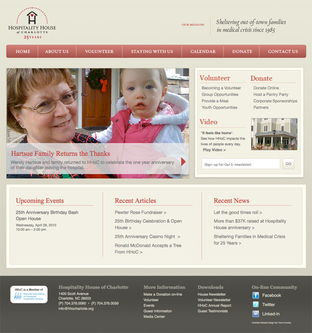
The new HHoC website establishes a firm foundation upon which the organization can build a dedicated following around its brand by engaging visitors with videos, news and articles that tell the story of Hospitality House in the greater context of the community it serves.
Turning passion into action
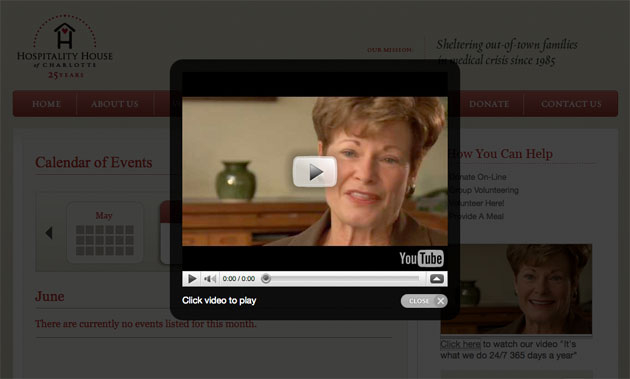
Throughout the site, compelling videos capture the passion at heart of the organization, with real people relating personal experiences in a genuine way that resonates with prospective donors and volunteers, creating a strong sense of urgency to act.
Making the connection
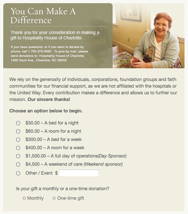
The donation module reinforces the mission of Hospitality House by associating the amount of each gift with the service it enables the organization to provide, making the impact of the contribution more tangible and meaningful for the donor.
Taking control
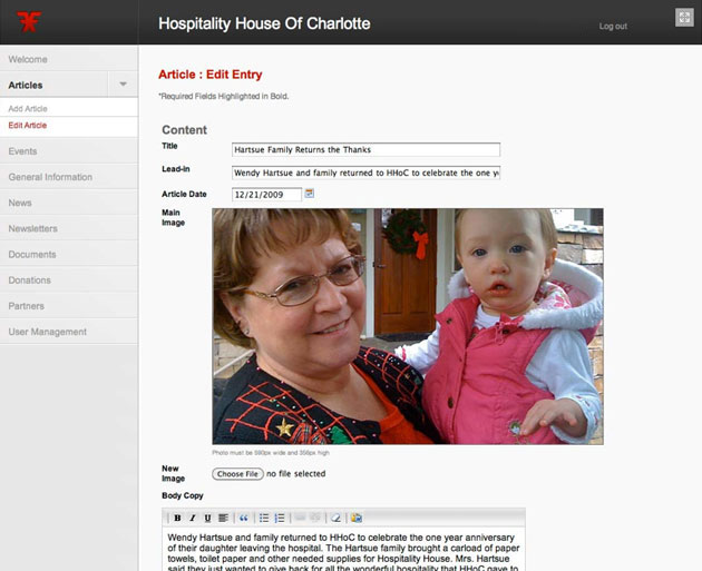
A critical aspect of community building is providing reasons for visitors to return to the site again and again by offering a constant stream of fresh content. Behind the scenes of the HHoC website is a powerful management system that puts the site to work for Hospitality House by allowing the organization to maximize its marketing and promotion efforts with a minimal investment of time.
To learn more about Hospitality House of Charlotte, visit http://www.hospitalityhouseofcharlotte.org.
Great authors are defined by their ability to set fire to the written word. All too often in today's digital information age, that creative spark is stifled, leaving the Web littered with content that is lifeless and ineffectual. Fame Foundry's Author has made it his mission to revive the act of writing as an art form, harnessing the power of language to command attention and ignite a following. It's the difference between telling a story and building a legend.