Going the Distance: Four Ways to Build a Better Customer Loyalty Program for Your Brand
December 2016
By Kimberly Barnes
 It’s easy enough for a customer to join your loyalty program, especially when you’re offering an incentive such as discounts. All your customer has to do is give out some basic information, and voila! They’re in the fold, a brand new loyalty member with your company. From there, it’s happily ever after. You offer the perks; they stand solidly by you, bringing you their continued business. Simple. Or is it? In reality, just how many of those customers are act ively participating in your loyalty program? Do you know? Sure, loyalty program memberships are on the rise according to market research company eMarketer, having jumped 25 percent in the space of just two years. However, that figure may be a bit misleading. The truth is that, while loyalty program sign-ups may be more numerous, active participation in such programs is actually in decline. At the time of the study, the average US household had memberships in 29 loyalty programs; yet consumers were only active in 12 of those. That’s just 41 percent. And even that meager figure represents a drop of 2 percentage points per year over each of the preceding four years, according to a study by loyalty-marketing research company COLLOQUY.
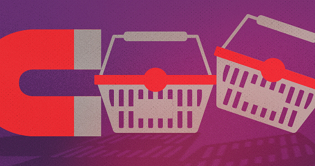
When discounts just aren’t enough
So what’s a brand to do? How can you make your loyalty program worth your customer’s while—as well as your own? After all, gaining a new loyalty member doesn’t mean much if your customer isn’t actively participating in your program. Consider this: Does your customer loyalty program offer members anything different from what your competitors are offering? Chances are your program includes discounts. That’s a given. And what customer doesn’t appreciate a good discount? But when every other company out there is providing this staple benefit in comparable amounts, it becomes less and less likely that customers will remain loyal to any one particular brand. Frankly, it’s all too easy for customers to get lost in a sea of loyalty member discounts. They’re everywhere. In fact, just under half of internet users perceive that all rewards programs are alike, according to a 2015 eMarketer survey. The key to success, then, is to differentiate your business from the crowd. If you can offer your customers something unique and valuable beyond the usual discount, chances are they’ll be more likely to stick with your brand. Here’s some inspiration from companies who get it.
Virgin: Reward more purchases with more benefits.
That’s not to say you need to get rid of discounts entirely. In fact, nothing could be further from the truth. Customers still love a good discount. The goal is to be creative in terms of the loyalty perks you offer. Take the Virgin Atlantic Flying Club, for example. As part of its loyalty program, the airline allows members to earn miles and tier points. Members are inducted at the Club Red tier, from which they can move up to Club Silver and then Club Gold. Here, it’s not just a discount. It’s status. And people respond to feeling important, elite. Still, even where the rewards themselves are concerned, Virgin is motivating loyalty customers with some pretty attractive offers. At the Club Red tier, members earn flight miles and receive discounts on rental cars, airport parking, hotels and holiday flights. But as members rise in tiers, they get even more. At the Club Silver tier, members earn 50 percent more points on flights, access to expedited check-in, and priority standby seating. And once they reach the top, Club Gold members receive double miles, priority boarding and access to exclusive clubhouses where they can get a drink or a massage before their flight. Now that’s some serious incentive to keep coming back for more. Discounts are still part of the equation – but they are designed with innovation and personal value in mind, elevating them to more than just savings.
Amazon Prime: Pay upfront and become a VIP.
What if your customers only had to pay a one-time upfront fee to get a year’s worth of substantial benefits? It may not sound like the smartest business idea at first glance. But take a closer look. Amazon Prime users pay a nominal $99 a year to gain free, two-day shipping on millions of products with no minimum purchase. And that’s just one benefit of going Prime. It’s true that Amazon loses $1-2 billion a year on Prime. This comes as no surprise given the incredible value the program offers. But get this: Amazon makes up for its losses in markedly higher transaction frequency. Specifically, Prime members spend an average of $1,500 a year on Amazon.com, compared with $625 spent by non-Prime users, a ccording to a 2015 report from Consumer Intelligence Research Partners.
Patagonia: Cater to customer values.
Sometimes, the draw for consumers isn’t saving money or getting a great deal. The eco-friendly outdoor clothing company Patagonia figured this out back in 2011, when it partnered with eBay to launch its Common Threads Initiative: a program that allows customers to resell their used Patagonia clothing via the company’s website. Why is this program important to customers? And how does it benefit Patagonia? The company’s brand embraces environmental and social responsibility, so it was only fitting that they create a platform for essentially recycling old clothing rather than merely throwing it away. The Common Threads Initiative helps Patagonia build a memorable brand and fierce loyalty by offering its customers a cause that aligns with deep personal values. OK, so their customers get to make a little money, too. Everybody wins.
American Airlines: Gamify your loyalty program.
If you’re going to offer your customers a loyalty program, why not make it f un? After all, engagement is key to building a strong relationship with your customer. And what better way to achieve that goal than making a game of it. American Airlines had this very thing in mind when it created its AAdvantage Passport Challenge following its merger with USAirways. The goal: find a new way to engage customers as big changes were underway. Using a custom Facebook application, American Airlines created a virtual passport to increase brand awareness while offering members a chance to earn bonus points. Customers earned these rewards through a variety of game-like activities, from answering trivia questions to tracking travel through a personalized dashboard. In the end, participants earned more than 70 percent more stamps than expected – and the airline saw a ROI of more than 500 percent. The takeaway: people like games.
Stand out from the crowd.
Your approach to your customer loyalty program should align with your overall marketing approach. Effective branding is about standing out, not blending it. Being memorable is key. To this end, keep in mind that loyalty programs are no longer a novelty. That means that yesterday’s strategies won’t work moving forward, so look for ways to rise above the noise, setting yourself apart from the cloying drone of countless other cookie-cutter programs.
Kimberly Barnes is a digital marketing specialist turned freelance writer born back when Apple was called “Apple Macintosh,” floppy disks were actually floppy, and #2 pencils were the best way to rewind unraveled cassette tapes. Most days you'll find her summoning her muse while drinking a non-coffee beverage in Starbucks.