We are the digital agency
crafting brand experiences
for the modern audience.
We are Fame Foundry.

See our work. Read the Fame Foundry magazine.

We love our clients.

Fame Foundry seeks out bold brands that wish to engage their public in sincere, evocative ways.


WorkWeb DesignSportsEvents

Platforms for racing in the 21st century.

Fame Foundry puts the racing experience in front of millions of fans, steering motorsports to the modern age.

“Fame Foundry created something never seen before, allowing members to interact in new ways and providing them a central location to call their own. It also provides more value to our sponsors than we have ever had before.”

—Ryan Newman

Technology on the track.

Providing more than just web software, our management systems enhance and reinforce a variety of services by different racing organizations which work to evolve the speed, efficiency, and safety measures, aiding their process from lab to checkered flag.

WorkWeb DesignRetail

Setting the pace across 44 states.

With over 1100 locations, thousands of products, and millions of transactions, Shoe Show creates a substantial retail footprint in shoe sales.

The sole of superior choice.

With over 1100 locations, thousands of products, and millions of transactions, Shoe Show creates a substantial retail footprint in shoe sales.

WorkWeb DesignRetail

The contemporary online pharmacy.

Medichest sets a new standard, bringing the boutique experience to the drug store.

Integrated & Automated Marketing System

All the extensive opportunities for public engagement are made easily definable and effortlessly automated.

Scheduled promotions, sales, and campaigns, all precisely targeted for specific demographics within the whole of the Medichest audience.

WorkWeb DesignSocial

Home Design & Decor Magazine offers readers superior content on designer home trends on any device.


  • By selectively curating the very best from their individual markets, each localized catalog comes to exhibit the trending, pertinent visual flavors specific to each region.


  • Beside the swaths of inspirational home photography spreads, Home Design & Decor provides exhaustive articles and advice by proven professionals in home design.


  • The art of home ingenuity always dances between the timeless and the experimental. The very best in these intersecting principles offer consistent sources of modern innovation.

WorkWeb DesignSocial

  • Post a need on behalf of yourself, a family member or your community group, whether you need volunteers or funds to support your cause.


  • Search by location, expertise and date, and connect with people in your very own community who need your time and talents.


  • Start your own Neighborhood or Group Page and create a virtual hub where you can connect and converse about the things that matter most to you.

775 Boost email open rates by 152 percent

Use your customers’ behavior to your advantage.

452 Marketing Minute Rewind: The new rules and the new rulers

Over the past few months, we've covered a lot of ground here on The Fame Foundry Marketing Minute. Now it's time to rewind and review our top five episodes of the quarter. First up, we reveal why ruling your market begins with bowing to the new ruler

774 Feelings are viral

Feelings are the key to fueling likes, comments and shares.

June 2021
Noted By Joe Bauldoff

The Making and Maintenance of our Open Source Infrastructure

In this video, Nadia Eghbal, author of “Working in Public”, discusses the potential of open source developer communities, and looks for ways to reframe the significance of software stewardship in light of how the march of time constantly and inevitably works to pull these valuable resources back into entropy and obsolescence. Presented by the Long Now Foundation.
Watch on YouTube

March 2010
By The Author

Jacob Gube: Simplifying the Formula for Success

The mastermind behind Six Revisions shares his philosophy on the importance of pragmatism, purpose and passion.
Read the article

Jacob Gube: Simplifying the Formula for Success

Six Revisions The secret to the success of Six Revisions is, in fact, not a secret at all. They have a singular purpose – providing “Useful Information for Web Developers & Designers” – and they serve it relentlessly. This straightforward, no-frills approach with an emphasis on quality, comprehensiveness and usefulness is exactly what drives the popularity of Six Revisions. The site has cemented its reputation among the development and design community for publishing consistently exceptional content written by talented professionals who not only practice but have a true passion for their craft. Recently Fame Foundry had the opportunity to talk with Jacob Gube, Six Revisions’ founder and chief editor, about what it takes to build a community around content, what he’s learned along the way and what lies ahead for the Web and web development. FAME FOUNDRY: Please tell us a bit about your professional background. How did you get your start as a web developer? JACOB GUBE: I got started as a web developer by doing freelance graphic design work. It was something that just fell into my lap. Companies that I did design work for frequently also needed a website, and they’d often ask me, “Do you know someone who can get a website up for us?” Not wanting to miss out on an opportunity, I’d say, “I’ll give it a shot!” And that’s how I got my start. FAME FOUNDRY: What was your first big web development project? JACOB GUBE: In terms of scope, the first big web development project I had was for a company called Eclipse Window Tinting. They offered car window-tinting services and wanted a Web presence as a way to drive traffic to their store. The site had a MySQL database for providing estimates based on car make and model, year and window tint type with a simple web app that calculated the price. It also featured an image gallery of cars they’d tinted using the original Lightbox script to open large-scale images inside a modal window after clicking on its thumbnail, which was still pretty fresh and new at the time. FAME FOUNDRY: What do you love about web development? Is there anything about it that you don’t enjoy? JACOB GUBE: I love the idea of being able to reach people who have an Internet connection with the products that we create. It doesn’t matter whether they’re just next door or thousands of miles away, they will still be able to interface and use the things we make. I can’t think of one thing that I don’t enjoy about web development. Maybe supporting old browsers like IE6, which can be frustrating at times. FAME FOUNDRY: How did Six Revisions come into existence? JACOB GUBE: It came into existence on a whim. I was just coming off a failed start-up for a blog that would discuss news and reviews of technology gadgets – sort of like Engadget. It failed because we didn’t really have a passion for the subject, so producing content was difficult. That experience taught me one of the biggest lessons I’ve learned about business: in order to be a successful entrepreneur, you have to believe in and have passion for your product. I started Six Revisions a few weeks after that experience. I just woke up one day itching to start a blog. I asked myself, “What am I really good at? What can I write about and never be bored of?” By the end of that day, I had a site about web development and design up and running, a domain name secured and my first post published. FAME FOUNDRY: What was your goal when you started out? Did you aim for this level of popularity, or did it begin as more of an outlet for your personal interests? JACOB GUBE: Six Revisions was never about popularity, subscribership, page views or profit margins. It was a personal side project – an outlet for me to share the things I learned while working as a professional web developer. I didn’t expect people would even read the site, but I guess they liked what I had to say and kept coming back. FAME FOUNDRY: What is the origin of the name? JACOB GUBE: In graphic design, you usually have rounds of revision after you produce a design for a client, so that’s where “Revisions” came from. Web developers and designers often have to go through these revision cycles as well. The number “Six” is arbitrary; it just sounded good to me at the time. I didn’t spend too much time picking out a name. I wanted a site up. FAME FOUNDRY: What were some of the influences that helped you shape the site? JACOB GUBE: I’d say, of course, the only real design blog out at the time, which was very popular then and still continues to be today, Smashing Magazine. My earlier work, though, was influenced greatly by Samuel Ryan’s Wake Up Later as well as Lifehacker. FAME FOUNDRY: How did you know that Six Revisions was going to be big? JACOB GUBE: I didn’t know Six Revisions was going to be big. I hadn’t anticipated for the growth, and I was ill-prepared. In the beginning, I had to move web servers five times in a span of maybe three months because the demand kept increasing, and no host could withstand the type of traffic the site was getting. That’s why my newest web start-up, Design Instruct, had a much longer planning phase and better infrastructure that scales as the demand goes up. Design Instruct is the fruit of my two years of experience with Six Revisions. Couple that with an amazing business partner, my brother Isaac Gube, and we’ve witnessed growth much faster than Six Revisions. Design Instruct screenshot FAME FOUNDRY: Was there any one moment or event that you attribute as your “big break”? JACOB GUBE: Our big break was being featured on Digg for the first time. That took our traffic and subscribership from basically zero to a very sizable amount. If I were to pick one single catalyst that took Six Revisions from a hobby to a company, it’d be the Digg community. You can see how much I value Digg by looking at the layout of each post: the Digg button is the first thing you see on an article. FAME FOUNDRY: How long did you wait for that first break? JACOB GUBE:: I’d say I had to wait maybe one or two months. FAME FOUNDRY: Did you ever get impatient or doubt your chances of success in the process? JACOB GUBE: Here’s the thing: I never really had any goals or milestones that I needed to meet. I don’t think I have them now. To me, when you build a product, all you have to do is work hard on it and let your passion show, and the rest will take care of itself. I didn’t get impatient or doubt my chances because I had no aspirations to be successful. FAME FOUNDRY: You’ve said that you prefer to let things grow organically in order to allow for creativity and flexibility. How has this played out over the history of Six Revisions? JACOB GUBE: Letting things grow on their own has worked out really well for me. When you have your five-year goal-setting, your meetings about meetings, your team-building exercises and your drawn-out private beta testing, you’re wasting the time that you could be spending on making your product better. To me, building a website or web app is simple: You do it. Your users tell you what you need to work on, and you do that. This mentality has played out very well with both Six Revisions and Design Instruct because when you start with a blank slate, you let your users shape your website. Any other development philosophy besides that is guesswork. FAME FOUNDRY: What happens behind the scenes at Six Revisions? What is a typical day for you? JACOB GUBE: I dedicate most of my time to the readers and the authors, both of which are what make the website what it is. The rest of the time is spent on making sure the site is running properly. A typical day for me begins early in the morning because that’s when I’m most productive. I do most of the creative work in the morning because I’m a morning person. Little time is spent on doing anything else: I’ll quickly scan my inbox to see if there are any pressing e-mails that need my attention and respond to those. Usually, e-mails that I respond to in the morning are from authors or readers. When my productivity and creativity are waning in the late afternoon, I do the administrative work – answering e-mails that I missed in the morning, accounting, site maintenance – all the tasks that you’d consider “boring.” FAME FOUNDRY: What are some of the challenges you see in running and growing an online magazine? JACOB GUBE: The biggest challenge will always be the lack of time. There are many things you need to do but very little time to do them. You need to move quickly and make speedy decisions or else you miss your window of opportunity. FAME FOUNDRY: Six Revisions has earned a reputation for great content. Where do you draw your inspiration from, and how do you channel that inspiration into content that is in demand among the design and development community? JACOB GUBE: I get a lot of inspiration from just making websites. Many of the posts I write were inspired directly by something I was working on that day. For example, my post about clean and simple websites was inspired by working on the design for Design Instruct. I feel that I have a good grasp on what designers and developers like because I am one, so I’m able to channel that inspiration into content that people enjoy reading. FAME FOUNDRY: Is good content hard to come by? JACOB GUBE: Good content is very hard to come by, especially in the field of web design and development. That’s because being a great web developer or designer and being a great writer don’t often come in one package. So when you find people who can do both, you try and hold onto them. FAME FOUNDRY: What do you look for in good content for Six Revisions? JACOB GUBE: My definition of good content is that which is well-articulated, provides solid arguments and is written by someone who’s actually done the thing they’re talking about. When you’re inexperienced about the subject you’re writing about, it’ll show. You can spend a lot of time researching a subject, but unless you’ve actually done it, you won’t be able to write about it as well as someone who has. FAME FOUNDRY: For those aspiring to use great content to create a community around their brand, what advice would you give? JACOB GUBE: You have to start publishing great content in order to get more great content. It’s the only way you’ll attract talented writers. When they see that you’re publishing great stuff, they will want to be a part of that. FAME FOUNDRY: You’re well-known for your affinity for minimalism – a philosophy that is as apparent in your site as in your personal workspace. Do you feel this helps you from an organizational standpoint, a creative standpoint or both? JACOB GUBE: Minimalism helps me in many aspects of my work and personal life. To me, a cluttered surrounding clouds your mind. You may not know it, but you might be feeling stressed or stifled because there’s so much stuff around you. When you live a life based not on how much stuff you have, but rather on how little stuff you have, you’ll find that you have more time to spend on things that really matter. From an organizational standpoint, you don’t have a lot of stuff to organize to start with, so it’s easy to keep things in check. From a creative perspective, when you’re comfortable and you’re not bogged down by “stuff” in your environment, you can output some pretty cool work. FAME FOUNDRY: Are you still active in web development, or is your time completely dedicated to the magazine? JACOB GUBE: I’m very active in web development. I wouldn’t be able to write about it effectively unless I was. FAME FOUNDRY: How do you see the Web evolving in the next few years? JACOB GUBE: In the next few years, I’m willing to wager that you’ll see simpler and cleaner designs. I think everyone’s had enough of the loud and bright-colored, 20-large-buttons-in-your-face web designs, so there will be a shift towards simplicity, cleanliness, and more thought-out user interfaces. FAME FOUNDRY: How do you see web development evolving with mobile platforms and the iPad? JACOB GUBE: I think the mobile web development industry is beginning to pick up. More and more web developers are thinking about engineering stuff for portability and mobility. That’s partly why I think simplicity will win in the next few years. Because of the current limitations of infrastructures, mobile designs need to be lightweight. They also need to be simple because the interface is limited by the controls and screen size. FAME FOUNDRY: What are your future plans for Six Revisions? JACOB GUBE: My only plan for Six Revisions is to continue the tradition of publishing great content written by great people. That’s my one and only recipe for growth and success. Eliza MetzAs the founder and chief editor of Six Revisions, co-founder and technical editor of Design Instruct and author of MooTools 1.2 Beginner’s Guide, Jacob Gube provides both inspiration and practical instruction to thousands of peers in the web design and development community. He’s also an active web developer and designer himself specializing in front-end and PHP development – work that fuels the success of his blogs as the source of content enriched by his depth of experience. Follow Jacob on Twitter @sixrevisions.
November 2015
By Jeremy Girard

Six Lessons from the Google School of Logo Design for a Digital World

Whether you love or hate Google’s new logo, you will do well to take heed of what it portends for how brand identities must evolve in today’s multi-screen, multi-device world.
Read the article

Six Lessons from the Google School of Logo Design for a Digital World

artice_googlelogoschool-lg Recently, Google set the design world abuzz when they unveiled their new brand identity. Gone was the familiar, sophisticated serif font reminiscent of classic books and newspapers that rolled off the printing presses. In its place, a new mark that retains Google’s trademark rainbow of colors but with a new sans-serif typeface of the company’s own creation called “Product Sans.” Love it or hate it, Google’s reasoning behind their redesign and what they hope to achieve with this new logo offer some interesting insights that any company in today’s multi-screen, multi-device world should take into consideration.

1. Size matters.

In their article rolling out the redesign, Google cites the need to “create a scalable mark that could convey the feeling of the full logotype in constrained spaces” as one of the challenges that they wanted to address. The need to consider a variety of screen sizes has become incredibly important over the past few years with the growing adoption of small-screened devices – from mobile phones to wearables like smartwatches. The relatively tiny screens on these devices put space at a premium, and most brand marks that were created prior to the advent of these small screens struggle to adapt to a much smaller canvas. For a visual brand to be successful in today’s world, you must ensure that it can scale and adapt to work effectively on any screen size or device.

2. You must consider the whole ecosystem.

In the not-too-distant past, when designing a new visual identity, there were only a limited number of applications that had to be taken into consideration: business cards, letterhead, signage, collateral materials, ads, product packaging, etc. This is why many early websites were little more than digital brochures. Companies took what they already understood (printed brochures) and tried to port them over to a brand new medium (the Web). This was obviously not an optimal solution, and since then, web design has come a long way from the days of static brochure sites. In much the same way, it’s time for logo design to evolve by taking into account the full array of digital platforms in which brands must reside today, including websites, mobile apps and social media sites, just to name a few. Taken as a whole, these make up a complex ecosystem with different channels that build upon and feed off of others. As a result, Google’s new identity takes the form not of a singular logo but of a system comprised of three “elemental states” that are flexible enough to be used across all mediums and platforms:elements
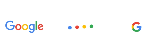
  • Google logotype: The sans serif logtype retains Google’s signature multi-color sequence.
  • Dots: A dynamic distillation of the logotype that takes the form of four animated, perpetually moving dots that are used for interactive, assistive and transitional moments.
  • Google G: A compact version of the Google logo that works in small contexts.
When evaluating your own logo and how it translates across different platforms and channels, it’s important to make sure that all of its elements and iterations work together seamlessly so that they feel connected to your core brand identity in order to protect the integrity of your brand throughout the ecosystem.

3. There’s more to logo design than choosing a typeface.

Talk to someone who does not understand the nuances of design, and they are likely to assume that the process of creating a logo is comprised of little more than selecting an attractive font and maybe adding an illustrated icon in front of it. In truth, however, logo design is its own unique and complex discipline. Just as Google did, any successful logo design process must consider the weight and legibility of that logo along with “spacing, clearance rules, and specification for in-product treatments.” It also must factor in big-picture thinking, such as how the logo will transform in various applications (when it must be displayed in black and white versus full color, for example) and whether it sets the right tone for the brand. Yes, using attractive letterforms is part of designing a quality logo, but this process goes way deeper than just font selection.

4. Performance matters.

How quickly a website loads is more important today than ever before. With mobile devices making up a larger and larger percentage of website traffic, and with emerging countries becoming an important part of the audience on the Web, the need to create sites that load quickly for all users is paramount. To accomplish this, website designers must look for ways to streamline a site’s overall file size. The new Google logo is only 305 bytes, which is a significant decrease from the old logo, which weighed in at ~14,000 bytes. Google actually had to deliver a text-based, non-image version of their old logo in some instances, but the new one is so small that it can be delivered to all connections, keeping the brand identity consistent. Overall performance is critical to the success of a website – after all, no one ever complains that a site loads too fast. You may not be thinking about download size and performance when creating a logo, but you should be, because improved performance should be a thread that runs through every decision you make on your website. Better performance can mean happier visitors, improved search engine rankings and better conversions rates for your website.

5. You can’t please everyone.

As soon as the new Google logo debuted, there were people praising the design as well as those tearing it down. Even within the design community, reactions on Twitter ranged from “The beautiful balance of utility and joy” to “I love the font in the new Google logo – a revival of Paul Renner’s rarely seen 1934 masterpiece, Futura Jackas” – proof that no matter how well-reasoned or well-intentioned the principles behind your design are, you simply cannot please everyone. One of the most challenging realities of a redesign, whether it is for a logo, a website or an application, is that you are forcing change upon people who did not ask for or expect it. Even if the change is for the better, it’s human nature to favor the familiar and therefore to react strangely to a change that they did not initiate themselves. Couple this with the fact that people are more likely to contact you when they dislike something than when they like it, and a redesign can quickly generate what feels like an overwhelming amount of negative comments. For some companies, this initial wave of critical feedback can be scary and may lead to the temptation to revert back to the old design. But you cannot give into this! If you followed a good process and if the new design is well thought-out and executed, you need to give it time for people to grow accustomed to it and embrace it. You cannot please everyone, but given ample time, you will find that a quality redesign will win people over, and all of those detractors will fall silent.

6. Redesign for the right reasons.

Because introducing a new visual identity can be disorienting for your customers, and because there’s no purely scientific method to ensure your redesign will be well received, it’s important to make sure that there is good reason behind your decision to reinvent the look of your brand. With Google, the logic behind their decision was clear: “Since its inception, the Google.com homepage has been strikingly simple: The quirky, multicolored logo sits above a single, approachable input field on a clean white canvas. But as technology moves forward, the canvas itself is changing, and the inputs and needs are becoming more diverse. New classes of devices and ways to interact and communicate have emerged with wearables, voice technology, and smart devices in the world around us. Users now engage with Google using a constellation of devices, and our brand should express the same simplicity and delight they expect from our homepage, while fully embracing the opportunities offered by each new device and surface.” In short, Google needed a new identity that would represent the brand as effectively to someone who is typing keywords into a search bar on a desktop as one who is using a smartwatch as one who is using a device that may not yet even be conceived – or at least available to the general public. Likewise, while you should never redesign your company’s logo just for the sake of redesign itself, if your brand has evolved since your logo was originally conceived – whether in terms of the products you offer, the audience you serve or the channels and platforms through which they interact with your brand – it may well be worth the risk to introduce a new, modernized identity that will support the growth of your company now and for many years to come.