We are the digital agency
crafting brand experiences
for the modern audience.
We are Fame Foundry.

See our work. Read the Fame Foundry magazine.

We love our clients.

Fame Foundry seeks out bold brands that wish to engage their public in sincere, evocative ways.


WorkWeb DesignSportsEvents

Platforms for racing in the 21st century.

Fame Foundry puts the racing experience in front of millions of fans, steering motorsports to the modern age.

“Fame Foundry created something never seen before, allowing members to interact in new ways and providing them a central location to call their own. It also provides more value to our sponsors than we have ever had before.”

—Ryan Newman

Technology on the track.

Providing more than just web software, our management systems enhance and reinforce a variety of services by different racing organizations which work to evolve the speed, efficiency, and safety measures, aiding their process from lab to checkered flag.

WorkWeb DesignRetail

Setting the pace across 44 states.

With over 1100 locations, thousands of products, and millions of transactions, Shoe Show creates a substantial retail footprint in shoe sales.

The sole of superior choice.

With over 1100 locations, thousands of products, and millions of transactions, Shoe Show creates a substantial retail footprint in shoe sales.

WorkWeb DesignRetail

The contemporary online pharmacy.

Medichest sets a new standard, bringing the boutique experience to the drug store.

Integrated & Automated Marketing System

All the extensive opportunities for public engagement are made easily definable and effortlessly automated.

Scheduled promotions, sales, and campaigns, all precisely targeted for specific demographics within the whole of the Medichest audience.

WorkWeb DesignSocial

Home Design & Decor Magazine offers readers superior content on designer home trends on any device.


  • By selectively curating the very best from their individual markets, each localized catalog comes to exhibit the trending, pertinent visual flavors specific to each region.


  • Beside the swaths of inspirational home photography spreads, Home Design & Decor provides exhaustive articles and advice by proven professionals in home design.


  • The art of home ingenuity always dances between the timeless and the experimental. The very best in these intersecting principles offer consistent sources of modern innovation.

WorkWeb DesignSocial

  • Post a need on behalf of yourself, a family member or your community group, whether you need volunteers or funds to support your cause.


  • Search by location, expertise and date, and connect with people in your very own community who need your time and talents.


  • Start your own Neighborhood or Group Page and create a virtual hub where you can connect and converse about the things that matter most to you.

June 2021
Noted By Joe Bauldoff

The Making and Maintenance of our Open Source Infrastructure

In this video, Nadia Eghbal, author of “Working in Public”, discusses the potential of open source developer communities, and looks for ways to reframe the significance of software stewardship in light of how the march of time constantly and inevitably works to pull these valuable resources back into entropy and obsolescence. Presented by the Long Now Foundation.
Watch on YouTube

094 - The value and cost of words

When it comes to developing the content for your website, it's important to understand the value of each and every word as well

775 Boost email open rates by 152 percent

Use your customers’ behavior to your advantage.

774 Feelings are viral

Feelings are the key to fueling likes, comments and shares.

December 2014
By Jeremy Girard

Another Google Game-Changer: How Going Mobile Friendly Will Boost Your Search Visibility

Google’s latest announcement means that if you want to compete successfully for mobile search traffic, your site must cater to the needs of mobile users.
Read the article

Another Google Game-Changer: How Going Mobile Friendly Will Boost Your Search Visibility

From Panda to Penguin to Hummingbird, Google has rolled out a series of major changes to its ranking algorithms over the past three years that have sent major shockwaves echoing through world of SEO.

While its latest announcement hasn’t been met with the same level of fanfare as these previous updates, it heralds an important turning of the tides in the future of search and signals to any business that depends on web traffic that the time has arrived to pay heed and take action.

So what is this latest game-changer from Google? In an article released November 18 entitled “Helping Users Find Mobile-Friendly Pages”, the search giant announced that it is now adding an eye-catching “mobile-friendly” label in front of its mobile search results.

sushi-mobile

How does Google define mobile friendly? According to the article, a page is eligible for the “mobile-friendly” label if it meets the following criteria as detected by Googlebot:

  • Avoids software that is not common on mobile devices, like Flash
  • Uses text that is readable without zooming
  • Sizes content to the screen so users don't have to scroll horizontally or zoom
  • Places links far enough apart so that the correct one can be easily tapped

Okay – so what's the big deal about mobile friendly?

On the surface, this may seem like a relatively minor aesthetic enhancement to Google’s search results pages. However, it’s the reasoning driving this modification that portends even bigger changes ahead. In Google’s own words:

“Have you ever tapped on a Google Search result on your mobile phone, only to find yourself looking at a page where the text was too small, the links were tiny, and you had to scroll sideways to see all the content? This usually happens when the website has not been optimized to be viewed on a mobile phone…We see these labels as a first step in helping mobile users to have a better mobile web experience.”

It’s those last few words – “a first step in helping mobile users to have a better mobile web experience” – that should prompt smart marketers, SEOs and webmasters to sit up and pay attention. While Google has long recommended the use of responsive web design for mobile device support, they are now taking proactive steps to draw attention to those sites that deliver an optimal mobile browsing experience in order to ensure that they are providing the best search results for mobile users.

What this means for you is simple: if your site is not yet optimized for mobile devices, now is the time to change that!

Will “mobile-friendly” sites receive higher ranking on search results pages?

As you can see from the example above, the new “mobile-friendly” label will certainly capture the attention of users searching on mobile devices over results listings that are not given the same designation. In that way, mobile-friendly sites will automatically receive a boost in visibility in mobile search results.

But the question on everyone’s mind is whether having a mobile-friendly site will actually affect where their listing is ranked on the search results page. The answer: quite likely. In the article, Google states that the labels are a “first step” in creating a better mobile web experience, but they also conclude by saying that they “are also experimenting with using the mobile-friendly criteria as a ranking signal.”

It has long been speculated that Google does, in fact, give extra weight to sites that offer quality multi-device support by employing a responsive design framework, but this statement is the first official acknowledgment of this practice. What this means is that in the months ahead, you may see websites that create an experience optimized for smaller-screen, touch-based devices start to climb the rankings over others that do not offer the same. Who knows – maybe Google will even start exclusively displaying mobile-friendly sites for mobile searchers, a move that could really shift the balance in favor of those that provide an optimal experience for mobile users!

If your company is searching for ways to rise above the competition and increase your exposure in search engine rankings, this could truly be a game-changing development – one that should absolutely be capitalized on immediately. Not only will optimizing your site for mobile improve the experience for a growing percentage of your users, but a responsive site is also very likely to be your ticket to improved Google rankings in the future while also earning you their new “mobile-friendly” designation today.

How do I get started?

Google offers a number of tools to help you determine whether or not your site is mobile friendly, starting with their “Mobile-Friendly Test.” Simply plug the URL for any page of your website into this tool, and if it fails the test, Google will offer some suggestions and recommended links to more information about how you can improve your site’s support for mobile users.

You can also use the Mobile Usability Report in Google Webmaster Tools, which highlights major mobile usability issues across your entire site, not just one page.

These tools are a good start, but there is a difference between “mobile friendly” and “mobile optimized.” A site that scales down to better display on small-screen devices and features navigational links that are easily usable on those mobile devices is “friendly”, but there are many other considerations that go into creating a site that provides a truly optimized experience for users on those devices. If your site fails the Google tests, evaluate the suggestions they offer and also be sure to speak to your web design firm about how best to address mobile device support on your site.

The bad news

So optimizing your site for mobile is going be awesome, right? It will improve the user experience for many of your customers, and now that Google is taking a firm stand on this issue, mobile optimization can actually mean greater visibility in search and improved rankings. Those are great reasons to jump aboard the responsive bandwagon, but the bad news is that making a site responsive is no small task.

Responsive web design is not a feature you can simply tack on to an existing site, especially one that is quite old and outdated. Responsive design often requires rethinking how a site’s content is presented, and it almost always involves rebuilding your site from the framework up. This means that to make your site truly mobile ready, you may be looking at a complete redesign.

As 2014 nears its end and 2015 is on the horizon, your company is likely in the midst of budgeting for the coming year, including planning your marketing expenses. Mobile optimization for your website, even if it will require a full site redesign, should be on your agenda because as Google has so clearly stated in their recent announcement, support for mobile devices is no longer just a nice-to-have luxury. Rather, to compete successfully on the Web of today and tomorrow, optimization for mobile devices is an essential element.


October 2011
By The Architect

Check it Out: 10 Ways to Stop Shopping Cart Abandonment

What are the flaws in your checkout process costing you in lost sales?
Read the article

Check it Out: 10 Ways to Stop Shopping Cart Abandonment

It’s not over until the cash register rings

A customer has found your site, browsed your store and added several items to their cart. You’re home free, right? No so fast...until they’ve confirmed their purchase, you’re still at zero, and you still have plenty of opportunities to derail the sale. Fatal flaws in your checkout process can not only cost you the potential sale at hand but also drastically decrease the likelihood of that customer ever returning to your site to buy from you in the future. If you’re experiencing a high occurrence of shopping cart abandonment, here are 10 ways to fix the obstacles and annoyances that are driving away customers and crippling your conversion rates:

1. Eliminate all chance of unpleasant surprises.

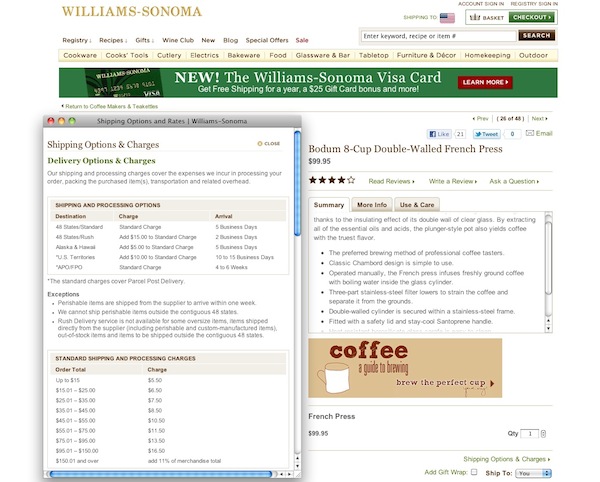
Make sure customers have all the information they need upfront to make a confident buying decision. This includes confirming the availability of the item; calculating promotional pricing or discounts; mapping out shipping options, costs and timetables; specifying whether or not sales tax applies to the purchase and clearly defining your return policy. Williams Sonoma shipping If a customer reaches checkout only to discover that the particular item they wanted is out of stock, ineligible for an advertised discount or costs more to ship than they are willing to pay, odds are good that will be the last you see of them.
2. Display relevant details in the cart.

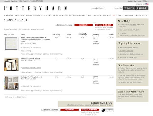
The shopping cart itself should provide a clear overview of the pending purchase at a glance so that customers do not have to navigate away from the checkout process to confirm the details of their order. Keep in mind that by this point in the process, your shopper may well have clicked to and from the cart numerous times as they selected multiple items, browsed various categories of products or compared one item to another, and they may be fuzzy on the specifics of everything they’ve chosen. Without the benefit of being able to glance down into a physical shopping cart to review their selections, they need reassurance that the package that lands on their doorstep will contain exactly what they intend, so be sure to provide thumbnail images, descriptions, quantities, sizes, colors, prices, availability and applicable discounts for each product in the cart. Pottery Barn shopping cart
3. Allow changes within the cart.

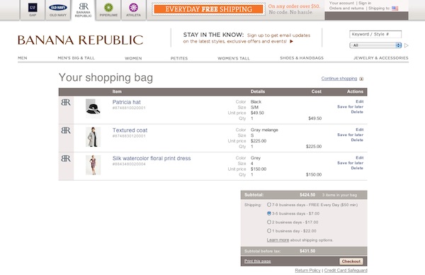
Every time your customer navigates away from the cart, you’re running the risk of losing them, so make sure that they can edit details such as quantity, size and color without having to locate the product page a second time. Banana Republic shopping cart
4. Offer multiple payment options.

If you’re conducting e-commerce business online, your site should be tied in to a secure payment gateway. However, offering the option to complete the transaction through a third-party processor like PayPal or Google Checkout can put some customers – especially those who may not shop online often – at ease because they don’t have to release their credit card number and billing information directly to you. Conversely, PayPal and Google Checkout shouldn’t be the only options you provide. If a customer does not already have an account established with one of these payment processors, they may not want to create one just to do business with you.

5. Don’t require customers to create an account.

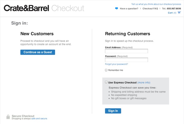
Without a doubt, it’s awfully tempting to require customers to create an account to complete their purchase because it will allow you to collect valuable data from them for future sales analysis and marketing. However, given the sheer number of social media and e-commerce sites that your customers likely interact with, they may very well have account creation fatigue. They may not want to establish yet another user account and password just to make a purchase, especially if they don’t necessarily anticipate ordering from you again in the near future. The best approach is to offer two options: checking out as a guest, which will expedite the process, or creating an account, which offers conveniences appealing to those who do shop with you often, such as eliminating the need to re-enter their shipping and billing information every time they make a purchase and allowing them to check on the status of an order. Crate & Barrel checkout The key is to let your customer make the choice that suits them best; don’t force the issue and lose a sure sale in pursuit of future marketing opportunities.
6. Simplify and streamline.

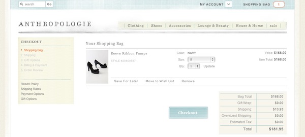
Online shoppers are notoriously impatient, so don’t ask for more information than you need to complete the transaction, and don’t break the checkout process into more steps than necessary. Make sure as well to display a breadcrumb trail that indicates how the checkout process will progress. If a customer can see at step one that they only have three steps left to complete their order, they won’t get impatient or frustrated as they move from one screen to the next, not knowing what’s coming next or when the process will be done. Anthropologie
7. Cater to the on-the-go shopper.

When evaluating your checkout process, don’t forget about mobile users. A customer may be standing in the bricks-and-mortar store of your competitor and comparison shopping on their phone. If you offer the better price, don’t you want to make it as easy as possible for this customer – who’s clearly ready to buy – to order from you on the spot instead? This is another reason why it’s critical to streamline the steps within your checkout process as much as possible as well as to ensure that form fields can be easily completed on touch-based devices. Walk through your checkout process on as many different types of mobile devices and platforms as you can get your hands on, and don’t waste any time in eliminating any obstacles or road blocks that you discover.

8. Don’t give up too soon.

In the age of multitasking, sometimes a customer will simply get distracted before they have a chance to complete their transaction. The phone rings, the baby wakes up from her nap, the computer freezes, the pizza delivery guy arrives, etc. Or sometimes, they just need some extra time to make a decision while they continue to do research, get opinions from friends and the like. While you can’t do anything to mitigate this type of offline interference, you still have a chance to save the sale. A persistent shopping cart retains the items your customer has selected for a set period of time, whether that’s a few hours or a few days. When your customer has a chance to return to their computer, they can pick up exactly where they left off rather than facing the hassle of tracking down each item again, even if they had closed their browser window.

9. Never underestimate the importance of the human element.

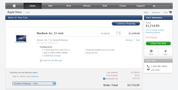
If your customer has a question as they are progressing through checkout, the easiest, most reliable way to ensure they don’t lose momentum is to display your customer service phone number prominently at every step along the way. Ask Apple A simple question should have a simple resolution, and usually that is best provided in real time by a human being. If you leave your customers to their own devices to find the answers they need, you’re running the risk of allowing them to become distracted or frustrated and losing all interest in completing the order.
10. Reinforce trust at every turn.

As with all elements of doing business online, trust is key. In the absence of face-to-face human contact, you must rely on your website to build trust for you if you want customers to choose to spend their hard-earned dollars with you rather than with your competitor. Some elements of trust-building in e-commerce are obvious. Do you display your SSL certificate to reinforce security? Do you feature customer testimonials or reviews to boost confidence in your reputation? Is it easy to locate your company’s phone number, physical address and return policies so they feel assured that they can resolve a problem or obtain a refund without hassle? Other elements are less tangible. Does your site have a polished, refined look and feel overall, or does it look dated or sketchy? Do you offer value-added content like how-to videos or blog articles that convey to your customers that they are doing business with experts who are knowledgeable and passionate about their products? Thanks to the proliferation of Internet scam artists, the burden of earning trust with online shoppers is steep, but it is surmountable with careful attention to detail.