We are the digital agency
crafting brand experiences
for the modern audience.
We are Fame Foundry.

See our work. Read the Fame Foundry magazine.

We love our clients.

Fame Foundry seeks out bold brands that wish to engage their public in sincere, evocative ways.


WorkWeb DesignSportsEvents

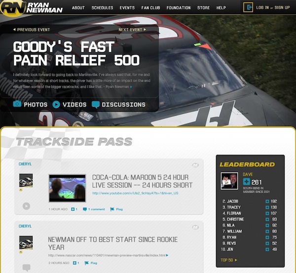
Platforms for racing in the 21st century.

Fame Foundry puts the racing experience in front of millions of fans, steering motorsports to the modern age.

“Fame Foundry created something never seen before, allowing members to interact in new ways and providing them a central location to call their own. It also provides more value to our sponsors than we have ever had before.”

—Ryan Newman

Technology on the track.

Providing more than just web software, our management systems enhance and reinforce a variety of services by different racing organizations which work to evolve the speed, efficiency, and safety measures, aiding their process from lab to checkered flag.

WorkWeb DesignRetail

Setting the pace across 44 states.

With over 1100 locations, thousands of products, and millions of transactions, Shoe Show creates a substantial retail footprint in shoe sales.

The sole of superior choice.

With over 1100 locations, thousands of products, and millions of transactions, Shoe Show creates a substantial retail footprint in shoe sales.

WorkWeb DesignRetail

The contemporary online pharmacy.

Medichest sets a new standard, bringing the boutique experience to the drug store.

Integrated & Automated Marketing System

All the extensive opportunities for public engagement are made easily definable and effortlessly automated.

Scheduled promotions, sales, and campaigns, all precisely targeted for specific demographics within the whole of the Medichest audience.

WorkWeb DesignSocial

Home Design & Decor Magazine offers readers superior content on designer home trends on any device.


  • By selectively curating the very best from their individual markets, each localized catalog comes to exhibit the trending, pertinent visual flavors specific to each region.


  • Beside the swaths of inspirational home photography spreads, Home Design & Decor provides exhaustive articles and advice by proven professionals in home design.


  • The art of home ingenuity always dances between the timeless and the experimental. The very best in these intersecting principles offer consistent sources of modern innovation.

WorkWeb DesignSocial

  • Post a need on behalf of yourself, a family member or your community group, whether you need volunteers or funds to support your cause.


  • Search by location, expertise and date, and connect with people in your very own community who need your time and talents.


  • Start your own Neighborhood or Group Page and create a virtual hub where you can connect and converse about the things that matter most to you.

775 Boost email open rates by 152 percent

Use your customers’ behavior to your advantage.

202 Being your own boss

Are you truly prepared to be your own boss, or will you only become your own worst enemy?

December 2016
By Kimberly Barnes

Going the Distance: Four Ways to Build a Better Customer Loyalty Program for Your Brand

Loyalty programs are no longer a novelty. That means that yesterday’s strategies won’t work moving forward, so look for ways to rise above the noise, setting yourself apart from the cloying drone of countless other cookie-cutter programs.
Read the article

Going the Distance: Four Ways to Build a Better Customer Loyalty Program for Your Brand

article-thedistance-lg It’s easy enough for a customer to join your loyalty program, especially when you’re offering an incentive such as discounts. All your customer has to do is give out some basic information, and voila! They’re in the fold, a brand new loyalty member with your company. From there, it’s happily ever after. You offer the perks; they stand solidly by you, bringing you their continued business. Simple. Or is it? In reality, just how many of those customers are act ively participating in your loyalty program? Do you know? Sure, loyalty program memberships are on the rise according to market research company eMarketer, having jumped 25 percent in the space of just two years. However, that figure may be a bit misleading. The truth is that, while loyalty program sign-ups may be more numerous, active participation in such programs is actually in decline. At the time of the study, the average US household had memberships in 29 loyalty programs; yet consumers were only active in 12 of those. That’s just 41 percent. And even that meager figure represents a drop of 2 percentage points per year over each of the preceding four years, according to a study by loyalty-marketing research company COLLOQUY.

When discounts just aren’t enough

So what’s a brand to do? How can you make your loyalty program worth your customer’s while—as well as your own? After all, gaining a new loyalty member doesn’t mean much if your customer isn’t actively participating in your program. Consider this: Does your customer loyalty program offer members anything different from what your competitors are offering? Chances are your program includes discounts. That’s a given. And what customer doesn’t appreciate a good discount? But when every other company out there is providing this staple benefit in comparable amounts, it becomes less and less likely that customers will remain loyal to any one particular brand. Frankly, it’s all too easy for customers to get lost in a sea of loyalty member discounts. They’re everywhere. In fact, just under half of internet users perceive that all rewards programs are alike, according to a 2015 eMarketer survey. The key to success, then, is to differentiate your business from the crowd. If you can offer your customers something unique and valuable beyond the usual discount, chances are they’ll be more likely to stick with your brand. Here’s some inspiration from companies who get it.

Virgin: Reward more purchases with more benefits.

That’s not to say you need to get rid of discounts entirely. In fact, nothing could be further from the truth. Customers still love a good discount. The goal is to be creative in terms of the loyalty perks you offer. Take the Virgin Atlantic Flying Club, for example. As part of its loyalty program, the airline allows members to earn miles and tier points. Members are inducted at the Club Red tier, from which they can move up to Club Silver and then Club Gold. Here, it’s not just a discount. It’s status. And people respond to feeling important, elite. Still, even where the rewards themselves are concerned, Virgin is motivating loyalty customers with some pretty attractive offers. At the Club Red tier, members earn flight miles and receive discounts on rental cars, airport parking, hotels and holiday flights. But as members rise in tiers, they get even more. At the Club Silver tier, members earn 50 percent more points on flights, access to expedited check-in, and priority standby seating. And once they reach the top, Club Gold members receive double miles, priority boarding and access to exclusive clubhouses where they can get a drink or a massage before their flight. Now that’s some serious incentive to keep coming back for more. Discounts are still part of the equation – but they are designed with innovation and personal value in mind, elevating them to more than just savings.

Amazon Prime: Pay upfront and become a VIP.

What if your customers only had to pay a one-time upfront fee to get a year’s worth of substantial benefits? It may not sound like the smartest business idea at first glance. But take a closer look. Amazon Prime users pay a nominal $99 a year to gain free, two-day shipping on millions of products with no minimum purchase. And that’s just one benefit of going Prime. It’s true that Amazon loses $1-2 billion a year on Prime. This comes as no surprise given the incredible value the program offers. But get this: Amazon makes up for its losses in markedly higher transaction frequency. Specifically, Prime members spend an average of $1,500 a year on Amazon.com, compared with $625 spent by non-Prime users, a ccording to a 2015 report from Consumer Intelligence Research Partners.

Patagonia: Cater to customer values.

Sometimes, the draw for consumers isn’t saving money or getting a great deal. The eco-friendly outdoor clothing company Patagonia figured this out back in 2011, when it partnered with eBay to launch its Common Threads Initiative: a program that allows customers to resell their used Patagonia clothing via the company’s website. Why is this program important to customers? And how does it benefit Patagonia? The company’s brand embraces environmental and social responsibility, so it was only fitting that they create a platform for essentially recycling old clothing rather than merely throwing it away. The Common Threads Initiative helps Patagonia build a memorable brand and fierce loyalty by offering its customers a cause that aligns with deep personal values. OK, so their customers get to make a little money, too. Everybody wins.

American Airlines: Gamify your loyalty program.

If you’re going to offer your customers a loyalty program, why not make it f un? After all, engagement is key to building a strong relationship with your customer. And what better way to achieve that goal than making a game of it. American Airlines had this very thing in mind when it created its AAdvantage Passport Challenge following its merger with USAirways. The goal: find a new way to engage customers as big changes were underway. Using a custom Facebook application, American Airlines created a virtual passport to increase brand awareness while offering members a chance to earn bonus points. Customers earned these rewards through a variety of game-like activities, from answering trivia questions to tracking travel through a personalized dashboard. In the end, participants earned more than 70 percent more stamps than expected – and the airline saw a ROI of more than 500 percent. The takeaway: people like games.

Stand out from the crowd.

Your approach to your customer loyalty program should align with your overall marketing approach. Effective branding is about standing out, not blending it. Being memorable is key. To this end, keep in mind that loyalty programs are no longer a novelty. That means that yesterday’s strategies won’t work moving forward, so look for ways to rise above the noise, setting yourself apart from the cloying drone of countless other cookie-cutter programs.


June 2016
By Jeremy Girard

Small Changes, Big Impact: 5 Things You Can (and Should!) Do Today to Boost Your Website’s Performance

There’s no time like the present to implement these quick fixes and reap the rewards for months to come.
Read the article

Small Changes, Big Impact: 5 Things You Can (and Should!) Do Today to Boost Your Website’s Performance

artice-smallchanges-lg Every spring it happens like clockwork: the temperatures get warmer, the days get longer and everything in nature becomes more vibrant and colorful. Along with these changes in the great outdoors comes the irresistible urge to clean house and embrace a fresh start. Why not keep that motivational momentum going and apply it to your business – and, more specifically, to your website – as well? After all, there’s no time like the present to sweep away the old and outdated and bring in fresh new ideas and technologies. But you don’t necessarily need to dive head-first into a full redesign and all of the time and expense that entails to reap measurable results. Instead, here are five small steps you can – and should! – take today to ensure that your site is up-to-date, relevant and doing all it can to bring you new customers and grow the community around your brand:

1. Reposition your contact form.

For most website owners – especially those in service-based businesses such as law, accounting, consulting, real estate, etc. – the key “win” for their site is when it motivates a visitor to request more information or schedule a meeting. Contact forms are a ubiquitous website staple intended to provide a convenient – and highly measurable – avenue to initiate communication between an interested prospect and a company. However, perhaps because they are so commonplace, all too often these forms are given little strategic thought, resulting in a cookie-cutter name/email address/phone number format that yields more bogus spam submissions than legitimate new business opportunities. However, there is one simple change you can make that has been shown to get better results: reposition your standard “Contact us” form as an “Ask our experts” feature. By doing so, you shift the focus of the form to providing your visitors with an opportunity to submit a question that is specific to their needs and concerns. Rather than feeling like they are opening themselves up to an endless barrage of solicitation calls and emails, your visitors will sense that they are initiating a dialogue with an expert who will help them solve their particular problem. Make sure to respond to all inquiries within 24 hours, provide helpful advice that is free of charge and tailored to your prospect’s situation, and leave the door open to continue the conversation in a future meeting or phone call. By doing so, you will establish an important foundation of trust and confidence with your potential new client that will make them more inclined to engage your professional services. expert I have personally seen the submission rates on these types of forms increase dramatically. On one site where this small change was implemented, form submissions jumped from one or two per week to one or two per day – all legitimate business opportunities that were sparked simply by repositioning the focus of the form.

2. Productize your offering.

Another challenge that professional services organizations face in creating a website that works as an effective customer conversion engine is that they do not sell a specific product but rather a suite of services that can be customized to each client’s specific needs. This makes it terribly hard to market to visitors who come to their site and simply want to know “What exactly does this company sell, and how much does it cost?”. Because there are so many variables to the company’s offerings, there is not a quick and easy answer to these questions. If this challenge sounds familiar to you, one approach you can try is to “productize” what you have to offer. Create a bundle of services with a fixed price, and market that package on your site in a simple, straightforward manner that makes your offering easy to understand and helps visitors feel like doing business with your company is as simple as buying a product off the shelf at a store. package This is exactly what my company did with some of the technology consulting services that we offer. Instead of only listing the array of services we provide, we also created a product that representing a very specific offering. This made it so much easier to answer the “What do you sell?” question, and it gave us something tangible to promote in our marketing campaigns. In reality, this approach in no way limited the range of services we are able to offer our clients; rather, it merely served as a vehicle to open doors to new opportunities and made it easier to start conversations with new customers for whom we could ultimately provide a custom-tailored solution. Examine the services that you offer, and work with your marketing team to create an appealing package that you can market – understanding all the while that this “product” is really just a means for you to connect with customers and begin the sales process with something tangible that they can easily understand.

3. Lose your home page carousel.

One simple change that I have seen many websites make in the past year or so is to remove animated image carousels from their home pages. These carousels have long been a popular fixture of website design, but the reality is that they can sometimes do more harm than good. Home page carousels typically feature giant, screen-spanning images which carry with them heavy download requirements both for the images and for the scripts that power the animation sequences, thereby creating a potential stumbling block in performance for users on mobile devices or with slower connections. Additionally, studies have shown that click-through rates on animated carousels are extremely low, and they drop significantly from the first slide to the subsequent ones. This is why many companies are replacing rotating carousels with a singular static message instead. This one change can greatly reduce a page’s download size (when my company did this on our home page, its file size decreased by 75 percent) while having little to no effect on actual user engagement or click-through. In fact, because the page now loads more quickly, many sites actually see an uptick in user engagement because fewer people are abandoning a site due to poor performance. image Do you have a carousel on your website? If so, do you know whether or not it is working well for you? Your marketing team may be able to do some A/B testing between a version of your site with this animation feature and one without it to see which performs better. Since carousels do work well for some sites (like news organizations or sites with lots of frequently updated content), having this data can help you determine whether or not it’s time to ditch the carousel.

4. Update your image(s).

Stock photography is something of a necessary evil of website design, as more often than not, companies don’t have the budget to execute a full-fledged custom professional photo shoot. However, not all stock images are created equal. Stock photos that are overused or that look so obviously staged that they scream of their “stockiness” can cheapen a site’s design and leave visitors with a negative overall impression of the site. Replacing those images can make a big difference in a site’s visual appeal. If your site’s imagery is stale, you can make some simple image swaps to freshen it up. If you are going to change out old stock images for new stock images, make sure to seek out photos that feel fresh and that are not terribly overused (most stock photo sites will tell you how many times an image has been downloaded). An even better option is to try to add some unique imagery to your site. This could be photographs that you hire a professional to take or – in keeping with one of this year’s hottest trends – custom illustrations that you commission from an artist. illustration If your budget is tight, incorporating even just one or two such one-of-a-kind images in key spots on your site can really boost its visual impact. For instance, if you lose that aforementioned carousel on the home page and replace it with one truly compelling static image and message, it can make a really powerful first impression on your visitors.

5. Publish less.

Most experts agree that publishing original, value-add content on your site on a regular basis is key to optimizing its success – both from a sales and marketing standpoint and as an advantage in the never-ending battle of SEO. While I agree with this approach in principal, for many companies, the drive to publish regularly has resulted in putting out mediocre content simply to meet an inflexible standard of frequency. This is often an entirely counterproductive effort, as content that lacks in quality, original thought or value for the reader reflects poorly on the organization and its perceived level of expertise. Publishing original content to your site on a regular basis is still a best practice, but that content must offer value for it to succeed. Let’s say a visitor comes to your site and is impressed to find that you publish new articles weekly or monthly; however, once they click through the headline to see what they can glean from your writing, if what they find is mediocre at best, what motivation do they have to return to your site again in the future, let alone entrust you with their hard-earned dollars? If, on the other hand, you publish new content less frequently, but everything you produce is of the highest quality, then that same visitor will know that the time they spend on your site will always be worth their while, and they will look forward to the next time you post something new. Re-examine your current content marketing strategy, and ask yourself whether you are focused on quality or frequency. If it’s the latter, commit instead to writing less but to improving the quality of what you offer on your site. While this change may not have an immediate impact, it will absolutely yield long-term results that your visitors will appreciate and respond positively to.

In closing

Eventually, your website will need a redesign, but in the meantime you can make small, strategic, surgical changes that will pay immediate dividends in your site’s success. This approach of implementing gradual but regular modifications will also benefit you when it does come time for that full redesign. By making intelligent improvements over time, you will ultimately be closer to your end goal, leaving less to accomplish with the redesign and thereby paving the way for a smoother and less costly project.
April 2011
By JoAnne Laffey Heckman

Eight Steps to Conquering Local Media

No matter the size of your business or the scope of your target market, never underestimate the power of local press to build trust and boost visibility.
Read the article

Eight Steps to Conquering Local Media

go-local Anyone charged with the task of growing a business salivates at the idea of landing in the national media spotlight. The lure of the massive exposure that just one mention on CNN, Good Morning America or Oprah or in the pages of Bloomberg Businessweek or USA Today delivers is the driving force behind many PR campaigns. However, it's important to remember that the cardinal rule of real estate also applies to media relations: location, location, location. Of course your potential customers are tuned in to news from the national players. But these customers also exist as members of their local communities. They live locally, shop locally and do business locally. They also read, listen to and watch local media outlets. No matter the size of your business or the scope of your target market, it's critical to develop a systematic approach to leveraging local media. That's why no matter the size of your business or the scope of your target market, it's critical to develop a systematic approach to leveraging local media outlets to increase awareness, build trust in your brand and boost sales. But if you want to make an impact, you must get strategic. Even at the local level, the competition is stiff for airtime and column inches. Here are the fundamentals of breaking through the clutter and conquering the local media markets where you do business.

1. Do your homework.

Every market offers a wealth of opportunities for media coverage. Make it your mission to uncover all of the outlets available to you in each market and then narrow your hit list according to the demographics of your target market and their media consumption preferences. For print media, you'll want to identify the major daily newspaper as well as smaller suburban weeklies and specialty publications that serve niche audiences like parents, women and retirees. Even the humble neighborhood association newsletter can be a valuable tool for showcasing your expertise or increasing awareness of your services. On the broadcast side, local television news programs are a given, but don't forget about local daily or weekly radio and TV talk shows, which often have strong loyal followings. Morning and afternoon drive shows in particular attract a huge number of listeners during the daily commute. Locally produced call-in and talk radio can also be ideal targets for your promotional efforts, particularly if you can offer an expert to field questions or provide insight on topics of interest.

2. Go grassroots.

In your efforts to canvas the traditional media outlets in a given market, don't forget to also investigate the opportunities that may exist to gain exposure among locally based online communities. In today's digital era, companies have unprecedented access to highly active, motivated and powerful influencers who can use social media platforms to disseminate information through their networks of friends and fans. A successful local social media-driven PR campaign begins with researching the popular websites and blogs that cater to that specific market as well as identifying individuals have a strong following on Facebook or Twitter and whose needs and interests overlap with your offering. Once you've pinpointed the sources that are the best fit in terms of both size and scope of their influence, that's when it's time to put trustcasting to work. You must strive to create authentic relationships with these individuals who hold a position of leadership within their tribes. You must also overcome the burden of proof that your company and your products are worthy of their recommendation. By giving you their endorsement, they're putting their reputation and their credibility on the line. Make it worth their while, and they'll make it worth yours in return. For example, when Just Focus Massage & Wellness in Charlotte, North Carolina, needed to build awareness for their new FocusForward wellness seminar series, they identified popular local lifestyle blogs and approached the owners with the opportunity to attend the series free of charge in exchange for sharing their experience with their readers. 2011-03-31 FocusForward blog promo For a minimal investment, Just Focus was not only able to gain exposure to a highly targeted audience, they also reaped the benefits of the inherent trust that comes with the word-of-mouth recommendation of an established tribe leader.

3. Get to know the gatekeepers.

It's always a good idea to get to know the talk show hosts and reporters who cover topics of relevance to your products or services. However, it's important to keep in mind that many of these individuals have relatively little control over the stories they report. The real power players in local media are the editors (print), producers (radio) and assignment editors (television) who tell the writers, hosts and reporters where to be and what to talk about. If you can get to know these gatekeepers and how to get in front of them, you'll greatly improve your chances of gaining the coverage you seek.

4. Develop genuinely local angles and events.

It's tempting to distribute the same press release or pitch to every outlet on your hit list, especially if you think your story offers a broad-based appeal. However, going the extra mile to enhance your story with local interest will pay dividends in securing coverage in the markets that matter most to you. For example, let's say you're an HR consulting firm pitching a story on the rising costs of health care. This is a compelling story that might gain coverage simply on the merits of its timeliness. However, you could significantly boost your chances of catching the eye of a local newspaper editor simply by including a few relevant details like how local cost increases compare to the nationwide average or the contact information for one of your consultants who is based in that location and can offer expert insight on how these changes are affecting the job market in that city.

5. Don’t forget the fundamentals.

Give your press release the “Would I read it?” test. In addition to giving local media stories that offer local angles, local impact, local data and local people, you must also make sure you’re obeying the fundamental rules of good storytelling. Give your press release the “Would I read it?” test. Keep it simple and find hooks that tie into universal themes. Time your pitches to correspond with news cycles and seasons. Offer compelling visuals and expert spokespeople. Learn the audience demographics and the hot-button issues for each media outlet you plan to approach, and shape your story accordingly.

6. It’s all in the delivery.

Even the best pitch can fall flat it it’s not delivered in the correct manner and at the appropriate time. An important part of building relationships with media professionals is getting to know how and when they prefer to be contacted. Does he live and die by his Blackberry, or will your e-mail just collect dust in his inbox? Would she like to hear from you, or would a phone call be an annoyance? Timing is everything. You must make sure you’re on the radar when editorial decisions are being made and that you’re not trying to get attention when a reporter is up against a deadline. Make sure you’re on the radar when editorial decisions are being made. While every news organization works differently, there are a few rules of thumb that apply in most cases. Deadlines generally fall in the afternoon for daily print publications and three to four days ahead of publication for weeklies. Radio show producers typically have either weekly or bi-weekly meetings to plan upcoming topics and guests, while assignment editors for local television news broadcasts make their final determinations about where to dispatch camera crews and reporters on a daily basis, usually very early in the morning. It’s important as well to be realistic and bear in mind that there can and will be times that no matter how strong or well-timed your story idea might be, no one will bite based on prior commitments or breaking news. Simply accept this graciously and move on to the next pitch.

7. Don't underestimate the personal touch.

Always remember that there are people on the receiving end of your stories. "Media relations" can be a bit of a misleading term. It implies that you’re sending your press releases and pitches to some nameless, faceless news-generating machine. In fact, nothing could be further from the truth. Always remember that there are people on the receiving end of your stories, so put your best relationship-building skills to work. Call and introduce yourself to local writers, editors, bloggers and producers when you have nothing to actively pitch. If possible, invite them to lunch to discuss their needs and interests as well as how they prefer to receive information, and demonstrate consideration for those preferences when you contact them in the future with story ideas. Do keep in mind that many media outlets have strict policies regarding gifts, so be sure to know and play by the rules.

8. Give ‘em the goods.

Product placement can go a long way in getting free advertising for your company, especially in radio. If you run a bakery, deliver a tray of your most popular treats to the afternoon drive show personalities. Or if you own a day spa, invite the busy mom who hosts the morning show to enjoy a free day of pampering. While there are no guarantees, chances are good that you'll at least get an on-air thank you and maybe even a genuine, glowing review of your products or services. Additionally, radio and TV producers are always looking for prizes for promotional giveaways and sponsors for events. These opportunities tend to cost much less than traditional paid advertising on the same stations but deliver high-impact exposure and referrals.

Let the conquest begin.

Remember: if you want to win the war of PR, you have to win the battles being fought in your own backyard. By employing these time-tested tactics, you can help to ensure that your pitches will stand out from the crowd and establish your company as a trusted source for local media outlets in the markets where you do business.
November 2013
By Jeremy Girard

Get it Type: Six Fundamentals of Good Typography in Website Design

If the content on your website is your brand’s message, then the typography is the voice with which your site speaks that message.
Read the article

Get it Type: Six Fundamentals of Good Typography in Website Design

Typography is often one of the least appreciated – yet most important – aspects of website design. So much more than just the “font” that is used to present your site’s content, the choice of typeface does as much to set the tone of the site as the colors, images and other visual components of the design. If the content on your website is your brand’s message, then the typography is the voice with which your site speaks that message. The study of typography has a long and rich history. While designers work for years to perfect this practice, by cultivating an understanding of a few basic principles, you can more effectively communicate with your design team as you work collaboratively to make the right typography choice for your website and, through those choices, find the perfect voice for your site. Here are six fundamentals of good typographic design that will help you avoid potential pitfalls and make sound aesthetic choices that will strike the right tone and support the delivery of your message:

1. Know what’s possible.

If you’ve been involved in a website design project in the past, then you’ve likely heard the phrase “web-safe fonts.” For years, limitations in web browsers forced us to utilize a very small group of fonts for our websites. If you requested the use of a font that fell outside of this select group, you would have been directed, instead, to one of these web-safe fonts so that the site’s text could be reliably displayed across a wide variety of browsers. In the past few years, however, this restriction has been greatly minimized as a new feature called @font-face (pronounced “at font face”) has been introduced, allowing us to make use of thousands of new fonts on our websites in a reliable way. This is both a blessing and a curse. The blessing lies in the ability to use the wide array of wonderful typefaces available to us today to create incredibly rich and unique designs. The curse is that, with so many options, it’s all too easy to overdo it and create a muddled mess with competing typefaces that obfuscate the message you are trying to send. Also, despite all of the advancements made in web fonts in the past few years, there are still limitations to what we can and cannot do with fonts on websites, so ask your web design team about these limitations to ensure you make choices that will work on a technical level.

2. Make strategic use of different font classifications.

Different font classifications have different feels and serve different purposes, so developing an understanding of these classifications is a good place to start.

Serif

A serif is “any of the short lines stemming from, and at an angle to, the upper and lower ends of the strokes of a letter.” If you look at a font like Times New Roman, you will notice the little flourishes that hang off the ends of each letter, adding an extra embellishment to those letterforms. Besides Times New Roman, other popular serif fonts include Georgia, Baskerville, Garamond and Palatino. Serif fonts are often used when you want to convey a sense of history or tradition in a design. Historically, serif fonts were used in the body text of printed works because they made large blocks of text easy to read. For computer screens, serif fonts are very versatile and can be used effectively for either body text or headlines. The accounting and business consulting firm KLR uses the serif font Georgia throughout their site to create a look that conveys a sense of professionalism, trustworthiness and experience. KLR

Sans-serif

Sans-serif, or “without serif,” fonts feature letterforms that do not have the extra embellishments found on serif fonts. Common sans-serif fonts include Arial, Helvetica, Verdana, Futura and Tahoma. In printed text, sans-serif fonts were typically used only as headlines because it was easier to read body text set as a serif font rather than a sans-serif, but for computer screens and websites, sans-serif fonts are equally as readable and versatile as serif fonts, so they can be used either for headlines or body text. The straight lines of sans-serif fonts and the lack of extra ornamentation often make these typefaces good choices to create a sleek, modern look. An example of sans-serif fonts can be found here on Fame Foundry in our navigation, our main billboard message and throughout our site in both headlines and body text. FF

Slab-serif

Similar to serif fonts in that they have extra embellishments added to them, slab-serif fonts often feature thicker, chunky letters whose serifs are blocky with little, if any, contrast between thin and thick lines. Typical slab-serif fonts include Rockwell and Clarendon. The bold letterforms and serifs of this font classification often give them a strong, impressive weight when used as headlines. These fonts are typically not used as body text but are often set in large sizes as headlines. An example of slab-serif fonts can be seen in the logo, navigation and main headlines of Brown Family Seafood’s website, which uses a typeface called ChunkFive. Brown

Display

Display fonts are typefaces that are typically only used at large sizes and are therefore better suited to headlines and large messages than body text. Display fonts typically have lots of character to them and are richly designed. With a wide variety of looks and styles available in display fonts, these fonts can be an excellent choice for headlines since they will add that character to the design, but these fonts are also easy to abuse or overuse. Typically, more than one display font in a design is too much. A few examples of display fonts are shown below: display-font

Grunge

Grunge fonts are typefaces that are designed to show artificial wear, almost like the printing on a vintage t-shirt that has been through the wash many, many times. These fonts, which are also typically used only in headlines or for large, short bursts of text, are a great choice when you are trying to add a worn, textured feel to your design. The city locations listed in the billboard text on Zombie Charge, which tries to recreate a worn and battered look for their zombie-themed adventure runs, uses a grunge font called Umbrage. Zombie

Script

Script fonts have a classy, elegant feel to them. These fonts typically have long, flowing characters and very thin letterforms. Because of this, script fonts are often only used for headlines and at larger sizes, because if you set these fonts too small, the thin letters become unreadable. Script fonts are a great choice when you are looking for a high-end, elegant feel and tone. You can see a script font, Allura, used in a number of places in the design for Concord OB/GYN, including in their navigation and main billboard messaging. Concord

Hand-drawn

Fonts that are classified as “hand-drawn” have an organic, if perhaps flawed, look to them. If a script font is drawn by a master artist, then a hand-drawn font is scratched out by an everyday writer who may be in a bit of a rush. These fonts can be used to add a human touch to a design and make it feel like an actual person, and not a digital computer, wrote out the words. The font Mathlete that is used on the billboard message for Sweet Nina’s Nom-Noms has an organic, hand-drawn feel to it that reflects the handcrafted desserts that the company offers. Nina

Novelty

Novelty fonts are often made to replicate popular brands and their distinct characteristic look (think Coca-Cola or Harry Potter). Because of their inextricable association with a well-known brand, these fonts are rarely appropriate to use on a website for another company. Other novelty fonts simulate things like dripping liquid, wood pieces or bones to create the letterforms. While these display fonts are not immediately associated with another brand or company, their overly stylized design also makes them a poor choice for most applications – although if you are going for this type of overly stylized look (for a Halloween-themed billboard message, perhaps), then they can be considered. A few examples of novelty fonts are show below: novelty-font

3. Always preserve readability.

As you undoubtedly noticed in perusing the above overview of font classifications, most of these fonts are meant to be set at large sizes as headlines. Only serif and sans-serif fonts are versatile enough to be used effectively for both headlines and body text. This is because of readability. If the font you use for your website is your site’s voice, you not only want to be sure the voice is appropriate for your brand but also that the voice speaks clearly. In this case, “speaking clearly” means having text that is easy to read. The overly stylized letterforms of grunge or display fonts and the thin letters of script or hand-drawn typefaces make them difficult, if not impossible, to read when set at smaller sizes. Since body text is set at smaller sizes, using these fonts would be an inappropriate choice. Regardless of which font you use, be sure to view it at the size that it will be set at for the actual website and in the colors that will be used. This will allow you to see the contrast that font has when set against its background so you can determine if the choice you have made provides an easy reading experience for your audience.

4. Avoid overused fonts.

Certain fonts carry a stigma with them due to how they may have been used, or overused, in the past. Fonts like Papyrus have been used in so many – often poorly applied – ways that they immediately have a negative association attached to them. In the case of Papyrus, there is even a website called Papyrus Watch that will show you many examples of how this font has been used and abused. Other fonts become overused in a relatively short time. The typeface Gotham was used by the Obama campaign in 2008, and it quickly started showing up everywhere as other designers jumped onto the bandwagon of this suddenly popular font. As a result, Gotham quickly hit the saturation point and now feels cliched. Some fonts may not be overused in general but only in your niche or market. If your competitors all use the same type choices, there is an easily forgettable, vanilla quality to that approach. By choosing a different typeface, you can set yourself and your site apart from your competition right from the start.

5. Practice restraint.

The wealth of fonts available to use today makes it very easy to overdo it, but by practicing restraint and limiting your site to maybe two or three different font choices at most, we can work to avoid overuse. As Robert Bringhurst says in his definitive volume, The Elements of Typographic Style, “Don’t use a font you don’t need.” By limiting your site’s design to only a couple of choices, you’ll create a clean, clear visual rhythm and ensure that the variety of type styles do not create a confusing mess.

6. Choose complementary fonts.

One way to limit your font choices is to select a pair of fonts that contrast and complement each other, perhaps with one choice for headlines and another for body text. This contrast, and the restraint demonstrated by your choices, will help create a professional and readable presentation. A look at my own personal website shows this contrast. The site uses two fonts, the thick slab-serif ChunkFive for the navigation, main billboard message and logo, and a contrasting sans-serif font, Roboto, for the body text. The thick, chunky letterforms of the slab-serif work well alongside the thin, clean letters of the serif, creating a presentation that is easy to read with font choices that do not overpower the messages I am trying to send. pumpkin

In summary

With a basic understanding of typographic best practices, you can better communicate with your design team to select font choices that work best for your organization. Some basics to remember include:
  1. Despite the advancements made in web fonts in the past few years, there are still limitations to what we can and cannot do with fonts on our websites. Ask your web team about these limitations to ensure you make choice that will work on a technical level.
  2. Understand the different font classifications and make choices that reflect the personality of your brand.
  3. Always remember that readability is key and choose fonts set at a size and color contrast that make them easy to read on the screen.
  4. Avoid overused fonts or fonts that carry a negative association with them from the very start.
  5. Don’t overdo it. A few judicious selections should be all you need.
  6. Look for fonts that pair well together. Using one font for headlines and another for body copy is one way you can the number of fonts while still maintaining nice variety and contrast.