We are the digital agency
crafting brand experiences
for the modern audience.
We are Fame Foundry.

See our work. Read the Fame Foundry magazine.

We love our clients.

Fame Foundry seeks out bold brands that wish to engage their public in sincere, evocative ways.


WorkWeb DesignSportsEvents

Platforms for racing in the 21st century.

Fame Foundry puts the racing experience in front of millions of fans, steering motorsports to the modern age.

“Fame Foundry created something never seen before, allowing members to interact in new ways and providing them a central location to call their own. It also provides more value to our sponsors than we have ever had before.”

—Ryan Newman

Technology on the track.

Providing more than just web software, our management systems enhance and reinforce a variety of services by different racing organizations which work to evolve the speed, efficiency, and safety measures, aiding their process from lab to checkered flag.

WorkWeb DesignRetail

Setting the pace across 44 states.

With over 1100 locations, thousands of products, and millions of transactions, Shoe Show creates a substantial retail footprint in shoe sales.

The sole of superior choice.

With over 1100 locations, thousands of products, and millions of transactions, Shoe Show creates a substantial retail footprint in shoe sales.

WorkWeb DesignRetail

The contemporary online pharmacy.

Medichest sets a new standard, bringing the boutique experience to the drug store.

Integrated & Automated Marketing System

All the extensive opportunities for public engagement are made easily definable and effortlessly automated.

Scheduled promotions, sales, and campaigns, all precisely targeted for specific demographics within the whole of the Medichest audience.

WorkWeb DesignSocial

Home Design & Decor Magazine offers readers superior content on designer home trends on any device.


  • By selectively curating the very best from their individual markets, each localized catalog comes to exhibit the trending, pertinent visual flavors specific to each region.


  • Beside the swaths of inspirational home photography spreads, Home Design & Decor provides exhaustive articles and advice by proven professionals in home design.


  • The art of home ingenuity always dances between the timeless and the experimental. The very best in these intersecting principles offer consistent sources of modern innovation.

WorkWeb DesignSocial

  • Post a need on behalf of yourself, a family member or your community group, whether you need volunteers or funds to support your cause.


  • Search by location, expertise and date, and connect with people in your very own community who need your time and talents.


  • Start your own Neighborhood or Group Page and create a virtual hub where you can connect and converse about the things that matter most to you.

775 Boost email open rates by 152 percent

Use your customers’ behavior to your advantage.

166 FF Rewind - Top 10 tips of the quarter: Web time is real time

Today, as we continue reviewing the top 10 tips of the past quarter, we return to our series on the fundamentals of Web culture

June 2021
Noted By Joe Bauldoff

The Making and Maintenance of our Open Source Infrastructure

In this video, Nadia Eghbal, author of “Working in Public”, discusses the potential of open source developer communities, and looks for ways to reframe the significance of software stewardship in light of how the march of time constantly and inevitably works to pull these valuable resources back into entropy and obsolescence. Presented by the Long Now Foundation.
Watch on YouTube

774 Feelings are viral

Feelings are the key to fueling likes, comments and shares.

April 2013
By Jeremy Girard

3 Simple Rules for Navigation That Will Boost Your Website's Performance

Lead the way to sales by following the three Cs of effective navigational structure – be concise, be clear and be consistent.
Read the article

3 Simple Rules for Navigation That Will Boost Your Website's Performance

navigation-article At the outset of every new website design project, I ask clients to list a few adjectives that would describe their ideal new site. Inevitably, “easy to use” is almost always at the top of the list. Naturally, no one wants their website to be difficult to use. After all, in today’s era of unlimited choice, a great user experience is an absolute necessity. You work too hard to attract visitors and prospects to your website only to drive them away because that site’s interface presents them with frustrations and challenges. In that vein, the ease with which visitors can navigate through your website and its content will have a significant impact on the success of your site. If users can’t quickly identify how to accomplish their goals – whether it’s obtaining more information or making a purchase – they are likely to make a quick exit, taking their business with them. It’s up to your site’s navigational structure to do the heavy lifting in supporting their objectives and answering their questions, guiding them through the site to find what they need and complete the actions appropriate to those needs. This could be purchasing an item, filling out a membership or information request form, or simply finding your phone number so they can call you and open the lines of communication with your business. Regardless of your site’s “win,” an intuitive navigation structure is what will lead them there, so make sure your website follows these three Cs of good navigation in order to ensure that you make the most of every opportunity to capture and convert new customers.

1. Be concise.

In his book The Laws of Simplicity, renowned designer and current President of the Rhode Island School of Design John Maeda offers the following advice as part of his First Law of Simplicity: “The simplest way to achieve simplicity is through thoughtful reduction.” When weighing various options, the fewer choices that are available, the easier the decision process becomes. Give me four items to choose from, and I will be able to select one much more quickly than if you present me with eight. The same principle holds true for website navigation. Presenting your audience with fewer choices will allow them to more easily identify the one that pertains to their specific needs. Considering how impatient typical website visitors are, this can have a very positive impact on your site’s user experience. Look again at John Maeda’s quote, and you will notice that he is not an advocate for arbitrary editing but rather “thoughtful reduction.” Paring down the elements of your website’s primary navigation structure from nine or 10 choices down to four or five is great, but you need to be strategic in how you do it. Start by looking at the pages outlined in your sitemap and deciding how they can be categorized or grouped together in order to reduce the number of topline options. One of my favorite examples of this practice is the common testimonials page. Businesses love to include a testimonials page on their websites, but based on traffic numbers, these are typically among the least visited pages on any site. Traffic numbers are the ultimate arbiters of value and importance. If your visitors aren’t accessing certain content, then that content shouldn’t be given the same prominence as those pages that they actively seek out and use. In the case of testimonials, removing that link from your primary navigation and establishing it as a subpage under your “Our Company” or “About Us” section works very well. The same applies to any pages that you have that are dedicated to company history, management team profiles, staff bios, your company’s mission statement and the like. While these items are valid information for someone who’s really digging in to vet your qualifications, the majority of your visitors will never look at them, so let them take a back seat to the content that’s really going to seal the deal. Of course, this is where the “thoughtful reduction” principle comes into play. While each of the examples above could be grouped together, that doesn’t mean it is the right choice for your site. The goal is to examine your sitemap with a critical eye and decide which elements are truly important to your audience, which ones are secondary, and how you can treat them accordingly to provide as few choices as possible within your site’s primary navigation.

2. Be clear.

Everyone wants their website to be unique. Sometimes, this leads to the temptation to try to reinvent the wheel when it comes to the organization and presentation of its navigational structure, whether that’s by replacing links with icons or coming up with clever names for major content areas. While this may sound like a great idea that will help set your site apart from your competitors’, it can easily backfire. Visitors want to make quick, logical choices as they navigate through your website, which means that the options presented to them need not only to be concise but also to be clear. The navigation on your website needs to conform to the expected conventions that your visitors instinctively know and recognize. This does not mean that your primary navigation should be designed to look like large, beveled buttons with faux‐3D effects. That treatment may make for an obvious “button,” but it is also not in keeping with the aesthetic of today’s Web. On the other hand, you don’t want buttons or links that are so subtle with so little contrast that they fade into the design to the point of becoming invisible. There is a happy medium to be achieved where all links can be obvious and attractive at the same time. Labels are also an important part of clear navigation. Having a navigation link labeled “About Our Company” directly conveys to users what they can expect to find on that page. Trying to be creative and instead name that link “Unlock the Magic” is anything but clear and will confuse and frustrate visitors who simply want to find more background information about your company. That’s not to say that exploring interesting and innovative avenues in the design of your website is always a bad thing. It can certainly help differentiate your site from others and make for a memorable experience. Just make sure that you are not sacrificing clarity for creativity and confusing the user experience in the process.

3. Be consistent.

The final rule of website navigation is consistency. If you’ve designed a clear, concise navigational structure that your visitors can quickly and easily understand and use, then it’s important to maintain that structure throughout the rest of your site. Your website is not a video game, where each level provides new challenges that are the purpose of the game itself. Your users do not wish to relearn how to use your site at every step along the way. They are there solely to obtain information or complete an action, and anything that gets in the way of their mission is reason enough for them to abandon your site. Consistency is about more than just your primary navigation, however. The way that submenus are presented on the interior pages of your site should remain the same from section to section as well, and the same holds true for treatment of text links or buttons. If you use a certain color for text links, consider using that same color for buttons. Users will quickly learn which color – red, for instance – denotes a clickable area, which will help them to continue moving through your site quickly and intuitively rather than being bogged down by simply trying to locate the pathways to their desired destination.

How does your site measure up?

While there are many factors that ultimately contribute to your website’s performance, a well‐designed navigational structure goes a long way toward ushering your visitors from point A (your home page) to point B (the point of conversion, whether that’s placing an order, sending you an email or picking up the phone to initiate conversation). Look at your site and evaluate its navigation based on the principles covered in this article.
  1. Is there anything you can do to make your navigational structure more concise through thoughtful reduction?
  2. Are there any changes you can make to make your navigation clearer to your audience?
  3. Are you consistent throughout your entire site with the way navigation is designed and presented?
Even if you are not ready to undertake a major site overhaul, you can still refine and tweak your existing site to improve its navigation and realize the rewards of presenting a better user experience to visitors that have found your website and are looking to do business with you.
November 2014
By Jeremy Girard

Left in the Dark? The Pitfalls of Taco Bell’s #OnlyInTheApp Social Media Stunt

Did Taco Bell think too far outside the bun with their social media blackout?
Read the article

Left in the Dark? The Pitfalls of Taco Bell’s #OnlyInTheApp Social Media Stunt

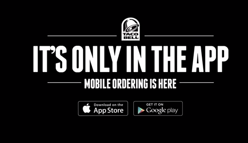
Taco Bell recently unveiled a new mobile app, available for both iOS and for Android, that “gives consumers complete access to every Taco Bell ingredient to create what they want, when they want it – all in the palm of their hand.” The app allows customers in drive-thru or in their dining room to order and pay for items directly on their mobile device. The app itself may be a great idea, but the marketing push behind this new addition from Taco Bell is certainly raising some eyebrows. The company decided to “go dark” on their social media platforms and on their website, replacing their normal content with a black background and a large message that says that “the new way to Taco Bell isn’t on the Internet, it’s #onlyintheapp”, using a hashtag that they have created for this campaign. Taco Bell site While I can appreciate the company’s desire to focus heavily on marketing this new feature, doing so at the detriment of all their other messaging and marketing channels is short-sighed. In this article, we will take a look at the possible benefits of this “all in” approach and why Taco Bell may have done this, as well as the pitfalls of this type of campaign and putting all your eggs, or in this case all your tacos, in one basket.
Information on demand

We live in world where immediate access to information is now expected. Have a question? You can whip out your phone or open the web browser on your desktop computer and hop over to Google for the answer. The same holds true for the services we use or products we buy, including menu items and locations or contact information for restaurants. Having worked on websites for restaurants in the past, I can tell you from experience that this information, menu and locations/contact, are some of the most heavily requested pages on those sites. Taco Bell’s current marketing approach, and their decision to “take down” their normal website in favor of a marketing message and nothing BUT a marketing message, is not a customer-friendly decision because it runs contrary to the information on demand culture that our customers have come to expect from websites. Now, to be fair, Taco Bell did not actually take down their entire site. If you run a search engine query for “Taco Bell Menu”, you can find those pages still live on the Web, but you have to work for it! Their current homepage, which is where their visitors will likely go, includes no links to the other pages of the site. If a customer needs menu information, or if they are looking for something like a location’s address or phone number, they will have to go out of their way to dig that information out. That is asking a lot of a person and few customers will go to those lengths.

What they want versus what you want

Taco Bell’s current campaign is a perfect example of placing a company’s needs before their customers’ needs. The marketing message that now dominates Taco Bell’s media properties is what they want people to know about. There is nothing wrong with promoting a new service or product, but by removing easy access to the rest of the information their customers may want, they are ignoring their needs in place of their own. What if a customer comes to the site to find nutrition information, only to be greeted by a message to download this new app. Is that a good customer experience? Perhaps they do not have an iPhone or Android device. This message is lost on them and they are at a dead end. This is a lost opportunity. Saying that this information is “not on the Internet” and instead forcing them to download an app is like saying “we don’t care how you want to access this information, we want you to download an app and we won’t give you that information unless you do so.” That may sound harsh, but that is absolutely how this decision comes across. Yes, there is value in putting a marketing campaign front and center in big way like this. Taco Bell’s new app is certainly being talked about, but most of the chatter I am hearing is not about the app itself or how great or convenient it is, it is about the company’s decision to market it in this way, with the rest of their messaging and information absolutely non-existent. A better approach would have been to market this new app in a big way with a bold, prominent placement across all their media channels, but to also include easy links to the normal website and social media content. With that approach, they could still ensure that their message comes across loud and clear, which is what they want, but they would not be ignoring what their customers want because that information would still be easily accessible.

Ignoring the conversation

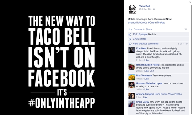
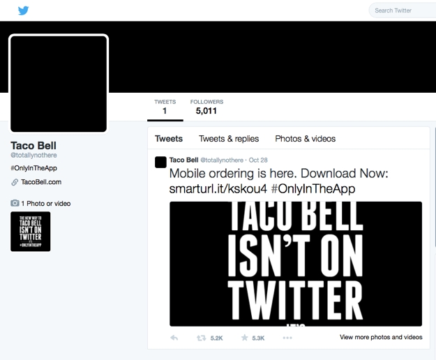
Another interesting (and not in a good way) aspect of Taco Bell’s “going dark” campaign is what they are doing on social media. Their Facebook page currently includes only 1 post with a message similar to their website about the new app. The Taco Bell logos and everything else have been removed. Taco Bell Facebook What this page does have are comments – 1,194 of them as of this writing. If you read through those comments, you will find people complaining about the removal of the website content, the lack of delivery services, and many random slams on Taco Bell in general. Bottom line, there is a lot of negativity on this page, but Taco Bell is nowhere to be found in those comments. Their “going dark” campaign also includes them removing themselves from the conversation. This is not how social media works. Taco Bell Twitter Social media is all about engagement and conversations. If you put something out there, especially something like a new service like this, you should be prepared to answer customers’ questions and have those conversations. Taco Bell has yet to do this. Instead, they have “gone dark” and are nowhere to be found.
A better approach

When you have an important message to convey to your audience, you want that message front and center. There may be the temptation to take the same route that Taco Bell did and remove all your other content in favor of that message. Yes, people that visit your site will see it because that is all that there is to see, but is that the end goal? No, you do not want customers to only see your message, you want them to see your message and take action. Preferably, you want them to take the action that this campaign is focused on, but if they cannot do that, you do not want them to hit a dead end. In the case of Taco Bell, someone without a mobile device that can download the app, or someone with no interest in downloading that app, has hit that aforementioned dead-end. There is nowhere else for them to go other than away from Taco Bell. That is a lost opportunity. For your own marketing campaigns, you want to ensure that if you put a message front and center, you also make other paths available for people who that message may be lost on. Bottom line, you do not focus on one message or campaign at the expense of everything else you have to say and offer – and you never take yourself out of the conversation! When customers are talking about your company and what you are doing, that is a golden opportunity to respond and start a conversation. If you instead decide to “go dark”, you miss that opportunity completely.

In closing

I expect that this campaign is a temporary one for Taco Bell. Soon enough, their website and social media will be back to normal, but in the meantime, all I see in this marketing push are missed opportunities and ill-informed decisions. When planning your own campaigns and messages, speak to your marketing team or agency and always ask yourself whether your plans focus too heavily on what you want instead of what your customers need. The key to a successful campaign is finding a way to address both of these needs and tie together your company’s goals and those of your customers.