Behavior-Triggered Emails: The Secret to Boosting Your Open Rates by 152%
When it comes to email marketing, personalization is the secret to success. But how can you effectively personalize a tool that is by its very nature designed for mass communication?
The answer? Behavior-triggered emails.
Behavior-triggered email is a versatile personalization technique that allows your business to engage with customers at timely touch points. For example, when RunKeeper, a pedometer app, sends a message to one of their registered users with a prompt that reads, “You went running last Saturday at this time. Why not go for a run now?” — that’s a behavior-triggered email. Although highly personal to the recipient, messages like these are easy to automate by taking advantage of data points that are relatively easy to mine and collect thanks to modern technology.
While there is an almost limitless range of ways to execute behavior-triggered emails, the keys to crafting a successful campaign are specificity and creativity. To help you better understand what this is all about and provide inspiration that you can implement in your own marketing, let’s take a look at just a few of the brands that are using this tactic effectively to connect with their customers:
Harris Teeter: Welcome
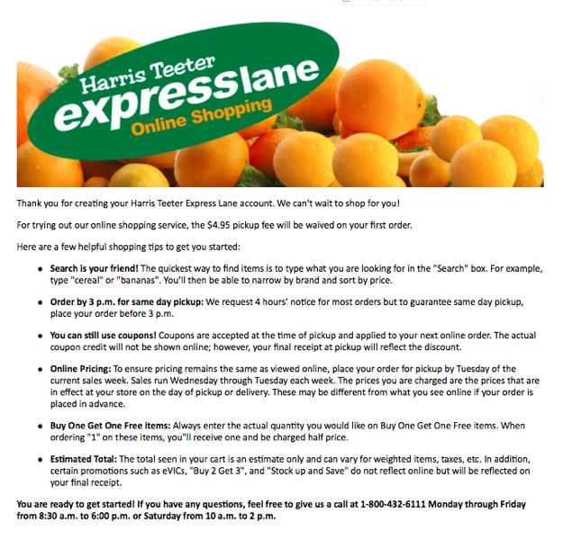 The strategy: Sending a welcome email is standard protocol almost any time someone signs up for an account on your website or app. However, this message from grocery store chain Harris Teeter goes a couple of extra steps beyond extending the typical thank-you for registering.
First, it offers a discount on the service fee, providing an extra kick-in-the-pants incentive for new account holders to seize the day and place their first order.
Second, it takes advantage of this inbox inroads to remind customers of the benefits of their personal online shopping service and offer a few helpful hints for getting started, thereby reinforcing the sales messages that prompted the user to sign up for an account in the first place.
Soap: Come back
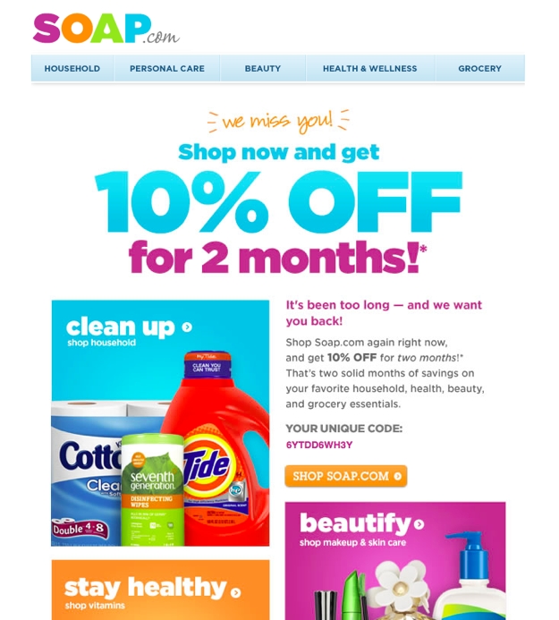
The strategy: In most relationships between customers and brands, there comes a time when the customer begins to drift away, whether because another competitor has caught their eye or because any of life’s myriad responsibilities and distractions have bumped their need for your products or services down in their list of priorities.
If it’s been a while since a customer last visited your site or made a purchase, it’s time to reach out and give them a gentle reminder that you’re still here for them, which is exactly the objective behind this message from Soap.com. Their approach is particularly effective because it is not just a one-time offer that might entice a customer back only to lose them again after making one purchase in order to reap the benefit of the discount. Rather, the offer code is good for every purchase made for two months, a smart sales strategy aimed at coaxing the customer back into becoming a habitual Soap shopper.
Williams-Sonoma: Abandoned cart
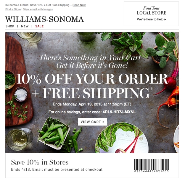
The strategy: Another staple of e-commerce email marketing is the abandoned cart reminder. While this strategy is not earthshakingly innovative, it is nevertheless effective.
Williams-Sonoma takes this approach to the next level by including a unique discount code that provides a strong incentive for the customer to return to the site – or the store – to complete their purchase. The code is valid for less than 24 hours, creating a sense of urgency to take advantage of the deal.
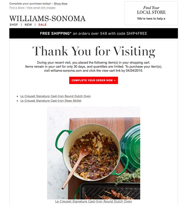
One caveat to this approach: You shouldn’t always include a discount offer in your abandoned cart reminder email, or you’ll run the risk of training your customers to put their desired items into the cart and then wait patiently for your message to arrive before checking out with their discount code. Rather, mix up your pitches and include a discount code in some messages but not all. Below is an example of a follow-up email from Williams-Sonoma that does not rely on a special offer to create an urgency to act but rather a mention of limited quantities and a reminder that the previously selected items will soon be cleared from the cart.
Old Navy: Product review
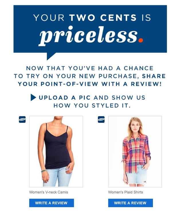 The strategy: If you’ve ever purchased something online, you’ve undoubtedly received one of these emails. Again, the reason they’re so popular is that they’re so effective.
Reaching out to someone who has already made a purchase from you to ask them to share their opinion about the product or services they received is a winning approach all the way around. The simple act of making the request conveys to your customer that you’re a brand that cares about your customers and their satisfaction. Moreover, when they click through to provide their review, you’re getting the benefit of a first-hand testimonial that will help you sell that product to future customers. You’ve also successfully brought an existing customer back to your site, where hopefully something new will catch their eye, leading to a purchase that will begin the cycle all over again.
Grovemade: Survey
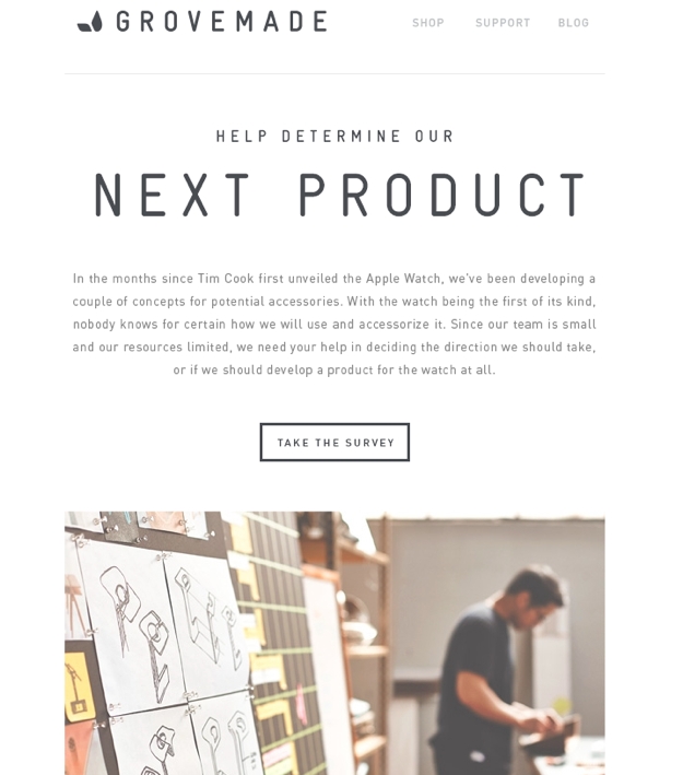
The strategy: The survey request is another sure-fire winner. Similar to the product review prompt, the survey request conveys to the recipient that their needs and opinions are valued.
In this example from Grovemade, customers who have previously purchased a related product are sent a link to a survey to provide input to the company on the design of accessories for the new Apple Watch. This accomplishes two smart marketing objectives. First, it gives the company valuable insights to shape their new product line so that it delivers exactly what their customers want. Second, it creates anticipation among their customer base for an upcoming line of products even while they are still in the R&D phase.
Nike: Celebrate a milestone
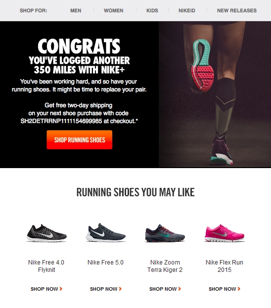 The strategy: If you have a website or app that tracks customer activity, you likely have data that will allow you to recognize your customer for reaching a milestone, whether it’s a birthday, the anniversary of their becoming your customer or even a personal accomplishment based on activity logged via the site or app.
This example from Nike is a great case-study in how to make this particular approach work for you. In the email, Nike puts the recipient front and center by keeping acknowledgment of their achievement the primary focus. As a secondary message, Nike includes a “reward” for reaching this milestone in the form of a discount on Nike running shoes. While this is obviously a bit self-serving on Nike’s part, it’s also a great way to foster customer loyalty by providing an incentive to buy at a time when the recipient is most likely to be in need of their product.
The proof is in the results
Market research shows that behavior-triggered emails are a valuable but underused tactic. EmailMonks reports that open rates for triggered emails are 152% higher than those for traditional email marketing messages. Even so, over 75% of marketers are not yet using behavior-triggered emails or auto-responders.
A word of caution
Before you go all-in on behavior-triggered emails, take a moment to consider how your correspondence will come across to the recipient.
Online privacy is a hot-button issue these days. Just because you can capture and use data about your customers doesn’t necessarily mean that you should. The last thing you want to do is alienate a prospect or customer because you are blatantly tracking their activities without their consent. The best approach is to apply the principles of trustcasting and allow your customers to opt in to receiving your messages and to tell you what types of communication they’d like to get. The simple courtesy of obtaining permission can make all the difference between being perceived as a helpful partner or an obtrusive snoop.
Also, as with any email marketing strategy, make sure you don’t wear out your welcome in your customers’ inboxes. Use good sense and restraint in the timing and frequency of your emails. For example, if I browse your e-commerce store, don’t make a purchase, get an email, browse again but still don’t commit, are you going to send me another reminder that I still have items in my cart? These are the kinds of rules and parameters that you’ll need to establish judiciously for your campaign in order to walk the fine line between smart marketer and pushy salesperson.
Getting started
If you’re not so sure about diving in without your water wings, there are tools that specialize in sending triggered emails, like Vero for e-commerce, Intercom for B2B and SparkPage for B2C campaigns. If email marketing is one of the primary vehicles you rely on to win and retain customers, then it may be worthwhile for you to partner with an experienced software development company to design a customized system that integrates with your website and your CRM and SFA systems to effectively capture and leverage the customer data you need to create the most powerful conversion engine possible.
Setting up an automated behavior-triggered email program does require an investment of time and tactical thinking upfront, but once it’s implemented, your company will reap the benefits of having a razor-sharp communication strategy that resonates with your customers by providing timely information that caters to their interests, preferences and habits.
For more than a decade, Carey Arvin has worked hand-in-hand with premier brands, helping them define their voice through marketing mediums, the Web and the social sphere in ways that engage customers and inspire trust. Carey currently serves as the editor in chief of Fame Foundry Magazine and The Fame Foundry Marketing Minute.