The Good, the Bad and How You Can Do It Better: An Analysis of 8 Great (And Not So Great) Landing Pages
In the world of business promotion and growth, landing pages have a singular purpose: to compel visitors to take a specific action that will further their engagement with your company.
Whether that action is registering for something (an event, an account, a newsletter, etc.), downloading something (a white paper, perhaps) or purchasing something, the goal is to persuade the visitor to complete that action and that action alone – not to tell them everything they could ever want to know about your company, its history and all it has to offer.
A good landing page makes it easy for visitors to understand what you want them to do and why they should do it while simultaneously keeping the process of taking that action streamlined and free of distractions and hassles.
A strong landing page is a critical component of any marketing campaign, whether offline or online. You've convinced someone to take their time to visit the page, so now you need to seal the deal by motivating them to take the next step. While this is no easy task, there are many ways to improve your odds of success.
One of the best ways to understand the dos and don’ts of landing page design is to see them in practice. Here we’ll examine eight very different landing pages and offer our analysis of what they’ve done right, what they’ve done wrong and how you can do it better.
UserTesting.com
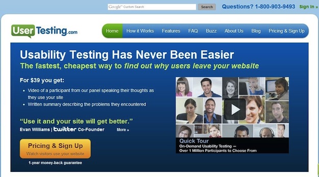
The Good: The heading presents a direct, relevant sales message, and the subhead provides excellent support. The copy is clear and to-the-point while the video offer the opportunity for users to learn more without leaving the page.
The "Pricing and Signup" button is very prominent, so visitors know where they need to go next, while the mention of the one-year money-back guarantee provides an important trust-building element to motivate them to take that step.
The Bad: On this site, the landing page is the home page, which is a mistake because there are a number of distractions present that can draw visitors away from the path to conversion.
The navigation elements are too prominent, and the top search bar is completely unnecessary, only providing yet another element of disruption. The display image for the video is a bit cluttered as well.
How You Can Do it Better: When you have a very specific marketing or sales objective to achieve (again, think signing up for your newsletter, downloading free content, launching a new product, etc.), use a landing page.
Your home page needs to serve a diverse array of functions and users. A landing page allows you to provide a completely customized experience focused on helping a more targeted group of users reach one specific conversion point.
Team Treehouse
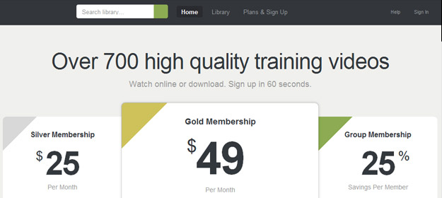
The Good: This landing page is clean, simple, focused and presents a clear pricing plan right off the bat. The navigation elements aren't so prominent that they distract, but they are definitely easy to find if a user wants to do more research. You know you're getting training videos, but the question remains...
The Bad: What kind of training videos? This landing page took simplicity so far to the extreme that it forgot to tell visitors what they're getting, even if they read all the text on the page. It’s impossible to understand what the offer is without leaving the page, which is a glaring oversight.
How You Can Do it Better: Minimalism is good but only when used within reason.
You must present enough information about your offer on the landing page itself for the user to feel confident in taking the next step. This requires good balance of content and design. It may also necessitate getting a bit creative in how you present your message. Often, a brief demonstration video can take the place of 1,000 words in providing more information about your product or service.
Windows Azure
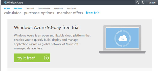
The Good: Here's a fairly solid landing page. The design is minimalist, the call to action is easy to find and who doesn't like getting something for free?
The heading and description are clear and easy to understand. The superframework (where the logo and log-in links live) is sufficiently muted and out of the way. Overall, the layout is clean and makes it easy for the eye to navigate the page.
The Bad: The main navigation is messy and overly complex. There are two tiers with various buttons highlighted in light blue, which introduces and element of confusion and distraction in an otherwise very clean and streamlined design.
How You Can Do it Better: Navigation is a make-or-break element of every website design, and landing pages are no exception.
When it comes to your landing page, remember that the goal is to persuade the user to take one specific action. Focus on providing them with only the information they need in order to take that action without leaving the page if possible.
If more information is needed than will be effectively served by a single page, keep the navigation streamlined and limited only to those options that serve the landing page’s core purpose.
RightBanners!
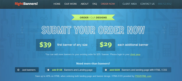
The Good: The layout of the page is simple and easy to follow, and the navigation bar is tucked out of the way. The clear pricing structure gives users the critical information they need to know. Plus, the colors are engaging and exciting.
The Bad: The "Submit Your Order Now" heading reads like a button, but it isn't a button at all. Instead, the user must scroll down to create an order – a process that's quite confusing.
There are also too many different sizes of text on the page, which is a direct result of trying cram too much information into the banner area.
This page would work much more effectively if it were broken into a two-step process: a streamlined landing page leading the user to a second page where they could complete their order.
How You Can Do it Better: When it comes to user interface design, the devil is in the details. You must always consider the cues and conventions that users expect when interacting with a page and use those to your best advantage.
For example, navigational buttons are so commonplace that we tend to take them for granted, but they play an important role in your landing page.
Pairing call-to-action statements like “Submit Your Order Now” with a button that performs that specified action is a simple but effective way to provide a familiar interface cue that helps users understand the process that they’re engaging in.
When these things don’t work as expected – as in the example above – it creates confusion and uncertainty that can inhibit the user from taking the action you desire.
PSD2HTML
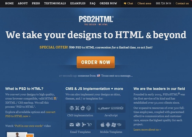
The Good: This is an excellent landing page. The call to action is clear, and the message is concise. Overall, it's easy to tell what you're getting and where to go next.
The Bad: The page is a bit cluttered, which leads the eye away from the primary point of focus.
How You Can Do it Better: As always, whitespace is your friend.
If the design is cramped, the page will seem visually intimidating to your user. By contrast, allowing the elements on the page room to breathe makes it easier for the user to draw distinctions between different types of information.
DealFuel.com
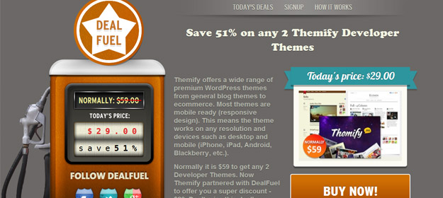
The Good: Deal Fuel pulls off the home page/landing page combo successfully because it's designed first and foremost to be a landing page.
The design is clever, and the value proposition is prominent. Navigation elements have been scaled way back to allow the header section where the call to action lives to take center stage. Pricing information is easy to find, and the layout of the page helps guide the visitor through the information presented in a logical order.
The Bad: The description paragraph is too long; it's just too much information to include in a call to action area.
Also, the color of the "Buy Now!" button should also be different than the brown used in the gas pump because it fades into the background.
How You Can Do it Better: Never underestimate the importance of color in website design. Color and contrast play a very important role in directing the user’s attention to key elements and establishing a hierarchy of information.
For example, on the DealFuel.com page, simply swapping the colors on the "Today's price" banner and the "Buy Now!" button would create better cohesiveness within the design and make the call to action button more prominent.
AppSumo
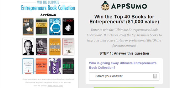
The Good: This is a unique landing page that offers a the user a chance to win a prize in exchange for giving the company their contact information.
The call to action button is impossible to miss, and the process draws you in because it's so easy to answer the (very obvious) question and fill out the form.
The Bad: The design is cluttered and the message is difficult to find right away. The heading says "Win the Top 40 Books...", but you don't know why or how immediately. The description that follows is difficult to read because there’s not enough contrast between the color of the text and the background.
Also, putting the books on the left side of the page (where the eye naturally goes first) is distracting. These should be positioned either to the right or below the call to action in this example.
It's also a mistake to offer a reward at such a superficial level of engagement. Users can provide their contact information and enter the contest without knowing anything about AppSumo or what they offer. The brand would be much better served if the page included even a short, single-line description of AppSumo's value proposition.
How You Can Do it Better: Before you create a landing page, you must clearly define the business growth objective that you want it to serve, and then you must decide how best that objective can be achieved in a way that delivers value for both your brand and your customers.
In the AppSumo example, the engagement between the visitor and the brand is fleeting and shallow. While AppSumo does gain the benefit of the user’s information, there’s nothing to qualify this user as a potential customer and no motivation for the user not to simply unsubscribe when they start receiving communication from a company that they still know nothing about.
While capturing a user’s contact information is a legitimate and useful business growth goal, it would be better achieved by offering the user something of greater value in return than simply a one-in-many-thousands chance of winning a prize.
Instead, think of a way to structure the exchange that promotes greater long-term engagement between your brand and this user, whether it’s a providing free white paper that showcases your expertise or offering a free trial of your services.
TemplateSOLD
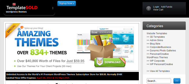
The Good: The design is modern, and the colors are interesting and engaging. The bold, concise heading makes the purpose of the page very clear. Prices are displayed upfront, so there are no surprises when the user moves to the next step.
The Bad: What is the next step, exactly? There's no one clear call to action. Instead, there are a LOT of calls to action here that muddy the design. The page wants you both to "Signup Now" and to "Download" the themes. There are also a number of different prices displayed on the page, each of which acts as a call to action in its own right.
Last but far from least, there's a major conflict in messaging. While the bold text claims to sell $40,866 worth of themes for just $59.95, the fine print cites a 50 theme limit. This type of marketing gimmick only serves to create confusion and make potential buyers wary of what they're really getting into.
How You Can Do it Better: Whatever you do, never, ever use any kind of gimmick or trickery in your presentation. No matter what action you want your users to take, they’re not going to do it if you don’t first establish a foundation of trust.
Instead, go above and beyond in your efforts to reduce the user’s perceived risk for taking action. When possible, offer a money-back guarantee or free trial period. Make sure you address potential sales objections, and provide social proof to reinforce believability and trust.
Tara Hornor has a degree in English and has found her niche writing about marketing, advertising, branding, web and graphic design, and desktop publishing. She writes for PrintPlace.com, a company that offers color printing for business cards, printed catalogs, posters, brochures, custom postcards, and more printed marketing media. In addition to her writing career, Tara also enjoys spending time with her husband and two children. Connect with Tara on Twitter @TaraHornor.