One Year Later

Today, there is freedom in marketing. No longer is the loudspeaker of the media controlled by a select few. As a result, so much more can be gained than ever before, all with fewer resources and less risk. The playing field has been officially leveled—and not a minute too soon.
With those words, we launched the first Fame Foundry Magazine and began leading a revolution.
Recognizing that the world of marketing is riddled with misinformation and con artists, we set out on a mission to cut through the static and get to the truth of the challenges of growing business today.
Each month we bring you articles that cut through the muck of jargon, myths, speculation and the outmoded ways of old marketing to give you the clarity and perspective you need to thrive in today's marketplace. As we mark our first anniversary, we take a look back at the fundamentals of new marketing that we’ve established over the past year.
The end of marketing as we knew it
Prior to the advent of the Digital Age, our culture was based on a handful of media. Television, print and radio were the anchors of mass information exchange and business promotion.
As a result, if you owned a business or were charged with growing a company, you were shackled to promotional entities such as television commercials, newspapers and the Yellow Pages.
Those days are long gone, and those systems are now dying. In their place are unlimited channels of conversation not only between one person and another but between people and business.
No longer does mass media claim a chokehold on the lines of communication between companies and customers. No longer are information gathering and sharing the exclusive domain of mainstream news organizations. No longer are consumers willing to passively absorb the web of lies concocted by marketing’s spin doctors.
Today the means of communication have been revolutionized, and the old methods marketing to the masses have been rendered ineffectual.
Read more:
Prying the Torch From the Dead Hands of Old Marketing
All hail the virtual agency

The only thing deader than old marketing is the traditional agency, and its business model is in the grave right along with it.
Today's marketplace is ruled by survival of the fittest. It's time to get faster, leaner, smarter and more agile, and marketing agencies are no exception to this rule.
The new marketing company is one that hasn’t forsaken business principles that are timeless but takes advantage of all that’s afforded by today's technology to shave off unnecessary expenses.
OUT: Deals with a select few in a position of control.
IN: True, choice-based media, entertainment and communications.
OUT: Expensive payments to big, traditional, bureaucratic agencies that still attempt to use carpet-bombing tactics to grow your business.
IN: Fresh and nimble development firms who know how to build a brand and grow a following around it using today’s communication systems.
OUT: Paying the price for enormous overhead expenses for big buildings and lavish offices filled with excessive personnel.
IN: Virtual and hybrid marketing firms that work fast and don’t pass the bloat of unneeded expenses on to their clients.
OUT: Working through layers of costly production managers, account executives and supervisors before you get to the people that really do the work.
IN: Having access to the key architects and creative talents who are integral to the ideas and concepts essential to your success.
Read more:
10 Things You Pay for From Traditional Marketing Agencies
If marketing is dead, what's next?
Getting and keeping customers is what it's all about. That much hasn't changed. What has changed is what's needed to achieve it.
Gone are the days of growing your brand by marketing to the masses. Today’s consumers are disengaged from commercial culture as we once knew it, disenchanted with marketing’s shallow messages and misleading claims and disillusioned by promises unfulfilled. Instead, they are ever in search of the authentic. They are driven to seek out companies they can believe in and to identify themselves with brands that inspire them.
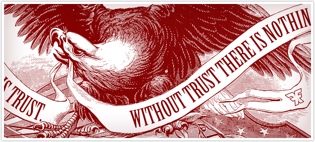
In a world of unlimited channels of communication, loyalty is no longer a commodity that can be bought rather than earned. In the new millennium, trust has become the currency of a marketplace driven by the consumer, and the new way to grow business is through trustcasting.
Simply put, trustcasting is the ongoing process of building and maintaining trust between a business and its customers. The practice of trustcasting requires that any and all resources dedicated to the promotion of business be directly or indirectly founded in trust.
Trustcasting approaches customers as people, not numbers. For those ingrained in the old practices of mass marketing, this represents a daunting ideological shift, but the task of earning and keeping trust cannot be reduced to statistics or demographic segments.
Recognizing word-of-mouth as the primary medium by which today’s customers are won, those that practice trustcasting engage in two-way communication with their customers on a human level, demonstrating genuine respect and value for their time and attention. While this approach undoubtedly requires a more significant investment in time and resources than traditional marketing, the return — cultivating a community of evangelists around a brand – is also much more profound and lasting.
Read more:
Put Away the Smoke and Mirrors
The Trust Manifesto
Goodbye, Marketing. Hello, Trustcasting.
10 Resolutions for Success in 2010 and Beyond
10 Keys to a Successful Marketing Partnership
A brave new world

In today’s marketplace, the Web is where customers are won and businesses grow.
It starts with a great website – one that has successfully confronted and conquered the challenges of providing a beautiful interface, engaging content and utility beyond your primary offering. However, even the best site is only the first step; it’s the foundation upon which you can start to develop a community around your brand.
Once you’ve launched your site, you’ve effectively set up shop and opened the doors. That’s when the real work begins.
To get and keep customers, you must master the Web marketing universe beyond your own site. You must actively seek out those whose needs, desires and interests align with the products or services you offer, draw them in and engage them in conversation.
While it may initially feel like daunting and unfamiliar territory, the key to navigating this new landscape successfully is to ensure that all of your efforts are driven by the motivation of establishing and keeping trust. As long as you always follow the principles of trustcasting, you will inevitably turn contacts into customers, customers into fans and fans into evangelists, all while cultivating a vibrant virtual community.
Read more:
The Web Marketing Universe
On the Right Path
Best of Charlotte Website Design
The “No Duhs” of Social Media
10 Principles of Trustcasting in the Web Marketing Universe
Be yourself or be nothing at all

It’s a mantra worth repeating: People follow people, not companies.
PR done right in today’s marketplace is about people. Cultivating a fan base and creating rich relationships with your public requires that you drop the corporate mask and be a real person.
The public has no affection for the face of corporate America. No one wants to see standard form-letter responses and press releases on Facebook, Twitter and the like.
You must stop being corporate and start representing your brand on a personal level. Be real, flaws and all. Be prepared to be honest through and through. Share your time, your action and your help. Be present every day – accessible and responsive – without fail.
If you try to play it safe and fabricate a personality that shows the world the face you want the public to see, this artifice will be found out quickly. No one will invite you back to the conversation. In fact, you will be banned from the conversation.
By contrast, engaging in real relationships creates fans. Fans are more than just loyal customers; they are brand evangelists that do your marketing for you.
Read more:
The Cult of Personality (Part 1)
The Cult of Personality (Part 2)
Breaking Boundaries
The Age of Tribes

Behind every major movement and successful marketing engine there is a tribe.
What is a tribe? Simply put, it is a group of people that connect around a common goal, shared passion, similarities in background or a need for solutions to improve their lives.
The facts are simple: if you want to grow and thrive in today’s marketplace, you must identify, become a member of and lead the tribes that are relevant to your business and your bottom line.Your organization, your business operations and your products or services must be shaped by and around the tribe.
Tribes are ready and waiting for the next big thing that is going to solve their problems, meet their needs or make their lives better. If you’re the one that delivers that idea, they’ll rally around you, spread your message like wildfire and fan the flames of your success. The power and influence you command as the leader of your tribe is unrivaled by any form of traditional advertising.
Read more:
Tribes in Today’s Marketing
Mastering Tribe Marketing
Shaping Business for the Tribe
Following the leaders

If you need living proof that the rules have changed, look no further than the Fame Foundry Podcast. Each month we spotlight the people and companies who are leading the way in setting new trends and redefining how business is done today.
Take, for example, best-selling author and video blogger extraordinaire Gary Vaynerchuk. When it comes to the gospel of personal branding, there is perhaps no one so well qualified to preach as Vaynerchuk, who has not only turned his family business into $60 million-a-year wine empire but has cultivated a following of more than 100,000 for his daily video blog.
For a true testament to the power of Twitter, we introduce you to Comcast’s Frank Eliason – the man behind the Internet’s most advanced social media-based customer service program. Eliason has achieved the impossible by lending a human voice to the cable giant and transforming formerly dissatisfied customers into brand evangelists.
Then there’s the inspiring story of Amélie’s French Bakery in Charlotte, N.C., which defied the unfavorable odds of launching a new restaurant in the midst of an economic downturn by cultivating a reputation for authenticity and a fiercely loyal community of ardent evangelists.
Perhaps you are sold on the importance of social media platforms like Facebook and Twitter, but you’re still dubious of the value of viral video. Meet self-proclaimed “Internetainers” Rhett & Link, whose reputation for creating highly popular video content has brought major brands like Cadillac, McDonald’s, Coca-Cola and Starburst to their doorstep.
Read more:
Gary Vaynerchuk: Profit from Your Passion
Comcast’s Frank Eliason: Creating a Better Customer Experience One Tweet at a Time
Amélie’s French Bakery: Staying True to Success
Rhett & Link: The Business of Viral
More to come
The revolution is far from over, and Fame Foundry is just getting started. Keep reading for more intelligence on the new rules for business growth and what it takes to compete in today’s marketplace.
Great authors are defined by their ability to set fire to the written word. All too often in today's digital information age, that creative spark is stifled, leaving the Web littered with content that is lifeless and ineffectual. Fame Foundry's Author has made it his mission to revive the act of writing as an art form, harnessing the power of language to command attention and ignite a following. It's the difference between telling a story and building a legend.